Minimalistic
Sep 9, 2022 12:21:54 #
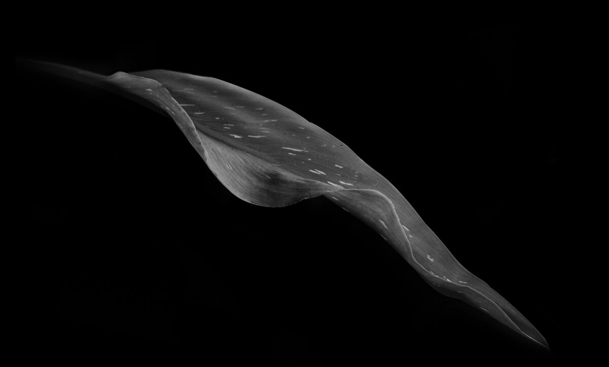
Simple but difficult minimalistic image. Lighting was troubling still not sure what I think about it.
Sep 9, 2022 12:39:24 #

Sep 9, 2022 13:09:20 #

This one is quite soft, which was probably your intention. I've noticed that minimalist shots very often benefit from some starkness - have you tried that? I also get the impression that it needs just a bit more space in the bottom right. It looks like the tip of the leaf is dissolving into the edge of the frame. Perhaps the tip just needs to be more clearly defined.
Sep 9, 2022 14:01:58 #
Sep 9, 2022 14:12:07 #
R.G. wrote:
This one is quite soft, which was probably your intention. I've noticed that minimalist shots very often benefit from some starkness - have you tried that? I also get the impression that it needs just a bit more space in the bottom right. It looks like the tip of the leaf is dissolving into the edge of the frame. Perhaps the tip just needs to be more clearly defined.
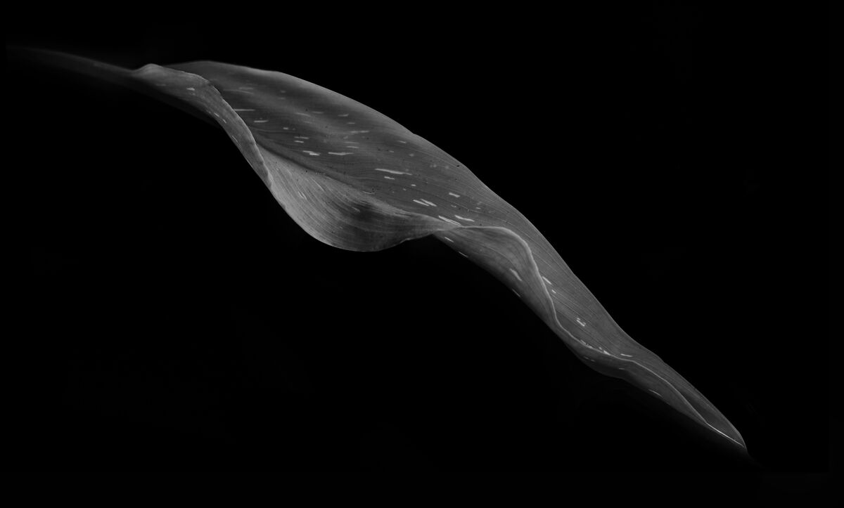
I tried more contrast but didn't like that so keep it soft. If I try to darker it (Starkness) it becomes too gritty to me. I cleaned up the tip to make it more visible while adding a little more space below it per your suggestion.
Sep 9, 2022 14:19:50 #
Jim-Pops wrote:
I tried more contrast but didn't like that so keep it soft. If I try to darker it (Starkness) it becomes too gritty to me. I cleaned up the tip to make it more visible while adding a little more space below it per your suggestion.
Maybe it's just my eyesight needing a bit of help but I find #2 easier to make out.
Sep 9, 2022 14:22:37 #
R.G. wrote:
Maybe it's just my eyesight needing a bit of help but I find #2 easier to make out.
And I think #2 is the keeper. 👍
Thank you for your thoughts R.G..
Jim
Sep 9, 2022 14:41:14 #
Jim-Pops wrote:
And I think #2 is the keeper. 👍
Thank you for your thoughts R.G..
Jim
Thank you for your thoughts R.G..
Jim
You're welcome.
Sep 9, 2022 17:55:23 #

Jim-Pops wrote:
The slight change makes a difference. I love the curves and softness. A very nice study.I tried more contrast but didn't like that so keep it soft. If I try to darker it (Starkness) it becomes too gritty to me. I cleaned up the tip to make it more visible while adding a little more space below it per your suggestion.
Sep 9, 2022 18:18:16 #
Linda From Maine wrote:
The slight change makes a difference. I love the curves and softness. A very nice study.
Thanks so much Linda.😊
Sep 9, 2022 18:43:02 #
Absolutely beautiful Jim. On black is difficult to say the least. I too like the second one
Sep 10, 2022 05:56:07 #
I usually find these types of images uninteresting. Not this one. I love everything about it. The softness suits this image. The curves, subject placement, and linear white lines in the subject are nice leading lines taking my eyes on a journey from the upper left towards the lower right and off the frame. It works!!!
Sep 10, 2022 11:08:01 #

Sep 10, 2022 14:14:32 #

I love your idea of working with a single petal or leaf. The simplicity of the single subject makes the eye enjoy the curves. My eye stays in the picture longer with your 2nd image with the black all around the tip stopping my eye from leaving the image. Nice work. Bev
Sep 10, 2022 18:11:17 #


If you want to reply, then register here. Registration is free and your account is created instantly, so you can post right away.