B&W
Oct 27, 2012 20:17:27 #

Oct 27, 2012 20:38:12 #

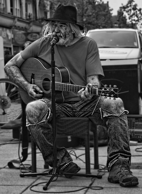
I love B&W.
I think this one would work better if the entire shot were in B&W.
I think this one would work better if the entire shot were in B&W.
Oct 27, 2012 20:48:47 #
hlmichel wrote:
I love B&W.
I think this one would work better if the entire shot were in B&W.
I think this one would work better if the entire shot were in B&W.
You're right. I posted the wrong on.
Oct 27, 2012 20:51:49 #

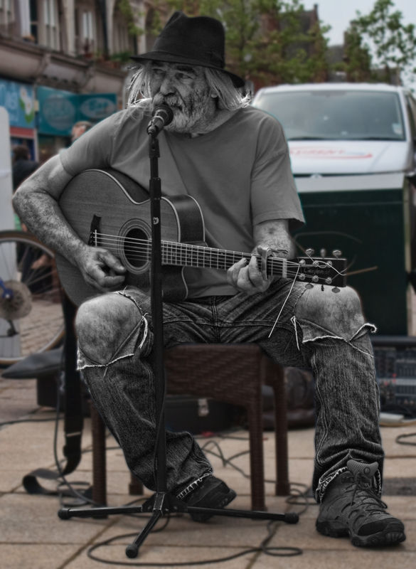
Too bad about that darn truck, but still, a great study. Very nice.
Oct 28, 2012 07:17:12 #

Oct 28, 2012 08:49:09 #

Wellhiem wrote:
You're right. I posted the wrong on.
hlmichel wrote:
I love B&W.
I think this one would work better if the entire shot were in B&W.
I think this one would work better if the entire shot were in B&W.
You're right. I posted the wrong on.
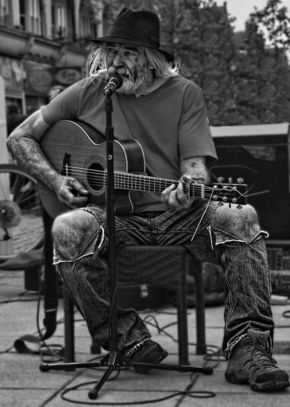
Nice shot. I might bump the contrast down a hair, but that's just me.
Oct 28, 2012 11:19:49 #
When I saw your first post of this, I said to myself "What?" Now that you posted the correct one, I think it works very well. Lol.
Oct 28, 2012 12:29:47 #

Oct 30, 2012 17:20:47 #

Nov 25, 2012 14:46:21 #

Nov 25, 2012 15:01:26 #
orterrym wrote:
Captain C is right, better without the Van.
No offense to Captain C, I take his advice and suggestions very seriously... but, in the real world, how many people are going to look at that shot and go: "Great picture, too bad about the van behind him though"? Seriously, with the depth of fields it's not really a distraction and the focus is on the musician so it's not really noticable.
Nov 25, 2012 15:12:29 #
Nov 25, 2012 15:26:22 #
CanonFire wrote:
No offense to Captain C, I take his advice and suggestions very seriously... but, in the real world, how many people are going to look at that shot and go: "Great picture, too bad about the van behind him though"? Seriously, with the depth of fields it's not really a distraction and the focus is on the musician so it's not really noticable.
orterrym wrote:
Captain C is right, better without the Van.
No offense to Captain C, I take his advice and suggestions very seriously... but, in the real world, how many people are going to look at that shot and go: "Great picture, too bad about the van behind him though"? Seriously, with the depth of fields it's not really a distraction and the focus is on the musician so it's not really noticable.
No offense taken, :-) I think you are correct. I am probably far more critical about those things than most. But here is the test: turn that image upside down and see where your eye goes - it will be right to that truck because it is the brightest thing in the image. It is a distraction. It needs to go.
Nov 25, 2012 17:12:10 #
CaptainC wrote:
quote=CanonFire quote=orterrym Captain C is righ... (show quote)
Hopefully, nobody will be looking at that image while standing on their head so it won't be that much of a distraction. LOL! :-D Once of the things I like about b&w is that removing the color removes many of the distractions. If it was a color image I would agree the truck would probably draw your eye away from the the musician. I do understand though, that what works for me may not work for you and that's ok! :thumbup:
Nov 25, 2012 17:25:38 #

Eye goes from Light to dark, Infocus to out of focus, and some one say Upper left to lower right.
In that order.
The picture has two problems.
1) Van is much lighter. Thats the first problem.
2) For me the singer is either underexposed or the background is overexposed.
The quality of the picture would have gone up dramatically by fixing both problems.
I agree with the Captain that the photo has merit based upon the subject. The picture would have been better with a little TTL.
Two rules in this type of photography.
1) Watch your background.
2) Watch your light.
This is a cool study.
If you want to reply, then register here. Registration is free and your account is created instantly, so you can post right away.