critique please this years Christmas cards
Nov 24, 2012 17:15:02 #

Voicing my opinion here as well!
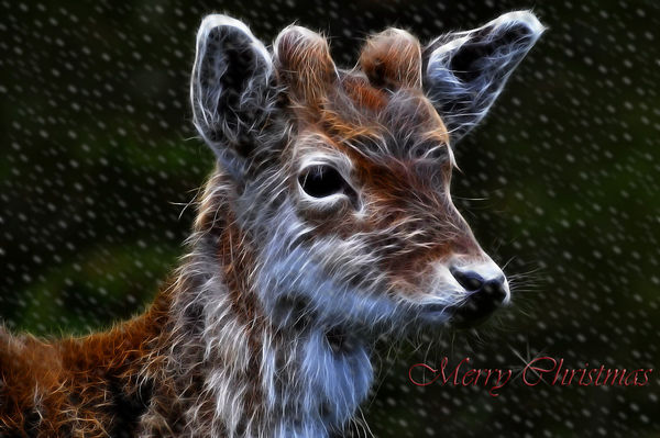
Just make the red much Brighter.. Other than that, i like what you have done to it.
Just make the red much Brighter.. Other than that, i like what you have done to it.
Treepusher wrote:
Very very nice! You're finished, so I won't say much, but I'm going to disagree with the others here. The red lettering is Christmassy, yes, but it's lost and hard to see against the background. Maybe if you haven't sent these to a printer yet, outline the lettering in yellow, as you had it originally.
Nov 24, 2012 19:11:53 #

Nov 25, 2012 05:32:50 #

Thanks for your imput. It's just a matter of moving the text layer up and then it's off to the printers
Check out Video for DSLR and Point and Shoot Cameras section of our forum.
Nov 25, 2012 06:03:07 #

Nov 25, 2012 11:29:27 #
Thanks for that colo43
I just move the type layer to the top and deepened the red, Denise if you want to dowmload it and print it feel free to do so
I just move the type layer to the top and deepened the red, Denise if you want to dowmload it and print it feel free to do so
Nov 25, 2012 11:31:14 #
Nov 25, 2012 11:31:53 #
Literati
Loc: South Carolina
Move the head over a little to the left so the eye is at the cross point.
Check out Drone Video and Photography Forum section of our forum.
Nov 25, 2012 11:35:42 #

Nov 25, 2012 11:55:15 #

Nov 25, 2012 12:00:22 #

Nov 25, 2012 12:12:06 #

Check out True Macro-Photography Forum section of our forum.
Nov 25, 2012 13:13:42 #
After looking at it again ( I think I've been looking at it too much) I agree with you naturenut I'll change the font to maybe garmound
Nov 25, 2012 13:53:53 #
Nov 25, 2012 13:55:33 #

Nov 25, 2012 16:25:30 #
That did it! Now these old eyes can read it. Hope I can come up with something as creative. Guess I better get on it or I'll miss Christmas.
graham52 wrote:
Changed from Vivaldi to Garmond
If you want to reply, then register here. Registration is free and your account is created instantly, so you can post right away.
Check out Wedding Photography section of our forum.