What does this need?
Jul 2, 2022 12:11:21 #
gmontjr2350
Loc: Southern NJ
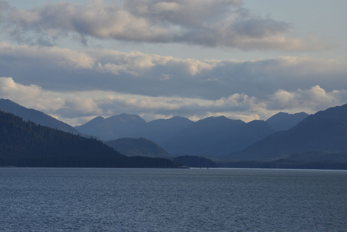
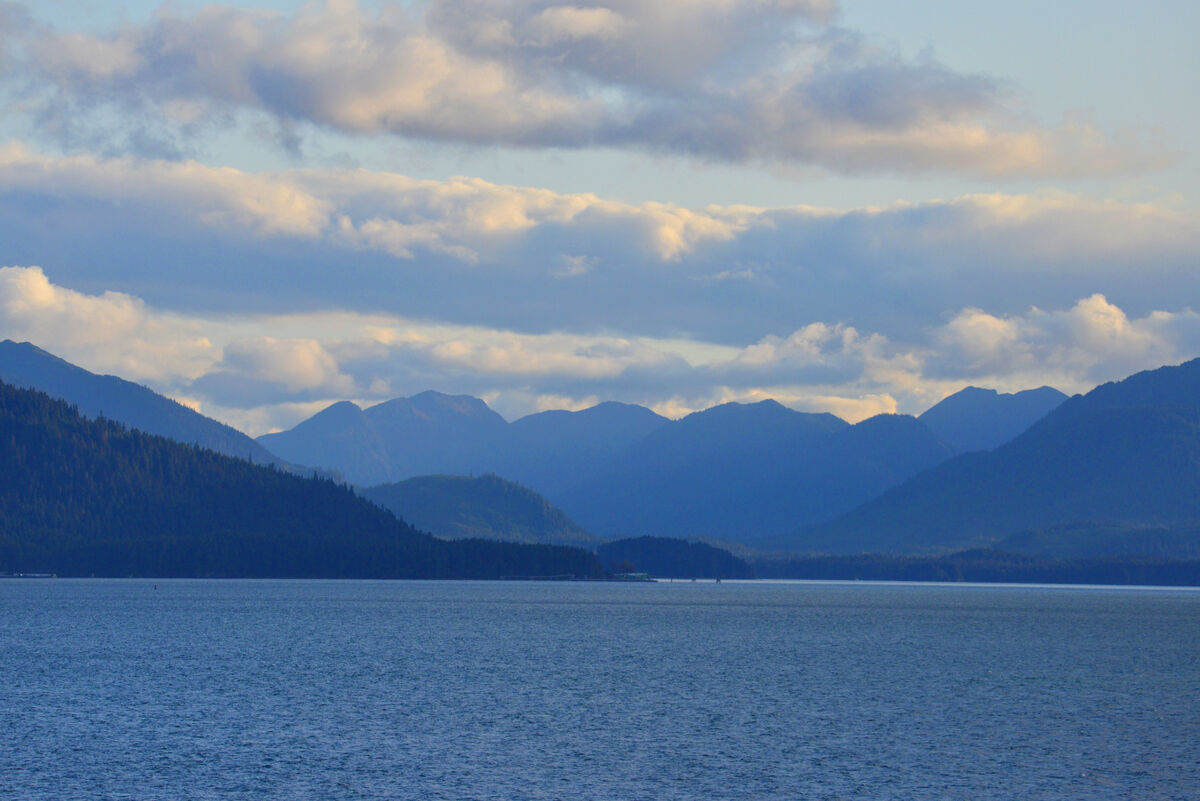
According to IrfanView, the histogram shows a properly exposed photograph.
I suspect Contrast is an issue, as well as the shadows needing a lift.
Am I on the right track? I don't want to keep using Auto-Adjust.
BTW, this is a shot taken from a cruise ship in Alaskan waters.
Thanks!
George
I suspect Contrast is an issue, as well as the shadows needing a lift.
Am I on the right track? I don't want to keep using Auto-Adjust.
BTW, this is a shot taken from a cruise ship in Alaskan waters.
Thanks!
George
Jul 2, 2022 12:25:41 #

Jul 2, 2022 12:27:13 #
13
Loc: I am only responsible to what I say..not what
gmontjr2350 wrote:
According to IrfanView, the histogram shows a properly exposed photograph.
I suspect Contrast is an issue, as well as the shadows needing a lift.
Am I on the right track? I don't want to keep using Auto-Adjust.
BTW, this is a shot taken from a cruise ship in Alaskan waters.
Thanks!
George
I suspect Contrast is an issue, as well as the shadows needing a lift.
Am I on the right track? I don't want to keep using Auto-Adjust.
BTW, this is a shot taken from a cruise ship in Alaskan waters.
Thanks!
George
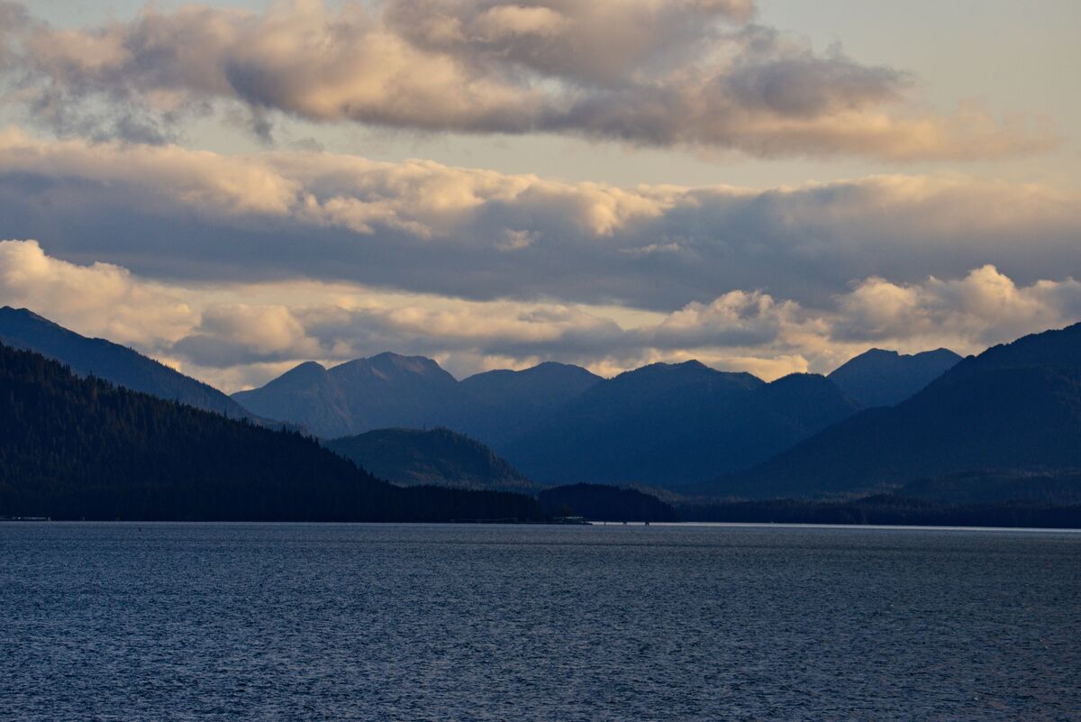
I dehazed it a little bit and a few other changes...what do you think about it? Is it OK? Hope it helps!
Jul 2, 2022 12:30:51 #
gmontjr2350
Loc: Southern NJ
13 wrote:
I dehazed it a little bit and a few other changes...what do you think about it? Is it OK? Hope it helps!
That looks great! Thanks!
Dehazing. That sounds like I should be using my UV Filter!

George
Jul 2, 2022 12:31:00 #
Yes, the second version looks much more striking. Probably closer to what you saw.
Jul 2, 2022 12:46:21 #
cahale
Loc: San Angelo, TX
gmontjr2350 wrote:
According to IrfanView, the histogram shows a properly exposed photograph.
I suspect Contrast is an issue, as well as the shadows needing a lift.
Am I on the right track? I don't want to keep using Auto-Adjust.
BTW, this is a shot taken from a cruise ship in Alaskan waters.
Thanks!
George
I suspect Contrast is an issue, as well as the shadows needing a lift.
Am I on the right track? I don't want to keep using Auto-Adjust.
BTW, this is a shot taken from a cruise ship in Alaskan waters.
Thanks!
George
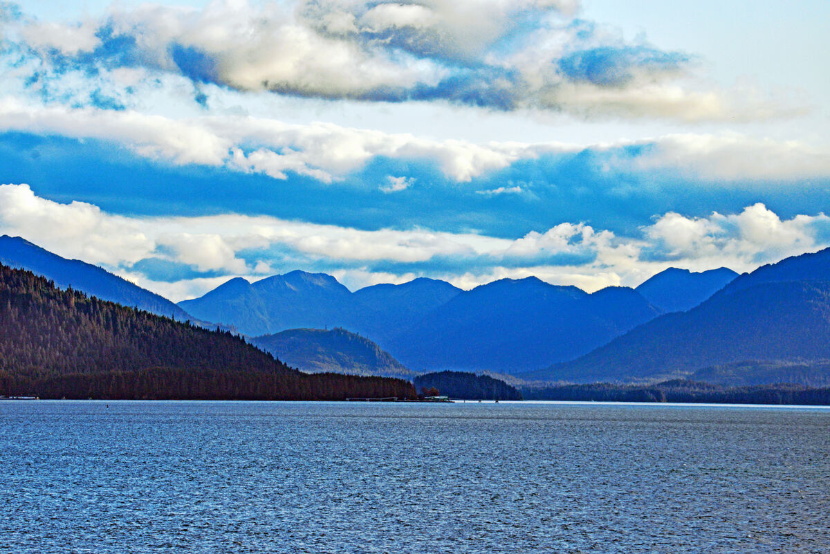
After PP. Dehaze, sharpen, adjust color levels. All done with Elements and peripherals. Lowering ISO and slowing shutter speed would have helped.
Jul 2, 2022 12:48:36 #

13 wrote:
I dehazed it a little bit and a few other changes...what do you think about it? Is it OK? Hope it helps!
This version looks great to me.
Jul 2, 2022 12:49:23 #
Jul 2, 2022 12:50:33 #
Jul 2, 2022 14:45:39 #

Another option: to keep the serene mood and understated but yummy light, be gentle. Instead of contrast, use levels or curves so that you can selectively adjust whites, midtones, blacks. Also, I used the yellow and blue sliders selectively in hue/saturation, rather than the "overall" option. PS Elements 2022.
Jul 2, 2022 14:55:42 #

Jul 2, 2022 20:04:13 #
gmontjr2350
Loc: Southern NJ
joecichjr wrote:
An awesome shot of both beauty and serenity 🔷🔵💙🔵🔷
Thank you.
George
Jul 2, 2022 20:05:16 #
gmontjr2350
Loc: Southern NJ
Linda From Maine wrote:
Another option: to keep the serene mood and understated but yummy light, be gentle. Instead of contrast, use levels or curves so that you can selectively adjust whites, midtones, blacks. Also, I used the yellow and blue sliders selectively in hue/saturation, rather than the "overall" option. PS Elements 2022.
Thank you for your input. The result looks great!
George
Jul 2, 2022 20:06:16 #
gmontjr2350
Loc: Southern NJ
cahale wrote:
After PP. Dehaze, sharpen, adjust color levels. All done with Elements and peripherals. Lowering ISO and slowing shutter speed would have helped.
Thank you for taking the time to chime in!
George
Jul 3, 2022 06:17:53 #

If you want to reply, then register here. Registration is free and your account is created instantly, so you can post right away.