Got Anything Else For This Bonfire Saffron?
May 2, 2022 12:46:07 #

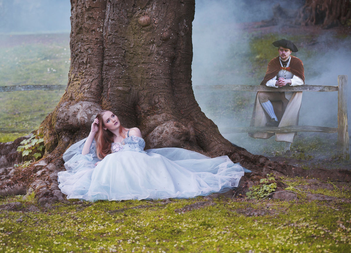
A mild composite from this weekend's model shoot. Not really the sort of model I tend to shoot, I don't think I'll use much from it. Someone turned up with a smoke machine that caused a few chuckles. Anyway, this is three images from two shoots. Any critique welcome, as always.
May 2, 2022 12:52:52 #
magnetoman wrote:
A mild composite from this weekend's model shoot. Not really the sort of model I tend to shoot, I don't think I'll use much from it. Someone turned up with a smoke machine that caused a few chuckles. Anyway, this is three images from two shoots. Any critique welcome, as always.
Interesting and creative shot! Thanx for sharing!
May 2, 2022 13:37:54 #
Sinewsworn wrote:
Interesting and creative shot! Thanx for sharing!
Thanks for commenting.
May 2, 2022 13:55:23 #

Very cool, Dave. I'm loving the lady and her gown. The gentleman seems a little too sharp for the surrounding fog (some fog is in front of the fence rail). Any thoughts to making him less visible?
May 2, 2022 14:19:15 #
Linda From Maine wrote:
Very cool, Dave. I'm loving the lady and her gown. The gentleman seems a little too sharp for the surrounding fog (some fog is in front of the fence rail). Any thoughts to making him less visible?
Hi Linda, I judged actual sharpness for him from the edge of the tree, adding blur in Ps. Is it sharpness or visibility that’s wrong? Perhaps he just needs a bit of fog in front of him - that means adding it with a brush I reckon. Fog in front of the fence is by making the fence transparent, I don’t think it will work so well for Ralph.
Hope all is well with you.
Dave.
May 2, 2022 15:11:42 #
I guess we'll call it visibility, then. Sort of looks like the fog parted just for him 
All good here, thank you Dave!
All good here, thank you Dave!
magnetoman wrote:
Hi Linda, I judged actual sharpness for him from the edge of the tree, adding blur in Ps. Is it sharpness or visibility that’s wrong? Perhaps he just needs a bit of fog in front of him - that means adding it with a brush I reckon. Fog in front of the fence is by making the fence transparent, I don’t think it will work so well for Ralph.
Hope all is well with you.
Dave.
Hope all is well with you.
Dave.
May 2, 2022 17:05:39 #

magnetoman wrote:
A mild composite from this weekend's model shoot. Not really the sort of model I tend to shoot, I don't think I'll use much from it. Someone turned up with a smoke machine that caused a few chuckles. Anyway, this is three images from two shoots. Any critique welcome, as always.
A dazzling beauty of a composition
🏆🏆🏆🏆🏆
May 3, 2022 02:36:40 #
joecichjr wrote:
A dazzling beauty of a composition
🏆🏆🏆🏆🏆
🏆🏆🏆🏆🏆
Thanks Joe - you’re being too generous!
May 3, 2022 06:11:48 #

magnetoman wrote:
A mild composite from this weekend's model shoot. Not really the sort of model I tend to shoot, I don't think I'll use much from it. Someone turned up with a smoke machine that caused a few chuckles. Anyway, this is three images from two shoots. Any critique welcome, as always.
Nicely done, the different elements fit well with each other !!
May 3, 2022 08:13:32 #

Generally I like this shot. But the soldier looked a bit off for me. I couldn’t figure out why until Linda mention the sharpness. I think your remedy is the way to go. The woman for me seems like a Southern Belle. More like the 1850’s or 60’s and not the 1780’s.
May 3, 2022 09:05:42 #
NJFrank wrote:
Generally I like this shot. But the soldier looked a bit off for me. I couldn’t figure out why until Linda mention the sharpness. I think your remedy is the way to go. The woman for me seems like a Southern Belle. More like the 1850’s or 60’s and not the 1780’s.
C’mon Frank, you know you gotta go with what you’ve got! I’m still not sure he needs any less sharpness but, as I persuaded Linda, a bit of the fog in front of him would do it. The fog at this stage is not added - I had to clone out the fog machine! The gap where I’ve sited him is natural, it just doesn’t look that way now you’re both mentioning it. If I liked the picture enough I’d change it but it’s going to be put down to ‘practice’.
May 3, 2022 09:11:05 #
UncleBuck wrote:
Nicely done, the different elements fit well with each other !!
Thank you, pleased you think so.
May 3, 2022 09:12:59 #
magnetoman wrote:
C’mon Frank, you know you gotta go with what you’ve got! I’m still not sure he needs any less sharpness but, as I persuaded Linda, a bit of the fog in front of him would do it. The fog at this stage is not added - I had to clone out the fog machine! The gap where I’ve sited him is natural, it just doesn’t look that way now you’re both mentioning it. If I liked the picture enough I’d change it but it’s going to be put down to ‘practice’.
Dave don’t get me wrong. I know you generally only use your images and not take things off the web, to fit your composite. So I understand the difference in period fashion. Just pointing out the casual viewer may have a “problem “ reconciling the difference. I also understand you can’t make everyone happy.
May 3, 2022 13:03:39 #
I really like the tonal qualities you achieve in your composites, not building up too much contrast.
May 3, 2022 13:32:19 #

If you want to reply, then register here. Registration is free and your account is created instantly, so you can post right away.