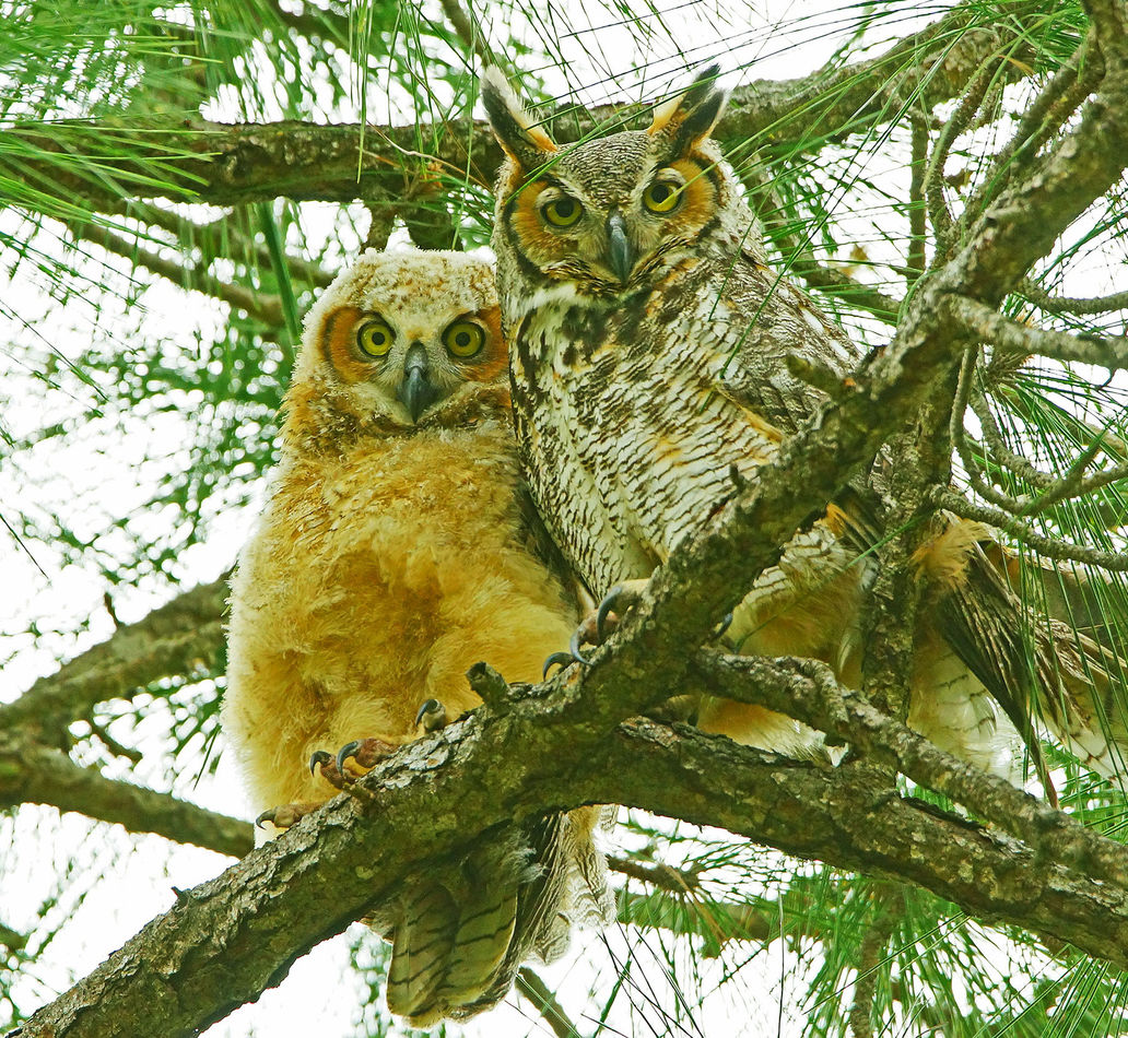
Florida: GHO's - dream shot ?
Mar 16, 2022 09:16:41 #
Mar 16, 2022 09:20:26 #
Mar 16, 2022 09:52:24 #
Mar 16, 2022 10:00:58 #
Mar 16, 2022 10:13:35 #
lnl
Loc: SWFL
You did it! A great photo of a cuddly mom and child. (Just don’t take cuddly too literally!)
Mar 16, 2022 10:20:17 #
Mar 16, 2022 11:24:34 #


Mar 16, 2022 11:33:25 #
Mar 16, 2022 11:41:27 #

imagemeister wrote:
Spent a couple hours with the Owls this AM - this ... (show quote)
 My best focus is on the Owlet - as it should be IMO. Another box check on my bucket list .......
It is a great shot but I think the colours are a little overprocessed. My screen is calibrated.
Mar 16, 2022 11:50:41 #
raymondh wrote:
Any estimate of what your distance to subject was for this superb capture?!
My original FOV was at 700mm with a 25% crop from there - I would guesstimate distance @ about 45 feet......
.
Mar 16, 2022 12:10:24 #
DebAnn wrote:
It is a great shot but I think the colours are a little overprocessed. My screen is calibrated.
Thanks, now you've got me thinking and that I might agree .........so, I do like my colors slightly saturated ( artistic license) - but it is a fine line for everyone ....
So, here is another version, I took red and blue out of the mid-tones, lightened the mid-tones and added a touch of contrast.......but, my monitor is not calibrated ......
.
Mar 16, 2022 12:20:07 #

Mar 16, 2022 12:50:47 #
imagemeister wrote:
Thanks, now you've got me thinking and that I might agree .........so, I do like my colors slightly saturated ( artistic license) - but it is a fine line for everyone ....
So, here is another version, I took red and blue out of the mid-tones, lightened the mid-tones and added a touch of contrast.......but, my monitor is not calibrated ......
.
So, here is another version, I took red and blue out of the mid-tones, lightened the mid-tones and added a touch of contrast.......but, my monitor is not calibrated ......
.
The greens and yellows are a little intense.
Mar 16, 2022 12:57:56 #
b
Thanks, ......part of my artistic license I guess .....but I do appreciate your concerns .
.
DebAnn wrote:
The greens and yellows are a little intense.
Thanks, ......part of my artistic license I guess .....but I do appreciate your concerns .
.
Mar 16, 2022 13:02:18 #
imagemeister wrote:
Thanks, ......part of my artistic license I guess .....
.
.
Yes, of course. But don't you want your nature images to look natural?
If you want to reply, then register here. Registration is free and your account is created instantly, so you can post right away.