Blue Bird Photo - Your thoughts vs the Pros
Feb 9, 2022 11:50:17 #
Orphoto
Loc: Oregon
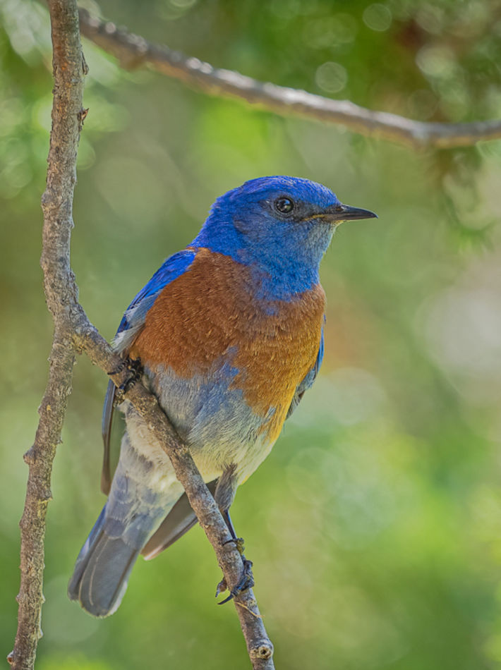
Any "pro" who discusses the rule of thirds and rotating this frame needs to be laughed out of the room.
The bird itself, stance and lighting are wonderful.
If you are going for a more environmental style, I would remove distractingly moderately out of focus elements as described above. Most of the background is very pleasingly complementary.
If your size limitations permit, I would simply chop off most of the image to the left of the vertical branch which is not really adding much. Similarly I would drop the top a bit . You have harsher specular highlights along the right edge with not quite out of focus enough stuff. Choices there include additional cropping or trying to blur it out more. Know that additional blurring often leaves artifacts and needs to be done deftly.
Feb 9, 2022 15:15:13 #
Hip Coyote wrote:
Thanks, this is my morning coffee time to muse, I guess. I liked the shot a lot as presented as well..I'll mess with it and see if I like it any more / less.
Happy shooting
Happy shooting
I would try to dodge the area around the eye a little. Subtly, of course. I think the upper horizontal branch is a good framing element, but agree that it could be more subdued. Also, the crop could remove some of the area to the left.
Feb 12, 2022 13:51:23 #

I love the image of the bird. The only thing wrong with the background, IMHO, is that there is too much of it. I would also lower the brightness of the highlights in the background. As is often the case, I think a portrait orientation would enhance the image. I have taken the liberty of combining my suggestions in the attached version - just a suggestion for consideration.
Feb 12, 2022 13:54:23 #

mcveed wrote:
I love the image of the bird. The only thing wrong with the background, IMHO, is that there is too much of it. I would also lower the brightness of the highlights in the background. As is often the case, I think a portrait orientation would enhance the image. I have taken the liberty of combining my suggestions in the attached version - just a suggestion for consideration.

If you want to reply, then register here. Registration is free and your account is created instantly, so you can post right away.