Newhall Pass Interchange
Nov 29, 2021 18:10:59 #

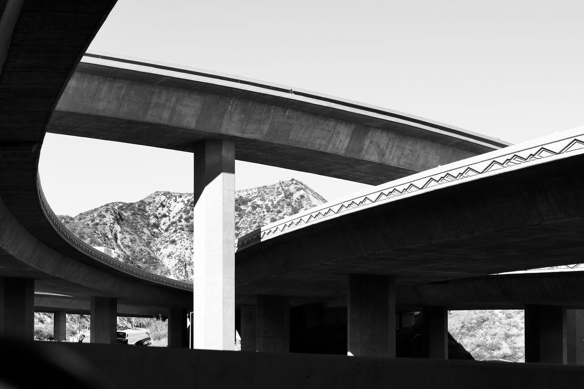
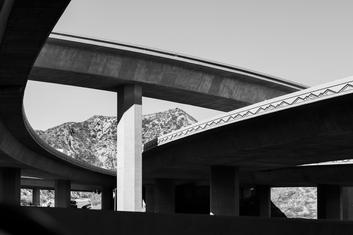
I hope you like this. I wanted to capture the lines of the bridges and the mountain motif as reflected in the nearby hills. It looks like I should trim a little off the top sky space, but I’d like your advice on how to crop it if at all. Other suggestions are welcome.
So that everyone can learn from this, feel free to download and edit for this discussion.
So that everyone can learn from this, feel free to download and edit for this discussion.
Nov 29, 2021 18:58:17 #

I am no B&W expert, Craig. I will follow this for the comments and suggestions. Next time you might want to post this in For Your Consideration.
Nov 29, 2021 18:59:13 #

I like it as is.
Cropping the top shortens the span on the left.
Cropping the bottom dark divider doesn't look right.
Cropping the top shortens the span on the left.
Cropping the bottom dark divider doesn't look right.
Nov 29, 2021 19:00:05 #
UTMike wrote:
I am no B&W expert, Craig. I will follow this for the comments and suggestions. Next time you might want to post this in For Your Consideration.
Why? Asking for comments not for the Gallery???
Nov 29, 2021 19:04:39 #
Longshadow wrote:
Why? Asking for comments not for the Gallery???
I get more expert response from posting there.
Nov 29, 2021 19:26:34 #
UTMike wrote:
I get more expert response from posting there.
Ahhhh. Good to know!
Nov 29, 2021 19:46:44 #
UTMike wrote:
I am no B&W expert, Craig. I will follow this for the comments and suggestions. Next time you might want to post this in For Your Consideration.
I had thought of posting there but wanted to hear from a broader audience. I’ll post there also since some of the members might not visit the Gallery. Thanks for the suggestion.
Nov 29, 2021 20:19:29 #
I like what you have here. Rather than cropping the sky, I suggest a very mild burning to aa slightly gradual darkened border might work.
A part of the image that I find slightly distracting is the thin triangle of light on the right side projecting from the edge to the middle of the bright square opening. Exploring some edits on this right side may yield a slightly more pleasing (balanced?) image. I'd suggest experimenting with ways to eliminate the distracting "eye detour" the squares and the horizontal wedge seem to set up (at least for me) on that right side. Also, you might be able to take down the brightness of the light coming though the "wedge" shaped triangle and square opening over there. Perhaps matching one of the lighter gray tonal values of the concrete shadows. The same holds for that small white "hot" spot of sunlight at the middle bottom and that tiny wedge on the left middle space. I'd also try to rescue any texture on the very bright sunlit vertical structure. Just enough to show us it isn't some bumps and slightly reduce the contrast.
If you're using Lightroom, you will use the benefits a non destructive editor gives you.
I really like the image. The geometry of the manmade sets beautifully with the natural. And you avoided the cars that makes this an epic Southern California parking lot look alike traffic bottleneck.
And bravo The B&W Processing!
C
Nov 29, 2021 21:12:21 #
Craigdca wrote:
I hope you like this. I wanted to capture the lines of the bridges and the mountain motif as reflected in the nearby hills. It looks like I should trim a little off the top sky space, but I’d like your advice on how to crop it if at all. Other suggestions are welcome.
So that everyone can learn from this, feel free to download and edit for this discussion.
So that everyone can learn from this, feel free to download and edit for this discussion.
I would not call myself an expert in a pink fit, but I do know what pleases my eye...
and your photo does just that, so I feel it's well worthy of an editors attention.
The biggest adjustment I made was toning down the contrast to the level
where almost all of the burnt out "whites" and total blacks were eliminated
bringing more detail to the image... one could go the other way and
bring the contrast up to the point where the image only displays two tones (total black and total white)
like a constructivist image but thats an alteration beyond merely editing imho.
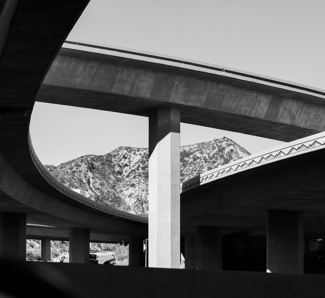
Anyway, I lopped a bit off the top and an even smaller bit off the bottom.
There was a dark blured artifact in the lower left corner that disturbed my aesthetic sense
so I eliminated that too.
Cheers,
Alan
PS I reckoned your image is worthy of a frame too

Nov 30, 2021 13:01:59 #
Nov 30, 2021 14:39:56 #
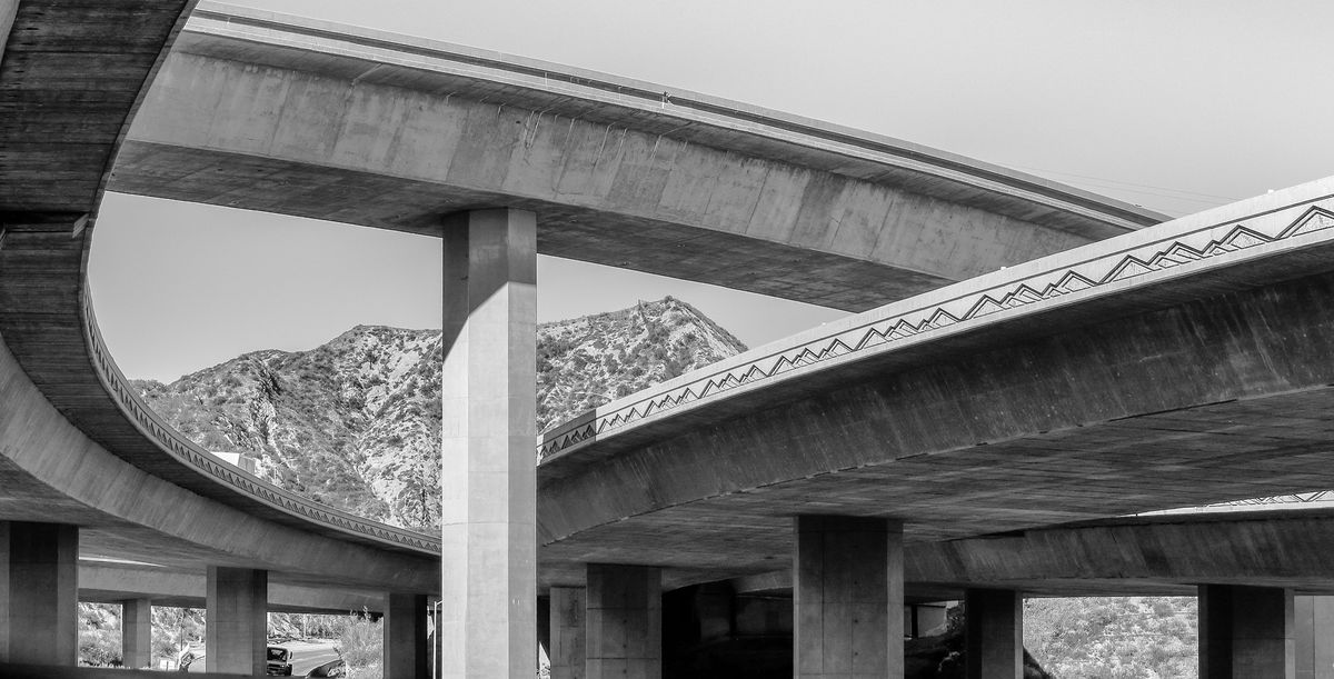
This is how I would do it.
Cropped out the bottom barricade, it seemed to add nothing.
Brought up the shadows a bit to show off the structure.
Cropped top down to the arc from the right.
Lowered the highlights to bring out the octagonal structure of the bridge support.
Cropped out the bottom barricade, it seemed to add nothing.
Brought up the shadows a bit to show off the structure.
Cropped top down to the arc from the right.
Lowered the highlights to bring out the octagonal structure of the bridge support.
Nov 30, 2021 16:04:36 #

KTJohnson wrote:
This is how I would do it.
Cropped out the bottom barricade, it seemed to add nothing.
Brought up the shadows a bit to show off the structure.
Cropped top down to the arc from the right.
Lowered the highlights to bring out the octagonal structure of the bridge support.
Cropped out the bottom barricade, it seemed to add nothing.
Brought up the shadows a bit to show off the structure.
Cropped top down to the arc from the right.
Lowered the highlights to bring out the octagonal structure of the bridge support.
Lovely architectural shot 🎖️🌀💞🌀🎖️
Nov 30, 2021 23:40:53 #
Thank you for taking the time to give this so much thought. i studied your edits on my 27” monitor and can see how your ideas would work.
I discovered that the feeling of height wasn’t as good when cropping from the top or bottom, even if it was to crop out the useless sky or distracting side view mirror in the lower left. I also found that I couldn’t part with the last bit of curve at the top left corner as it gives a feeling of being overhead
A member of the FYC group suggested trimming off the right to form a sideways triangle. I set the tall column in the center and thought it works as an alternate crop. But I still like my first crop as I can use it as a wallpaper.
Next I studied the tones and sharpness. Lightening the shadows is normally what I would want, but somehow the resulting textures distracted from the mountains and the shapes of the bridges. Lowering the highlights a little was just what it needed as it softened the extreme brightness and revealed more of the central column’s shape. I didn’t want to darken the sky too much as it looked smudgy to me.
What would I do differently? I would shoot it later in the day and hope to still get enough of the mountain pattern on the bridges. It would give brighter edges against a darker sky, and maybe a little more light in the shadows.
I took a bunch of shots to capture the natural mountains with the pattern in the bridge. This shot was clearly the best of the bunch and now it’s better.
This was a great exercise - thanks a ton!
- Craig
Dec 1, 2021 02:04:09 #
I like this on my 27” even after cropping off the top and bottom to make it fit. Also cloned out two small hot spots that were near the bottom. The shadows are a little too dark on my phone but they’re good on my computer screen.

Dec 1, 2021 22:45:48 #
Fortunately a couple members stayed involved and pointed out how the shadows were too dark. I would have to agree and even the original version is too dark. So I started over and think this does it justice.

If you want to reply, then register here. Registration is free and your account is created instantly, so you can post right away.