Two Butterflies
Sep 12, 2011 03:56:02 #

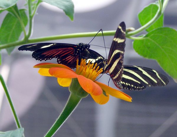
I've had this pic for several years. Love the butterflies and hated the background. The background was so unmanageable (I thought) the there wasn't much I could do with it. Taken at an indoor butterfly display in San Francisco. I'll put the original too so you can see what I mean about the background. Took me forever to figure out what to replace it with but I what I did is slowly growing on me. What do you all think. Any other suggestions for a background? How's the overall look?
You call that a background?
Two Butterflies
Sep 12, 2011 04:01:33 #

Great editing, great results. The look as if they are dueling or giving each other a high five.
Sep 12, 2011 04:59:32 #
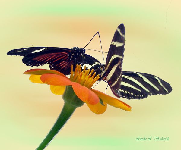
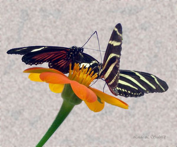
Here are two other backgrounds I tried because I was wondering if the first one was drawing too much attention to itself. (I tend to overthink my work). Anyway here are two other backgrounds. Let me know what you think. :-D
second BG
third BG

Sep 12, 2011 09:21:49 #
The second one would be my choice, it doesn't draw attention away from the subject like the first one...
Sep 12, 2011 09:30:56 #
This is the best background for thius picture, because it picks up color tones that are in the butterflies and green stem that they are sitting on.
Sep 12, 2011 09:35:30 #

I have to agree with Linda Lee. Edits whic were done by mommy115-The first one to me draws to much attention away from the subject, as to where the second draws you to the subject.
Sep 12, 2011 10:54:17 #
Sep 12, 2011 11:01:37 #
K7DJJ
Loc: Spring Hill, FL
mommy115 wrote:
I've had this pic for several years. Love the butterflies and hated the background. The background was so unmanageable (I thought) the there wasn't much I could do with it. Taken at an indoor butterfly display in San Francisco. I'll put the original too so you can see what I mean about the background. Took me forever to figure out what to replace it with but I what I did is slowly growing on me. What do you all think. Any other suggestions for a background? How's the overall look?
I like the background with hints of the original flower colors. It has a real art feel for me.
Sep 12, 2011 11:05:45 #

Beautiful butterflies. Beautiful photos. Beautiful editing.
Great job!
Congratulations!
:thumbup:
Great job!
Congratulations!
:thumbup:
Sep 12, 2011 11:09:22 #

Sep 12, 2011 11:09:28 #
After looking at your photo again, I do like the purple in the original background. And the leaves help make it look natural.
Just a thought. :-)
Just a thought. :-)
Sep 12, 2011 11:10:02 #
Great capture!! I like the second background the best. It has a touch of green that blends well with the stem of the flower. Good editing work!
Sep 12, 2011 14:46:50 #
Linda Lee wrote:
Have you tried adding a graidient?
I've used gradients in the past but just didn't feel like I would like it with this photo so I did not try it. Thanks for the suggestion, however.
Sep 12, 2011 14:48:20 #
Phyllis wrote:
After looking at your photo again, I do like the purple in the original background. And the leaves help make it look natural.
Just a thought. :-)
Just a thought. :-)
I originally left the leaves in the foreground but they seems to be a distraction from the flower and butterflies so I removed them.
Sep 12, 2011 14:49:08 #
If you want to reply, then register here. Registration is free and your account is created instantly, so you can post right away.