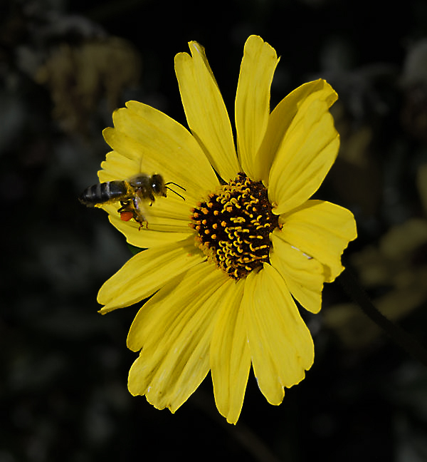
A Photoshopped Photo Vs No Photoshop
Apr 4, 2021 16:11:59 #

dennis2146 wrote:
.../... Difference .../...
Dennis
Dennis
Yes, # 2 is washed out, no 'pop' compared to #1
Apr 4, 2021 17:25:20 #
dennis2146 wrote:
But my question is this: Looking at both photos, mine first and his rendition second, is there a noticeable positive difference in the two photos in your opinion?
Yes there is a 'difference' as has already been mentioned and personal preference will vary.
It also appears the the 'colour profiles' of the two images are different so this may have an affect on what we see.
Apr 4, 2021 18:56:18 #

Longshadow wrote:
I just process them until they look good to me.
No charts, no curves, no numbers,
just the way it looks.
No charts, no curves, no numbers,
just the way it looks.
As do I. What numbers? What charts? Curves is a tool, not a number.
Apr 4, 2021 19:24:18 #

PHRubin wrote:
As do I. What numbers? What charts? Curves is a tool, not a number.
Slider values; any parameter value displayed; any numbers shown on any graphs/charts/curves.
(I note slider starting values simply to put it back where it started if I don't like the adjustment.)
Split hairs if you want, charts≈curves≈graphs, those picture representations of data.
I don't look at them either, ONLY the result of a change to the image when I adjust something.
Bet a cup of coffee you look at, and ponder, the charts/curves/graphs.

Apr 4, 2021 20:35:50 #
Better (best..??) image is perhaps somewhere between the two.
As others have noted ...I simply tweak the image until it looks optimal to me.
Good question and replies.
As others have noted ...I simply tweak the image until it looks optimal to me.
Good question and replies.
Apr 5, 2021 02:19:25 #
Apr 5, 2021 04:22:26 #
Apr 5, 2021 05:55:10 #

dennis2146 wrote:
But my question is this: Looking at both photos, mine first and his rendition second, is there a noticeable positive difference in the two photos in your opinion?
Sorry, I'm really short on time and I'm sure others here have given good advice.
The first is dark and the second unnatural with no depth to the yellows.
Some images and colors take serious work and various techniques to deal with well.
Hopefully you have received good advice here and can come up with a 3rd version.
Apr 5, 2021 07:30:57 #


--Bob
Linda From Maine wrote:
The main thing I notice (on a somewhat poor Chromebook screen) is the second one is brighter; is that "better" for you? Personally, I would do selective editing to lighten the flower while leaving the bright greens of the background darker. IMO it is a busy background that overwhelms the subject.
Ask 25 people, you'll get 25 opinions. Unless you have a paying customer, shouldn't the result be about you, not us? 😊
Ask 25 people, you'll get 25 opinions. Unless you have a paying customer, shouldn't the result be about you, not us? 😊
Apr 5, 2021 07:45:39 #
bbrown5154
Loc: Baltimore, MD
maxlieberman wrote:
Actually, I like the first, deeper version better. The flower looks washed out and has lost detail in the second, and the background, because it is brighter, is more distracting.
+1. for all those reasons.
Apr 5, 2021 07:57:30 #
PHRubin wrote:
You lose. Thanks for the coffee.


Glad I lost!
Apr 5, 2021 09:12:04 #

It’s all in the eye of the beholder. If you shoot in RAW (even if you don’t), Adobe Camera Raw(ACR) is a very powerful tool to bring out, or suppress, how you interpret a shot. ACR’s main drawback is that it is too easy to over do an adjustment. It’s greatest strength is in allowing you to adjust the shot to fit your personal taste. Most often, ACR is the only part of Photoshop I use.
Apr 5, 2021 09:24:41 #
gvarner
Loc: Central Oregon Coast
The first one is soft, the edited version is sharper and has more "pop". Your camera settings may be able to do some of that if you don’t want to get into doing much editing after the fact.
Apr 5, 2021 10:21:05 #
Others have made the same comments I would about brightness. What struck me was the loss in sharpness and detail in the second photo - particularly noticeable in the bee. The detail in the first picture is pretty outstanding for a small, moving object.
Apr 5, 2021 10:28:49 #
Lithoman wrote:
It’s all in the eye of the beholder. ...
....
....
You noticed that?
No matter what anyone does, there will always be someone with a better way.

If you want to reply, then register here. Registration is free and your account is created instantly, so you can post right away.