La Mancha Disney
Jan 11, 2021 17:17:29 #

Jan 11, 2021 17:22:52 #

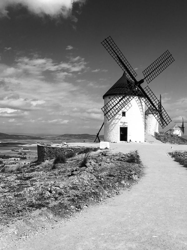
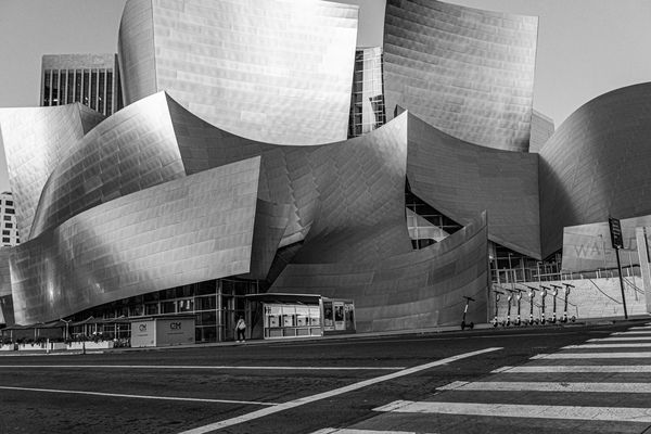
Both are quite interesting subjects. The first, however, has some large blown-out areas that can be distracting. The second photograph has some very nice tonal qualities and textures.
--Bob
--Bob
Fitz424 wrote:
Please critique these 2 photos
Jan 11, 2021 17:25:33 #
rmalarz wrote:
Both are quite interesting subjects. The first, however, has some large blown-out areas that can be distracting. The second photograph has some very nice tonal qualities and textures.
--Bob
--Bob
Thanks
Jan 11, 2021 17:25:51 #

I'd crop the first to remove the white cloud leaving the top of the frame. I'd reshoot the bottom to prevent having the top of the building being cut off by the top of frame.
Jan 11, 2021 17:28:09 #
CHG_CANON wrote:
I'd crop the first to remove the white cloud leaving the top of the frame. I'd reshoot the bottom to prevent having the top of the building being cut off by the top of frame.
Thanks
Jan 11, 2021 17:50:03 #
I agree with Bob that the sun-facing sides of the windmills are overexposed. If you were shooting raw you should be able to recover the detail fairly easily. Otherwise good range of B&W tones. The second image is also a tad overexposed. I would reduce the amount of street foreground, cropping to the sidewalk on the left side.
Jan 11, 2021 20:46:02 #
Ourspolair wrote:
I agree with Bob that the sun-facing sides of the windmills are overexposed. If you were shooting raw you should be able to recover the detail fairly easily. Otherwise good range of B&W tones. The second image is also a tad overexposed. I would reduce the amount of street foreground, cropping to the sidewalk on the left side.
Thanks
Jan 12, 2021 08:44:47 #

Jan 12, 2021 09:16:23 #

I've studied these - and the various comments already made. As usual, I don't agree with any of them! Or at least not entirely. In the first one, yes the building towards the sun is blown out. If seen in bright sunlight, that's probably the way it looks to the eye. So that doesn't bother me. There is detail in the less-directly lit areas for me to know how that portion looks. The little cloud at the top could be superfluous. But, if it is cropped out, then the path leading in is overbearing and would also need to be cropped. I did a virtual crop to a square and the image looked well balanced. But, frankly, I like that little cloud. About the second, since the top of the building has been cropped off, then I think the bottom of the building should be cropped closely. That would give the impression that one simply could not get the full height of the building in the frame instead of that one simply missed getting the top. The bottom of the image is parking lot and very uninteresting, so getting rid of it (IMO) wouldn't do any damage to the image.
Jan 12, 2021 10:31:25 #
Jan 12, 2021 14:46:33 #
TheShoe
Loc: Lacey, WA
CHG_CANON wrote:
I'd crop the first to remove the white cloud leaving the top of the frame. I'd reshoot the bottom to prevent having the top of the building being cut off by the top of frame.

Also:
1. The first has vertical lines from the blades. The one on the left has been partially removed. Either remove them completely or leave the lines intact.
2. The one of the building looks very noisy.
Jan 12, 2021 16:31:20 #
Jan 12, 2021 16:33:35 #
Jan 12, 2021 17:28:32 #
Jan 12, 2021 17:55:15 #
If you want to reply, then register here. Registration is free and your account is created instantly, so you can post right away.