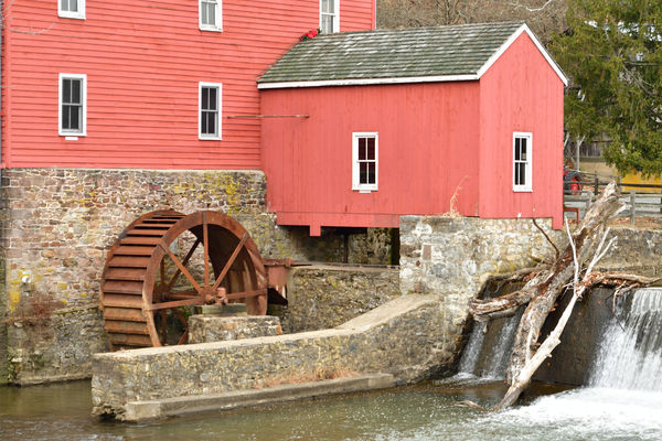
Red Mill Inn NJ
Jan 11, 2021 07:14:30 #
sclay1234
Loc: Ocean county nj
Hello First time posting pictures. Please tell me what you think good or bad....
Thank you Scott
Thank you Scott
Jan 11, 2021 07:37:16 #
manofhg
Loc: Knoxville, TN
While I haven't posted a large number pictures, it is a great place to post and receive helpful critique, especially if you request it or post it in the "critique" section.
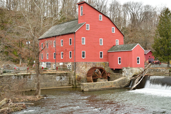
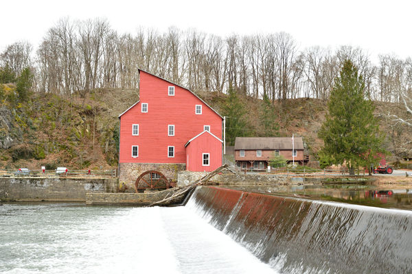
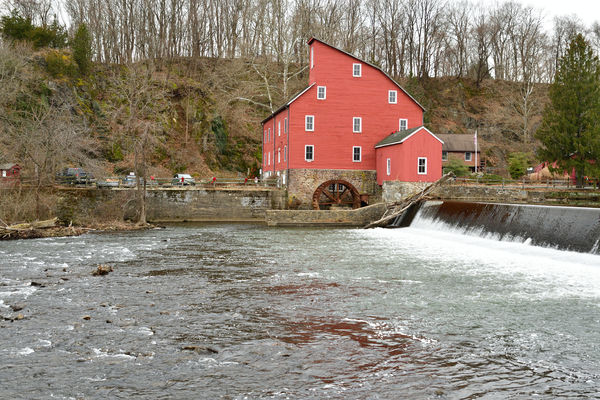
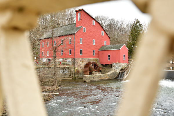
I like the 1st and 3rd the most. They both show more than just a profile which is what 2 is. The one through the railing, while it does the framing as intended, it is too distracting to me, but others may find it complimentary. In all, your captures have made me want to go there which says a lot for the photography. I looked it up and found it isn't really an inn, but a museum.
I like the 1st and 3rd the most. They both show more than just a profile which is what 2 is. The one through the railing, while it does the framing as intended, it is too distracting to me, but others may find it complimentary. In all, your captures have made me want to go there which says a lot for the photography. I looked it up and found it isn't really an inn, but a museum.
Jan 11, 2021 07:40:30 #

Looks like you did a great job. Interesting site and your viewpoints tell the story. Due to time of year, there is not much color, except for the mill itself. So, these pictures might be better in B&W. Worth a shot, anyway.
And, I’d want to go back during other times of the year to get more colors. You are off to a great start!
And, I’d want to go back during other times of the year to get more colors. You are off to a great start!
Jan 11, 2021 08:00:40 #
The mill in Clinton is one of the most photographed buildings in New Jersey. I have shot it many times over the years. You have done a very good job of capturing the mill and its location.
Jan 11, 2021 08:01:20 #

Did you go through the museum and grounds? additional buildings and views there besides the history.
Jan 11, 2021 08:05:05 #

Jan 11, 2021 09:28:02 #
I enjoy most that this mill is a part of what our country was built on. We still have a couple grist mills standing in West Virginia. Linda
Jan 11, 2021 11:36:36 #

A very nice first post. The shot through the railing is the only one I don't really like. I get what you for striving for but it doesn't work for me in this case. Really nice other than that.
Jan 11, 2021 12:46:46 #

Nice shots, i took a trip to that location a few years in the fall, great location that time of year.
Jan 11, 2021 17:29:16 #
On my monitor, they all look a bit over-exposed, with detail lost in the window frames and the water. Should be trivial to fix this in post-processing. Otherwise great captures. I would also crop the one where you framed the mill - crop out the weir and the distractions on the left side and see what it looks like.
Jan 11, 2021 21:08:32 #
Jan 12, 2021 07:51:26 #

Nice compositions, interesting subject.
Not having been there, I must ask a question: is the building really that color? My assumption is that it should be redder; could those of you who have been there please enlighten me?
Not having been there, I must ask a question: is the building really that color? My assumption is that it should be redder; could those of you who have been there please enlighten me?
Jan 12, 2021 07:54:57 #
Xanadu
Loc: Clay County FL
My two cents - I agree with manofhg. The 2nd photo (profile) provides no sense of dimension. If the bridge frame is removed from the 3rd photo, it provides a nice dimensional view and gives the viewer a better feel for the setting.
Jan 12, 2021 08:31:17 #
Jan 12, 2021 09:13:26 #

sclay1234 wrote:
... Please tell me what you think good or bad....
Thank you Scott
Thank you Scott
Hi Scott. Great subject for your 1st posting. IMHO:
#1 the Mill needs some more room at the top. Feels a bit cramped.
#2 Good image. I have some from probably right where your feet were. Go back there at sunrise in Autumn. You'll thank me.
#3 Not a bad Winter shot. But go back to that spot in the Spring when folks are fishing. Same camera position but more elements in the shot.
#4 Too "artsy". Images like this make me think the shooter is trying too hard.
#5 "The Devil is in the details." Good thought here but it just doesn't work for me "as is". Maybe a tad less on the left and a bit more of the water on the right.
Again, just MHO.
If you want to reply, then register here. Registration is free and your account is created instantly, so you can post right away.