Rail Lines
Jan 2, 2021 17:10:12 #

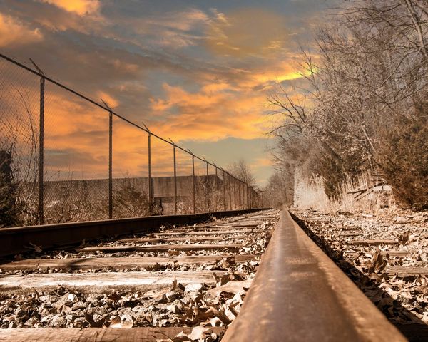
Which do you prefer one two or neither. Please let me know why you made your choice. Thanks in advance.
Jan 2, 2021 17:23:07 #

Frank, I like the first one, as it's a perspective of rail lines that one doesn't normally see.
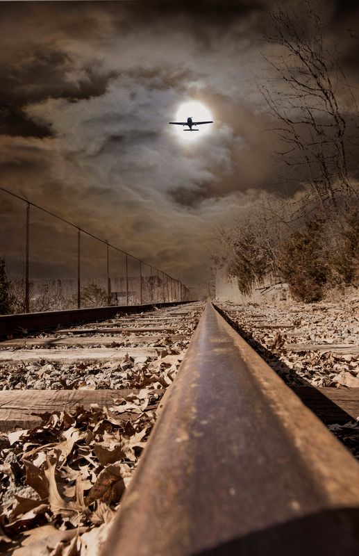
The second one looks like a contrived assembly.
--Bob
The second one looks like a contrived assembly.
--Bob
NJFrank wrote:
Which do you prefer one two or neither. Please let me know why you made your choice. Thanks in advance.
Jan 2, 2021 17:38:15 #
Jan 2, 2021 17:55:06 #
rmalarz wrote:
Frank, I like the first one, as it's a perspective of rail lines that one doesn't normally see.
The second one looks like a contrived assembly.
--Bob
The second one looks like a contrived assembly.
--Bob
Thanks Bob, I appreciate you taking the time and commenting. It's good to hear how others view an image.
Jan 2, 2021 17:55:43 #
Curmudgeon wrote:
Of course it does it is a contrived assembly 
I believed that is the story of my life.

Jan 2, 2021 18:08:41 #

Jan 2, 2021 18:11:11 #

I like the idea of #2, which for me is two modes of travel, with our eye taking them in different directions, and related thoughts of adventure and venturing into the unknown.
I don't care for the execution of #2 because of the large amount of out of focus rail. I could see cropping an inch or two from bottom of #2 without losing any story. (the treatment of darkening your sky etc has made the lighter section on right side - in the distance - a bit weird-looking )
)
I don't care for the execution of #2 because of the large amount of out of focus rail. I could see cropping an inch or two from bottom of #2 without losing any story. (the treatment of darkening your sky etc has made the lighter section on right side - in the distance - a bit weird-looking
)Jan 2, 2021 18:25:55 #
UTMike wrote:
I like #1 for its warmth. #2 is bleak.
Thanks Mike, I have to agree about the warmth factor. But the other sky happen a lot in NJ, this time of year.
Jan 2, 2021 18:31:34 #
Linda From Maine wrote:
I like the idea of #2, which for me is two modes o... (show quote)
Thanks Linda for you detailed analysis. The weirdness on number 2 is something I will have to address. Your crop suggestion is something to also consider.
Jan 3, 2021 02:59:01 #

Jan 3, 2021 06:31:12 #

Jan 3, 2021 07:05:04 #

The rail alone is a photo story, mixing the moon and airplane is a competition for eye-attention, it detracts from a good rail vanishing point photo. The upper/right quadrant is another photo story. For both, KIS, keep it simple is best.
Jan 3, 2021 07:41:18 #

I like no 1, There is no distraction from the 3 lines, fence, rail and the wall with the trees...
Jan 3, 2021 08:40:22 #

What Bob said--the first one is a winner for me. The second, not so much because I have never been a fan of inserting objects into photos. The second one also looks flat, while the first is vibrant.
Jan 3, 2021 08:55:16 #
rvenneman wrote:
I like the dark #2. I think the plane distracts the image.
Thanks for commenting. I too like the dark. I feel it is bold looking. I feel the rails pop a little more with that sky. It is certainly the opposite of my other entry. The plane is something I can take or leave.
If you want to reply, then register here. Registration is free and your account is created instantly, so you can post right away.