A Little Help Please!
Dec 27, 2020 12:35:47 #
Blurryeyed wrote:
I am new to landscape photography but am very fort... (show quote)
Hello Geoff,
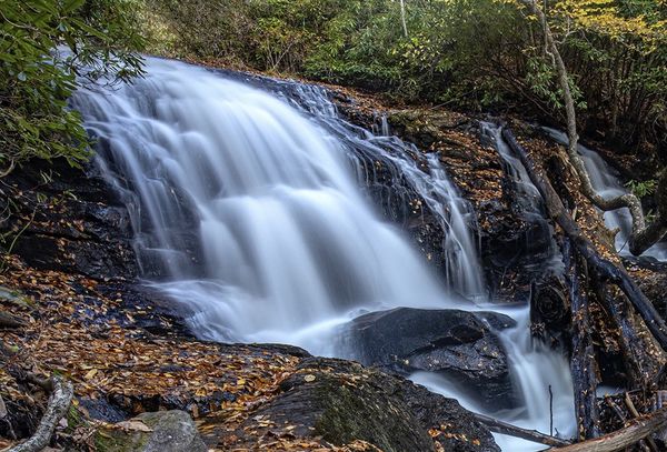
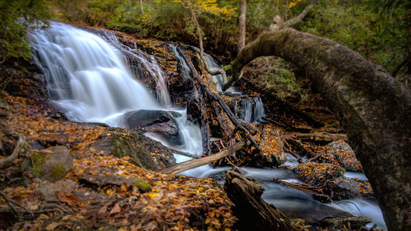
My preference is #3 while my least preference is #2. The first photo is fine but no real drama to capture the viewers attention. I just see this as a nice tranquil setting where I like to maybe have a picnic while hiking. But #3 has the drama and the elements to create a very nice sense of extreme depth. This is my favorite image by far.
Since you asked for feedback, I've taken the liberty of editing your image to illustrate the changes I'm describing here. This is only my preference and yours may be different, but I hope that it at least gives you some ideas that you could use.
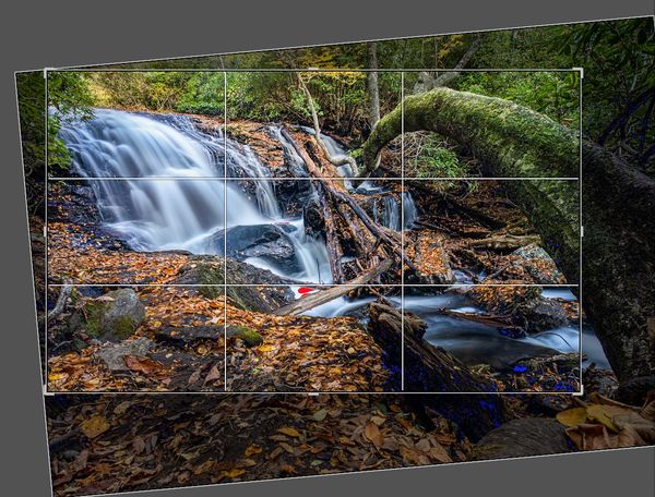
First, I found the tree crossing the stream to be a very essential part of this image. This is the element that gives the image a very nice sense of dimension and depth, However, in you original, I found it a little overwhelming, so I looked at a different crop. The falls are the subject and the tree shouldn't overwhelm the subject. Also, I would have liked to have the tree coming in from the left and leading the viewer into the falls, but that may detract from the way you remember it. So a crop reducing the size of the tree but leaving enough to create depth I found to a key element of this image.
I also found the overall image to be underexposed by about one stop, so I increased overall exposure by about .5 stop with the center exposed by a full stop to create a slight vignette. I love fall colors. So I just brightened the green and yellow leaves in the background and the golden leaves scattered around the stream banks. I left the light blue cast in the water since I found that it contrasted nicely with the golden leaves. Added a little highlight to the tree on the right to further accentuate the sense of depth. The attached images illustrates the changes I described here.
Hope this helps
Mike
A crop removing some of the tree on the right and partially straightening the falls horizon
(Download)
(Download)
Dec 27, 2020 12:43:47 #
Dec 27, 2020 13:22:22 #
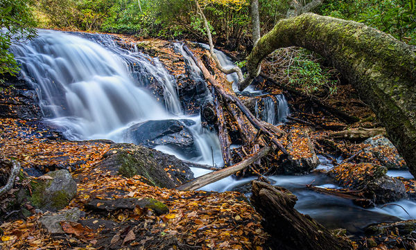
The images are all well composed, exposed and focused correctly so great job. I especially liked the last one as it has a more three dimensional look and great leading lines.
Dec 27, 2020 13:49:56 #
Dec 27, 2020 16:03:51 #
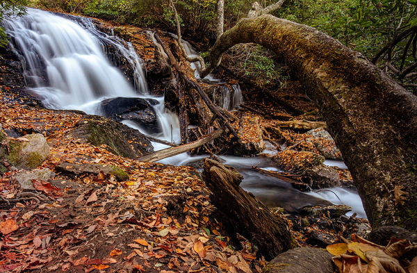
for me the second one. the third one the tree limb is distraction. but all three are nice
Dec 27, 2020 16:22:35 #
JimBart
Loc: Western Michigan
I like #3 however I’d crop the tree or branch out of pic and focus on the waterfall. A much better wall hanger for me
Dec 27, 2020 17:28:27 #
I believe image #2 would make a nice canvass wrap. Just remember that you need to allot two inches to wrap around the edges and back. The wrap frame boards come in many sizes. I've been told you can get them done at Walmart. Hobby Lobby also sells the frame sticks. You may also find a print shop that prints canvass and can make them also.
Dec 27, 2020 17:46:09 #

I found this post most interesting and educational. I started by liking #3 the best, but not being an expert it was interesting to read the comments for things I thought would help a little with an already exceptional photo. I liked the idea of eliminating the muddy areas and dealing with the lower right corner. So I took a stab at cloning some leaves and cropping up from the bottom and in from the right. It seems that everything adds to the composition. See what you think.

Dec 27, 2020 17:53:43 #
JimBart
Loc: Western Michigan
I took the liberty rightfully or wrongly and cropped it to where your pic would be meaningful to me See what you think and if you want I’ll try and delete.
Dec 27, 2020 18:07:27 #
Might try using the bent over tree as a frame in No. 3. Look for natural frames, friend used to carry and old sash window around. Lead in lines, pictures with in a picture. Carry a rectangle to use in judging scenic landscapes.
Dec 27, 2020 19:23:07 #

JimBart wrote:
I took the liberty rightfully or wrongly and cropped it to where your pic would be meaningful to me See what you think and if you want I’ll try and delete.
In my opinion you cropped it and left a branch running diagonal in the bottom right corner which I think is far more distracting than a long arching leading line that leads the eye to the waterfall.
Dec 27, 2020 19:57:24 #
RJW
Loc: Oregon
A slight cropping on 2 and 3 makes them very nice photos. Well done ! On #3 I would crop on the right to catch the curve of the branch but nothing beyond it. #2 crop to lower the top skyline down to the tree tops. The light and focus is off on #1 and I wouldn't use it.
Dec 27, 2020 20:46:16 #
Dec 27, 2020 23:52:32 #
RJW
Loc: Oregon
Here's a 16:9 crop that brings out the falls with a slight blurring to the edges. Falls are emphasized and the main focus. Again, very nice photo ! Another idea RJW
Dec 28, 2020 00:58:45 #
Gallimaufry
Loc: Denver, CO
Blurryeyed wrote:
Funny you should ask, I have that pic already processed, I have a bunch of images and I really just put these up here for critique, I love shooting these streams, falls, and mountains as well, and want to get better at it. But here is the crop I did when I originally processed this scene. This is a different image taken from a different spot, but it is pretty much what you asked for.
Unretouched, I think #3 is the most eye catching. To me if I were going to hang it, I would make it somewhat more dramatic. That's my taste. Without your permission, I have edited it a bit to bring out certain detail, certain brightness, colors in certain areas. I've attached it.
Barry
If you want to reply, then register here. Registration is free and your account is created instantly, so you can post right away.