which is better? any thoughts?
Dec 24, 2020 05:39:41 #
gator81
Loc: Jeffersonville Indiana
I lucked out and was able to trade and get a nice lens. canon 70-200 2.4
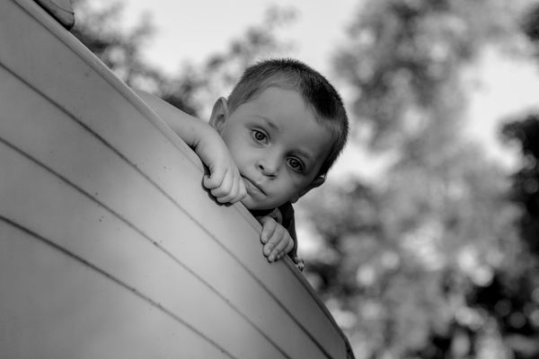
Here is a picture of my grandson that I thought turned out really good and wanted to save as color and monochrome and to me they both look great but the more I look at them over time I still think something is missing and I cannot put my finger to what it could be this time.
This was taken with canon 70D f/4 ISO 100 1/200sec at 70mm with this being SOOC. Hand held and with no modifiers. This was taken earlier this year and I have now been able to work with it some more.
My thoughts are that I could crop down just enough to remove the distraction at the top left of the photo and it would move him just a little keeping him from being so centered. That is actually a slide at a park and the angle and lines enhanced the photo more and the background seemed to enhanced the photo even more. There was also a lot of luck as he was really having so much fun being chased around having his picture taken.
Again if you notice something else it can only help me be more aware with trying to improve my skill.
thank you
Dec 24, 2020 05:47:59 #

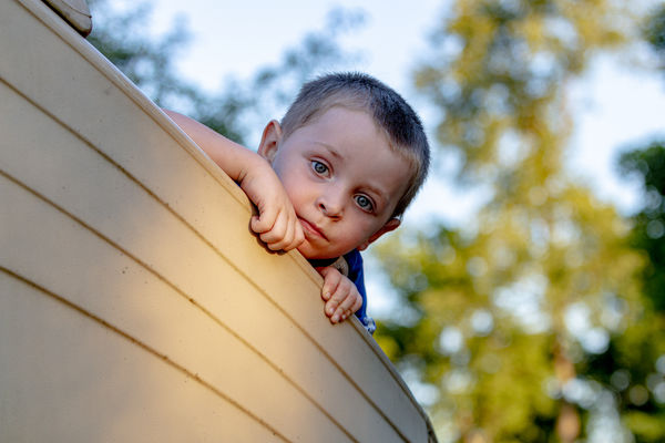
The sky is really bright and it draws the viewer's attention away a little. It does help to crop some off the left and top as it moves your grandson more to a rule of thirds location. I hope it's OK, I gave the white sky a slight blue tint and cropped some off the left and top.

Dec 24, 2020 05:58:22 #

[quote=gator81]I lucked out and was able to trade and get a nice lens. canon 70-200 2.4
Here is a picture of my grandson that I thought turned out really good and wanted to save as color and monochrome and to me they both look great but the more I look at them over time I still think something is missing and I cannot put my finger to what it could be this time.
/quote]
A slight crop and toning down the sky...The crop helps to put your grandson's face slightly to the right.
Dec 24, 2020 06:35:05 #

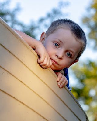
I like the second crop better. In fact I'd go even tighter, more off the right and getting rid of that little block of wood top left. It's a little distracting. JMO
Dec 24, 2020 06:59:08 #

gator81 wrote:
I lucked out and was able to trade and get a nice ... (show quote)
Please understand this my personal preference and not everyone's choice; photos of one or two people look better to me as portraits not landscapes. I would crop as a portrait as original ratio. I did this crop best as I could using someone else computer, and as others have stated lower highlights in the background.
Dec 24, 2020 07:16:17 #
PaulBrit
Loc: Merlin, Southern Oregon
That last is much improved and it’s now a riveting photograph!
Dec 24, 2020 07:23:05 #

"If your images are not good enough you are not close enough"
Robert Capa.
Robert Capa.
Dec 24, 2020 10:24:54 #

Endearing subject...
Superb pivotal moment...
you are very fortunate to have a wonderful grandson to share with...
albeit rather than having to explain issues you are dealing with..
or pontificate about your kit...
simply post only images that you feel are truly worthy...
btw, your kit is likely the least important variable in an image equation...
Oft said, "You are only as good as the weakest image in your portfolio"
It took me many years to get my head around the wisdom latent within...
Please stay safe during this challenging holiday season... a.k.a. act responsibly and lead by example...
Dec 24, 2020 12:29:15 #
gator81
Loc: Jeffersonville Indiana
Thank you all for the replies, it helps me a lot to stimulate my thinking process in how this could look better and to watch for when taking new pictures.
Dec 24, 2020 12:35:19 #

Not a lot of contrast in the B&W, so I am going with the color. Not a lot of contrasting light in that one either, but the color brings the boy nicely to the viewer.
Dec 24, 2020 15:08:56 #

Like others I prefer the color version and the tighter crop. What I am finding somewhat distracting is the bright area below his hand. I would like to see this area and his hand darkened a bit it would draw attention to his face that seems to be in a bit of a shadow. I wish my grandson was that cooperative.
Have a Merry Christmas and stay safe!
Bill
Have a Merry Christmas and stay safe!
Bill
Dec 24, 2020 17:36:55 #
gator81
Loc: Jeffersonville Indiana
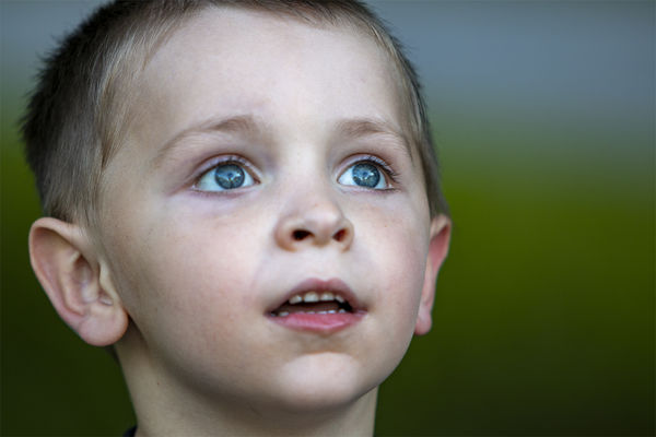
I know this is a different pic but there was comments on closer and this is another one that I did closer and his eyes just Pop.
what you think?
what you think?
Dec 25, 2020 07:55:07 #
CO wrote:
The sky is really bright and it draws the viewer's attention away a little. It does help to crop some off the left and top as it moves your grandson more to a rule of thirds location. I hope it's OK, I gave the white sky a slight blue tint and cropped some off the left and top.
It would be better if the light highlighted his face and not the boat. Great look about him, keep trying.
Dec 25, 2020 08:54:06 #

CO wrote:
The sky is really bright and it draws the viewer's attention away a little. It does help to crop some off the left and top as it moves your grandson more to a rule of thirds location. I hope it's OK, I gave the white sky a slight blue tint and cropped some off the left and top.
Try cropping it into a vertical which would eliminate most of the distractions.
Dec 25, 2020 09:51:53 #

gator81 wrote:
I know this is a different pic but there was comments on closer and this is another one that I did closer and his eyes just Pop.
what you think?
what you think?
I love it!
If you want to reply, then register here. Registration is free and your account is created instantly, so you can post right away.