Options , good or not so good
Oct 18, 2020 17:25:01 #
bshine3742
Loc: Florida
Nothing nasty please , haven’t seen any on here , that’s why I avoid FB , too many negative people and not kinds words
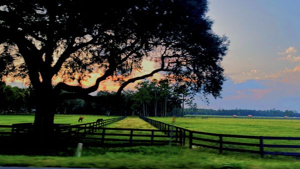
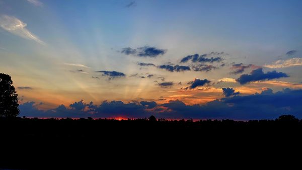
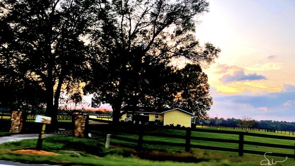
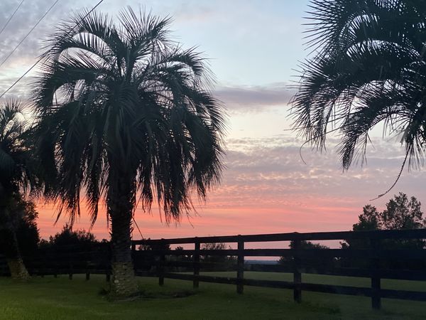
So here I am posting a few new shots , tell me your thoughts .
In a town called Ft McCoy Fl
So here I am posting a few new shots , tell me your thoughts .
In a town called Ft McCoy Fl
Oct 18, 2020 17:45:08 #

Oct 18, 2020 18:11:16 #
kenArchi
Loc: Seal Beach, CA
To begin with I am not an accomplished like most of these guys here are. So here is my 4 cents worth.
All photos very rich colors.
#1 is good composition. You need to be more level.
#4 very good composition, leading with the fence on the right and a touch of the palm tree above it.
#2 Sunset is awesome, the bottom black can be cropped by half. Try it and see if it works for you. And catching the sun ray's is good.
#3 hmmmmm. Not level. Not sure what you are trying to get here. Unbalanced?
Lots of trees to left, with big open space to right?
What would it look like if you stood in the middle of driveway.
I would take many approaches from left to right until I get what I like.
Example lesson: I took 5 different views of a remodeled shower(2 more than what the client showed me). How many more do you need, right? As the client was studying the photos he says to me, "Why didn't you take this angle of view?". From that time on, one view is not always the best view.
Oct 18, 2020 19:49:00 #
LWW
Loc: Banana Republic of America
bshine3742 wrote:
Nothing nasty please , haven’t seen any on here , that’s why I avoid FB , too many negative people and not kinds words
So here I am posting a few new shots , tell me your thoughts .
In a town called Ft McCoy Fl
So here I am posting a few new shots , tell me your thoughts .
In a town called Ft McCoy Fl
1 - I would have zoomed out or stepped back a bit to get the whole tree in and then cropped so that the bottom of the frame would be about where you have it now.
2 - The best of the set IMHO, I would crop the partial tree on the left out.
3 - That needs a lot of centering/leveling.
4 - The second best. I would have made it in portrait mode and lose the tree on the left but not a pixel more. I think you might like that variant better, but it’s certainly a good photo as is.
I hope this helps, and that’s my $0.02.
Aso, #2 might look striking as a blank and white.
May I tinker a bit with them?
Oct 18, 2020 20:40:43 #
Oct 19, 2020 07:21:05 #

NMGal wrote:
These are really nice. You might think about leveling number three.
I agree, very nice!
Oct 19, 2020 09:07:15 #

Oct 19, 2020 09:49:42 #

bshine3742 wrote:
Nothing nasty please , haven’t seen any on here , that’s why I avoid FB , too many negative people and not kinds words
So here I am posting a few new shots , tell me your thoughts .
In a town called Ft McCoy Fl
So here I am posting a few new shots , tell me your thoughts .
In a town called Ft McCoy Fl
As with other GROUPS, all show their political bias, the Hogg isnt blatantly LEFT, but management does show an obvious favoring of liberal perspective. See what happens if you hint toward ANY CONSIDERATION of a RIGHT toleration! RJM
Oct 19, 2020 11:18:42 #

#2 is your best, then #4, but they all need to be leveled to some degree, but you did very good, don't give up.
Oct 19, 2020 11:24:19 #

#1 is very nice. #3, everything is falling off - horizon line is not horizontal.
Oct 19, 2020 12:52:28 #

NMGal wrote:
These are really nice. You might think about leveling number three.
And #1, which is otherwise a fine shot.
Oct 19, 2020 19:08:25 #

digit-up wrote:
As with other GROUPS, all show their political bias, the Hogg isnt blatantly LEFT, but management does show an obvious favoring of liberal perspective. See what happens if you hint toward ANY CONSIDERATION of a RIGHT toleration! RJM
Not really needed IMHO.
Don
Oct 20, 2020 09:44:19 #
Lucian
Loc: From Wales, living in Ohio
Just a little too much saturation work done. It is always best to err on the side of less. Just a hint of saturation is best, too much and they start to look gaudy.
Oct 23, 2020 17:57:22 #
Oct 23, 2020 17:57:56 #
If you want to reply, then register here. Registration is free and your account is created instantly, so you can post right away.