Check out Advice from the Pros section of our forum.
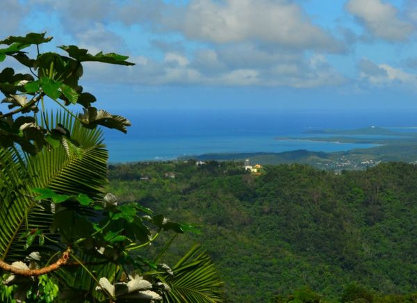
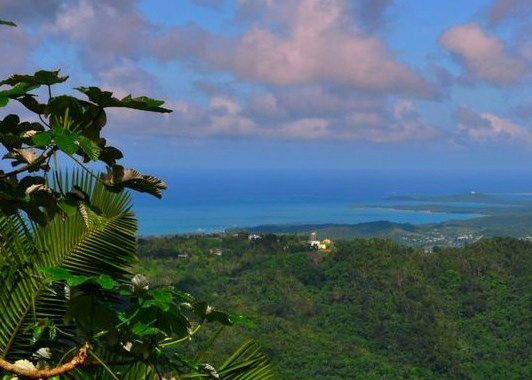
Some more nature For Critique
Nov 9, 2011 11:42:41 #
Nov 9, 2011 11:44:07 #

Nov 9, 2011 12:07:23 #
Check out Traditional Street and Architectural Photography section of our forum.
Nov 9, 2011 12:19:53 #

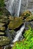
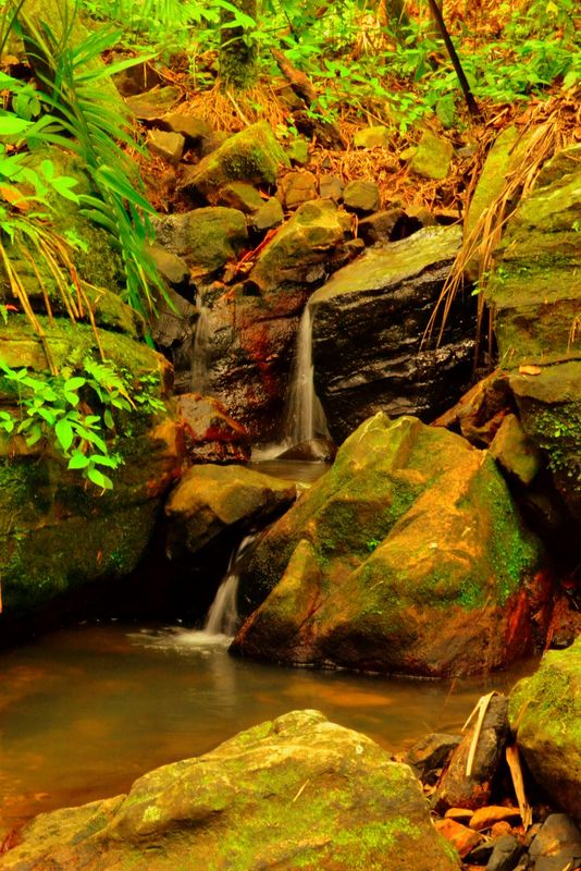
I love all the pictures!!! It does seem like there is too much of a red tone in the first two pictures? I know there is going to be some but it seems to be talking over the other colors in the pictures. Jus my personal opinion:) but other than that great job!!!
Nov 9, 2011 12:56:17 #

I think that these are all over-cooked - too much saturation in post-production - can you show the original? I think they would be even better!
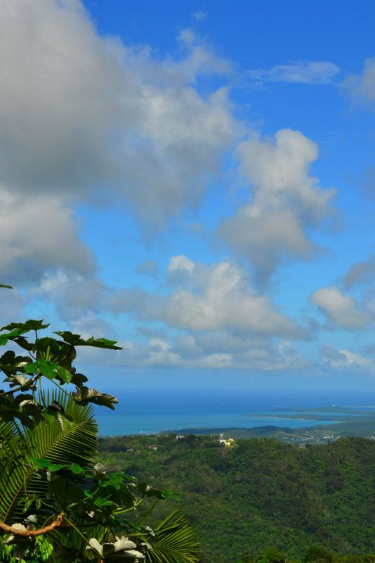
Oh, the Landscape is NOT cooked, but what do you think about a little less sky? If the horizon was at the top third, would the foreground be grotesquely big? Try it & see what you think!
Oh, the Landscape is NOT cooked, but what do you think about a little less sky? If the horizon was at the top third, would the foreground be grotesquely big? Try it & see what you think!
Nov 9, 2011 12:59:15 #

slrGuy wrote:
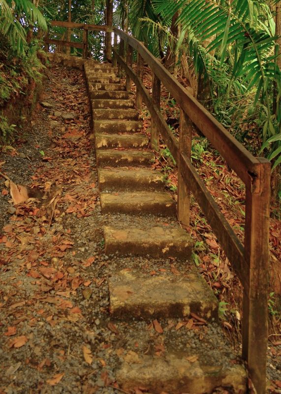
Some more photos for ciritique
I like the first one, the second one is over saturated and to yellow to be natural. The third one would look great more as a Horizonal Pano then as a vertical picture.
All are interesting and nice subjects.
Nov 9, 2011 13:04:23 #

slrGuy wrote:
Some more photos for ciritique
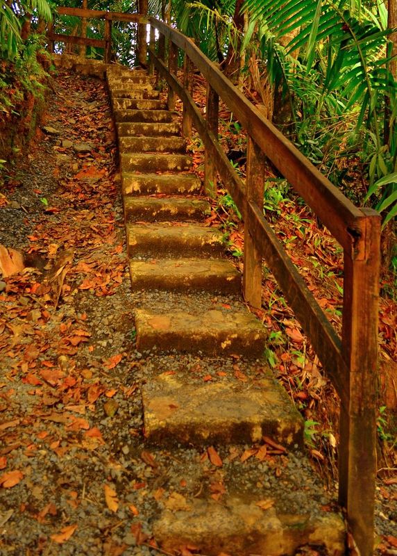
Like the stairs shot..and too much sky in the third. Nice shots though.
Nov 9, 2011 13:21:37 #
I will try to post the un-processed stairs here is the landscape cropped differently
Nov 10, 2011 11:09:28 #

Stairs need a color balance in between the original and the edited one. The water is a tad too yellow.
The clouds in the landscape might look good with some post HDR.
The clouds in the landscape might look good with some post HDR.
Nov 10, 2011 15:42:01 #

Ugly Jake wrote:
Don' think the last one is overcooked, just cropped it and added a little color to the sky....I think that these are all over-cooked - too much saturation in post-production - can you show the original? I think they would be even better!
Oh, the Landscape is NOT cooked, but what do you think about a little less sky? If the horizon was at the top third, would the foreground be grotesquely big? Try it & see what you think!
Oh, the Landscape is NOT cooked, but what do you think about a little less sky? If the horizon was at the top third, would the foreground be grotesquely big? Try it & see what you think!
Nov 10, 2011 15:46:20 #
Indi wrote:
Did a tad to the sky but didn't want to over do it............Stairs need a color balance in between the original and the edited one. The water is a tad too yellow.
The clouds in the landscape might look good with some post HDR.
The clouds in the landscape might look good with some post HDR.
Check out Astronomical Photography Forum section of our forum.
Nov 10, 2011 15:52:38 #
coco1964 wrote:
Indi wrote:
Did a tad to the sky but didn't want to over do it............Stairs need a color balance in between the original and the edited one. The water is a tad too yellow.
The clouds in the landscape might look good with some post HDR.
The clouds in the landscape might look good with some post HDR.
Thanks I like the color
Nov 10, 2011 16:09:32 #

Nov 10, 2011 17:30:11 #

caitlyn13 wrote:
I love all the pictures!!! It does seem like there is too much of a red tone in the first two pictures? I know there is going to be some but it seems to be talking over the other colors in the pictures. Jus my personal opinion:) but other than that great job!!!
I agree. I played with them in photoshop. Do you mind if I post them ?
Nov 10, 2011 17:33:56 #
photogrl57 wrote:
I agree. I played with them in photoshop. Do you mind if I post them ?
caitlyn13 wrote:
I love all the pictures!!! It does seem like there is too much of a red tone in the first two pictures? I know there is going to be some but it seems to be talking over the other colors in the pictures. Jus my personal opinion:) but other than that great job!!!
I agree. I played with them in photoshop. Do you mind if I post them ?
No I don't mind at all...
If you want to reply, then register here. Registration is free and your account is created instantly, so you can post right away.
Check out Wedding Photography section of our forum.