Check out Sports Photography section of our forum.
Some b&w images.
Apr 24, 2020 11:05:56 #

Thank you once again. Gvarner if you ask me I am going to say that a b&w image without the right amount of contrast will not look very attractive to the eye. Contrast is an integral part of monochromatic images and I remember when I was learning that my instructors put emphasis on using contrast wisely and I am talking during those times when we used film and fiber based paper. I believe that the best example I could give you would be looking at an image by the late Ansel Adams. The bright areas were impeccable while the important shadow areas had all of the needed details with a range of tones that represented the scene he was printing. "Moonrise over Hernandes" is a classic example. Ansel Adam did not have his exposure meter with him when he shot the scene, it was a calculated exposure that ended underexposed. It took weeks of work in the darkroom till he perfected the print to his taste. Today it is one of his classics.
Apr 24, 2020 12:20:49 #

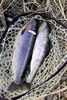
Numbers 1 and 4, particularly #1make compelling statements in b&w. The tonal range and contrast of #1 make it a really fine image - good capture and good PP work!
Apr 24, 2020 14:34:48 #
Check out Close Up Photography section of our forum.
Apr 24, 2020 14:52:45 #

Apr 24, 2020 15:28:00 #
Apr 24, 2020 18:04:03 #
Apr 24, 2020 18:30:04 #

camerapapi wrote:
Looking to my archives I found these original color images that I converted with Topaz B&W Effects 2. They have some added warmth to simulate my favorite paper Agfa fiber based paper.
Shot with Nikon and Olympus cameras. The last image shot with the Zuiko 17 mm f2.8 at f5.6 is one of the presets in the Topaz software.
Shot with Nikon and Olympus cameras. The last image shot with the Zuiko 17 mm f2.8 at f5.6 is one of the presets in the Topaz software.
Love the lighthouse and the leaves images!
Check out Infrared Photography section of our forum.
Apr 24, 2020 18:30:37 #
camerapapi wrote:
Looking to my archives I found these original color images that I converted with Topaz B&W Effects 2. They have some added warmth to simulate my favorite paper Agfa fiber based paper.
Shot with Nikon and Olympus cameras. The last image shot with the Zuiko 17 mm f2.8 at f5.6 is one of the presets in the Topaz software.
Shot with Nikon and Olympus cameras. The last image shot with the Zuiko 17 mm f2.8 at f5.6 is one of the presets in the Topaz software.
I love the lighthouse and the leaves images!
Apr 24, 2020 18:52:35 #

Apr 24, 2020 21:33:57 #
Apr 27, 2020 07:31:34 #
Check out Software and Computer Support for Photographers section of our forum.
Apr 27, 2020 10:10:48 #
Apr 28, 2020 15:26:58 #
I love your conversion. Maybe it is that I also love the look of the same Agfa paper. I sometime miss the darkroom.
Apr 28, 2020 18:14:44 #
Captain ugly I miss the darkroom but we are now in the digital era. We can do with software what we never imagined we could do when printing. I see more control now of b&w images than ever before.
The Agfa fiber based paper I used used to impart a warm color to the prints. Perhaps much softer than what I am using with software. A good Tri-X negative developed with Kodak HC-110 printed to perfection on the Agfa paper of my choice.
Thank you for stopping by and for your comments.
The Agfa fiber based paper I used used to impart a warm color to the prints. Perhaps much softer than what I am using with software. A good Tri-X negative developed with Kodak HC-110 printed to perfection on the Agfa paper of my choice.
Thank you for stopping by and for your comments.
May 14, 2020 11:46:22 #

If you want to reply, then register here. Registration is free and your account is created instantly, so you can post right away.
Check out Landscape Photography section of our forum.