O' Mighty Oak
Feb 4, 2020 17:32:01 #
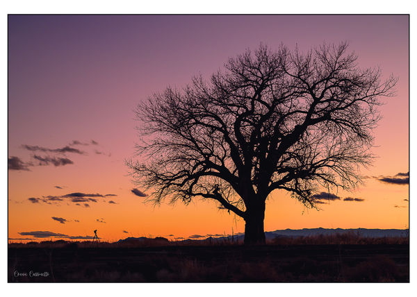
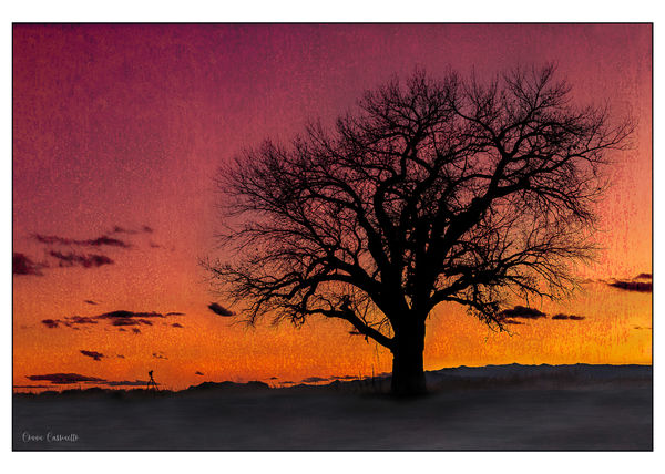
Posting this became very interesting. Obviously the colors in the second version were "pushed" in a number of ways. In the first version the sky really was that orange but the blue became more purple once the sky was darkened in post. Either way, these are difficult colors to reproduce. Additionally, upon using LR export in the Export panel (and yes I was using sRGB) the colors in the sky on both images would not render correctly once imported into UHH. The colors in LR Develop module did not show out of gamut for screen or print in the sky area. In the second image, which is darker here than in the original image, only rendered to any degree of correctness when I darkened it, whereas on the top image I had to lighten it to get it to render correctly. Additionally, using the Print Module Print to JPEG file gave me the file with the correct sharpness (using output sharpening) whereas no matter what I checked in the LR Export panel, including output sharpening, I could not get the correct sharpness of the original file. Taken in Socorro, New Mexico. I'll have to pay around more with these export settings, especially to see how sharpen differs between the Print Module Print to JPEG file and the Export Module. Anyway, I kind of liked the end result of both. I do have it in BW, too, which is the main thought when taking the image. And, of course, I have it with only the tree. I liked the juxtaposition of the two subjects which helped to show how large this tree actually was.
Feb 4, 2020 17:34:48 #

via the lens wrote:
Posting this became very interesting. Obviously t... (show quote)
Like them both. The second appears as if painted on fabric.

Feb 4, 2020 17:39:44 #
l-fox wrote:
Like them both. The second appears as if painted on fabric.
Yes, I used a background and layered it in PS. I love using background layers. Thank you.
Feb 4, 2020 19:08:29 #

Wow, Connie, sounds like you nearly brought UHH to its knees  Thanks for the extensive information and for posting these gorgeous works.
Thanks for the extensive information and for posting these gorgeous works.Feb 4, 2020 21:51:23 #
First I want to mention nice addition having the camera on try-pod pointing up at the tree. I'll give you an extra 10 points just for that.
Reading your post you indicated you were loosing the blue in the sky. I am only guessing your desired blue color but I made some corrections to your first image and I think you can get back to blue.
I opened your image in Photoshop CC. Added a Color Balance Layer, make sure Tone is set for Midtowns. Move bottom slider to +70. I had Preserve Luminosity checked. You can turn that box on and off to see if it helps get to your original setting. Not sure if it was needed but I painted away this adjustment to the bottom 20%.
In Photoshop I chose Export>Export as> next screen make sure JPG is in the Format box>Export> call it what you want and save. I have my preferences set to export as sRGB. This is how I make all my files for printing. Almost always posted UHH pictures will look flatter but not in printing with my print suppliers.
See is this helps or I can post what I have done.
Jim
Feb 4, 2020 21:58:59 #
Jim-Pops wrote:
First I want to mention nice addition having the c... (show quote)
Hi. Thanks for what you have done but I am quite content with the outcome as is. I'll take a look at your settings if I do want that blue. The problem I was addressing is with UHH. I like purple and am not worried at all about the color. Also, I am not comfortable with other people downloading and processing my images, but I do thank you for trying to help me.
Feb 4, 2020 22:17:26 #
I want to assure you I never repost a members pictures anywhere else and never save them. When trying to help someone I download and try what I am thinking first. I don't want to pass out bad information without testing my theory. I apologies to you for my misunderstanding and thinking you prefered the blue sky. I did see your © that's why I told you what I did before going any further.
I assure you your file and everything I did is now gone.
I assure you your file and everything I did is now gone.
Feb 4, 2020 22:21:40 #
Jim-Pops wrote:
I want to assure you I never repost a members pictures anywhere else and never save them. When trying to help someone I download and try what I am thinking first. I don't want to pass out bad information without testing my theory. I apologies to you for my misunderstanding and thinking you prefered the blue sky. I did see your © that's why I told you what I did before going any further.
I assure you your file and everything I did is now gone.
I assure you your file and everything I did is now gone.
Not a problem. Thanks.
Feb 5, 2020 07:41:14 #

IMVHO, the colors in both thumbnails are pretty awful.
In the download for #1, colors are great, being acceptably natural, which make for a pleasant picture worth framing.
As for #2, the colors and textures created are not at all pleasant. IMVHO.
In the download for #1, colors are great, being acceptably natural, which make for a pleasant picture worth framing.
As for #2, the colors and textures created are not at all pleasant. IMVHO.
Feb 5, 2020 08:20:40 #

Nice, but I’ll bet the black and white version is excellent--how about posting it?
Feb 5, 2020 12:19:16 #
Delderby wrote:
IMVHO, the colors in both thumbnails are pretty awful.
In the download for #1, colors are great, being acceptably natural, which make for a pleasant picture worth framing.
As for #2, the colors and textures created are not at all pleasant. IMVHO.
In the download for #1, colors are great, being acceptably natural, which make for a pleasant picture worth framing.
As for #2, the colors and textures created are not at all pleasant. IMVHO.
Thanks for your input. I do know that sometimes I get "over the top" as I like to experiment and believe that, for me, just about anything in photography goes. Good to hear that what might be "acceptably natural" outlook from someone else.
If you want to reply, then register here. Registration is free and your account is created instantly, so you can post right away.