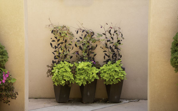
Entryway
Jan 31, 2020 07:32:14 #

It just caught my eye.
1/50, f11, 38mm, 640 iso
Some processing in LR, PS & topaz while trying to understand the actins and interactions among these programs.
Now to see if I remember how to send to a UHH posting.
1/50, f11, 38mm, 640 iso
Some processing in LR, PS & topaz while trying to understand the actins and interactions among these programs.
Now to see if I remember how to send to a UHH posting.
Jan 31, 2020 07:34:18 #
I have some homework to figure out what went wrong. I may have solved the issue.
Jan 31, 2020 09:48:14 #

The impact of the three, essentially identical potted arrangements is compositionally strong, especially as accentuated by the enclosing passage into the area where they stand di#played.
However, the asymmetric intrusions of leafy stuff from both sides are distracting from the nicely framed subjects.
The image is technically adequate at NVD.
Impact 4/5
Tech 3/5
Comp 3.5/5
Total 10.5/15
Dave
However, the asymmetric intrusions of leafy stuff from both sides are distracting from the nicely framed subjects.
The image is technically adequate at NVD.
Impact 4/5
Tech 3/5
Comp 3.5/5
Total 10.5/15
Dave
Jan 31, 2020 12:19:24 #

If it doesn't add to the composition get rid of it. All you need is those three plants. I love that part. Less contrast and light on the background. A tighter frame would accentuate the texture and lines in the plants.
Feb 1, 2020 06:20:39 #

I'd be tempted to try cropping away either side to leave a fairly tight crop of the three pot plants. You got the top right, leaving the plants with room to grow into, and bottom is fine. Nice composition. 
Feb 1, 2020 09:53:42 #
Feb 1, 2020 13:11:10 #

dave sproul wrote:
I have some homework to figure out what went wrong. I may have solved the issue.
I think you cut too much off the sides. I want to see more. I don't think more information along the sides would take away from the central shot, the plants in the middle. It seems a little flat. Somehow I want to open it up a little more. I would just play around with the PP sliders some and see what develops.
...Cam
Feb 1, 2020 13:13:05 #
CamB wrote:
I think you cut too much off the sides. I want to see more. I don't think more information along the sides would take away from the central shot, the plants in the middle. It seems a little flat. Somehow I want to open it up a little more. I would just play around with the PP sliders some and see what develops.
...Cam
...Cam
Just remember .. no edits are to be posted in the Critique Section. If the OP would like, it might be a good idea to take it over to the post processing section. Every section has a valuable role to play.
Feb 1, 2020 16:37:03 #
Nightski wrote:
Just remember .. no edits are to be posted in the Critique Section. If the OP would like, it might be a good idea to take it over to the post processing section. Every section has a valuable role to play.
Ok to send edits by PM?
Feb 1, 2020 22:32:14 #

I agree with Dave about including only the 3 plants. I do like the wall corners, though.
If you want to reply, then register here. Registration is free and your account is created instantly, so you can post right away.