First Fine Art Look
Feb 1, 2020 06:31:24 #
Feb 1, 2020 06:41:44 #

Haydon wrote:
Be gentle, it's a learning experience ;)
Very nice indeed.
Smile,
JimmyT Sends

Feb 1, 2020 06:56:02 #

Feb 1, 2020 07:20:07 #

Feb 1, 2020 14:02:54 #

Jimmy T, tradio, and yssirk-
Come on guys, didn't y'all read the new section rules- no more "ataboy critiques". So...please tell us WHAT you like about this image. Your comments will be appreciated.
Haydon- When you say "fine art" do you mean a period piece emulating old world painterly styles? Or, "fine art" photogrhy?
I'll offer my critique later- let's hear from the other guys. You don't need to request gentle remarks- harsh and non-constructive critiques are not allowed here in this section- they will be deleted.
Come on guys, didn't y'all read the new section rules- no more "ataboy critiques". So...please tell us WHAT you like about this image.
Your comments will be appreciated. Haydon- When you say "fine art" do you mean a period piece emulating old world painterly styles? Or, "fine art" photogrhy?
I'll offer my critique later- let's hear from the other guys. You don't need to request gentle remarks- harsh and non-constructive critiques are not allowed here in this section- they will be deleted.
Feb 2, 2020 08:37:26 #

Haydon wrote:
Be gentle, it's a learning experience ;)
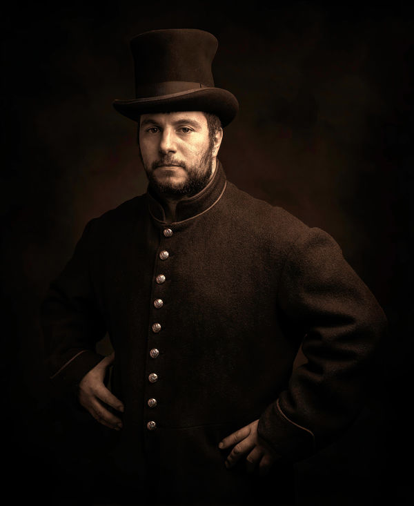
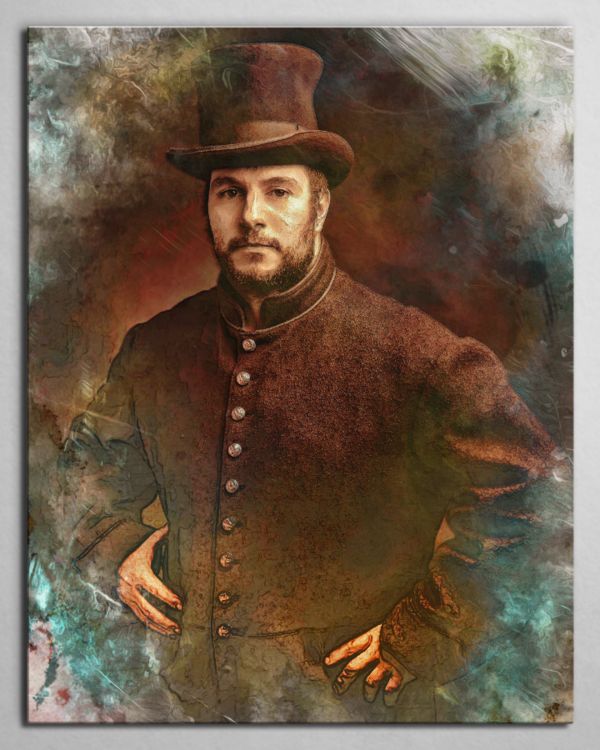
I really like it. My eye is drawn to the face where it should be. I think the highlight in his left eye could have been brighter. The texture shown in the coat and the shine on the buttons is excellent. I like the overall dark look. It reminds me very much of an old studio photo I have of a great, great uncle. I think you did a very good job.
Feb 2, 2020 19:34:32 #

Feb 2, 2020 22:06:10 #
1.) JimmyT thank you for your kindness!
2.) tradio much appreciated sir.
3.) yssirk123 thanks for your comment.
4.) DebAnn greetings and salutations! I appreciate your elaboration.
5.) Ed, thanks for keeping things clean in this forum.
6.) Dean thank you so much!
2.) tradio much appreciated sir.
3.) yssirk123 thanks for your comment.
4.) DebAnn greetings and salutations! I appreciate your elaboration.
5.) Ed, thanks for keeping things clean in this forum.
6.) Dean thank you so much!
Feb 2, 2020 23:46:35 #

I’m the farthest thing from a pro you’re gonna meet but I’ll offer my suggestion in an effort for my own education.
The only thing I would change is to add some back lighting to isolate the model.
Edit: I believe it’s called rim lighting.
The only thing I would change is to add some back lighting to isolate the model.
Edit: I believe it’s called rim lighting.
Feb 3, 2020 15:09:14 #

I think this is a beautiful shot but would prefer it with more separation from the background, and more exposure on the front so his hands are not so isolated.
Feb 4, 2020 11:25:57 #
Haydon wrote:
Be gentle, it's a learning experience ;)
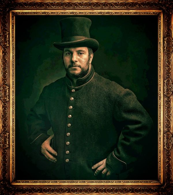
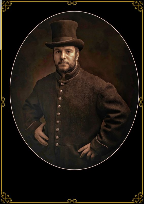
I'm still trying to find out what you meant by "fine art". Is you concept to create an image based on the styles of the old masters or Dutch Masters painters. Perhas another past period of photograhy? This image has much potential and can also stand alone as a portrait or a reenactment character portrait.
There is a lot inf information in that file that does not appear on the screen in terms of separation between the subject and the background and shadow detail in the clothing and the the subject's face. On the other hand, you might have intended more blending of the subject into the background- it seems more mysterious that way? Folks are criticizing that blending as if this was a contemporary standard portrait, perhas you did not intend it to be that way? As the artist, the final rendition is up to you!
I did a few rough edits to bring up the detail. To me, it is reminiscent of an old tintype, Daguerreotype, or antique photograph mounted on an oval cabinet card- the monochromatic aspect of the image works well for that. Or- a Rembrandt-like oil painting, or an discovered antique faded and damage photographs of historical value.
It's all a matter of presentation and how you elect to post-process it.

If you want to reply, then register here. Registration is free and your account is created instantly, so you can post right away.