Comments please
Nov 6, 2011 08:06:01 #
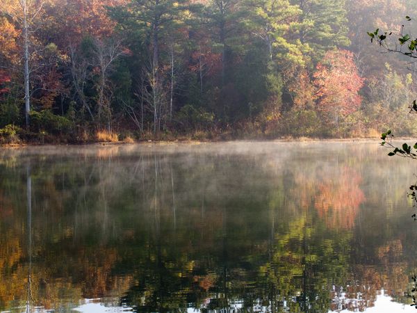
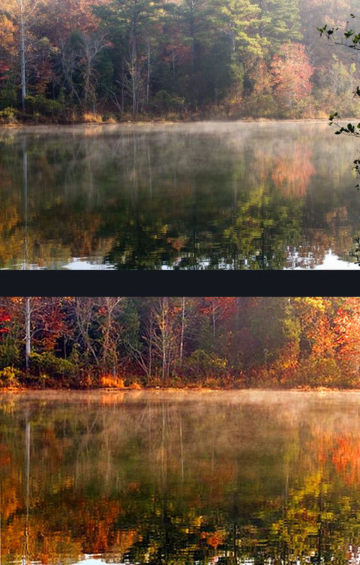
I posted this yesterday with 2 other pics and got 74 looks but no cc.
How is the pic? How is the post work...too much...not enough?
How is the pic? How is the post work...too much...not enough?
Nov 6, 2011 08:18:24 #
colors too bland, branch on the right is distracting, reflection is great. looks peacefull. nice photo. post more please.
Nov 6, 2011 08:36:56 #
sinatraman wrote:
colors too bland, branch on the right is distracting, reflection is great. looks peacefull. nice photo. post more please.
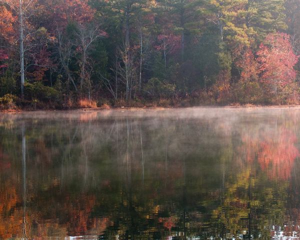
Is this any better? I don't know if the colors are any better, but the branch being gone helps.
Nov 6, 2011 08:46:57 #

usetobe wrote:
I posted this yesterday with 2 other pics and got 74 looks but no cc.
How is the pic? How is the post work...too much...not enough?
How is the pic? How is the post work...too much...not enough?
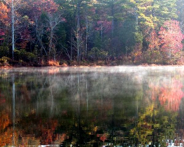
It's a very peaceful looking place!
The colors are a little flat, and the edit could still be improved upon a little more in that respect (in my non-professional opinion).
Out of a sense of personal curiosity, I took the liberty of trying to tweak it myself. May I share the results here with you? It remains your photo of course... I was just curious if my thoughts would actually improve the photo any.
I did an auto adjust first with Picasa, then adusted the shadows a bit, then made a slight adjustment to saturation. To have sharpened it any would have been too much, however.
I ended with straightening it a bit.
Hope it doesn't look like crap when it gets here. *blush* Monitors DO have a tendency to display differently...
I really like the photo!
your original

tweaked
Nov 6, 2011 21:57:13 #
tilde531 wrote:
quote=usetobe I posted this yesterday with 2 othe... (show quote)
I love what you did to the photo....I will try to see if I can get close to it.
Nov 6, 2011 22:54:57 #

Hi there. I like your photo as it is a beautiful setting. I hope you don't mind but I also re-edited your photo using Photoshop Elements 9. First off I recropped to put it into the rules of thirds. Since you had more water and more emphasis on the reflection and the mist on the water, I cropped one thirds trees to two-thirds water. I then straightened it. Next, I warmed up the ambient light temperature because I the photo to me portrays the warm morning sunrise showing the mist on the water. Then I increased the color saturation to really make the photo pop. I hope you like it.
Before and After
Nov 7, 2011 11:48:54 #
If you want to reply, then register here. Registration is free and your account is created instantly, so you can post right away.