printer for larger prints
Dec 4, 2019 11:05:27 #

I always seemed to use Epson printers. My P800 is myu current version and it's been problem free for several years. Best of luck.
Dec 4, 2019 11:34:16 #
cahale
Loc: San Angelo, TX
Epson P6000-8000 series. With the P6000 you can print up to 24" on the short side, use about any type stock, and get great prints. P8000 up to 44" on the short side. Ink is pricey, but worth it. If printing photos 12" or under on short side, combine and print 2 at once. Saves money.
Dec 4, 2019 13:06:33 #

jabe750 wrote:
I asked this before but I had deleted the recommendations. I would like to get advice for a printer that does prints larger than the standard 8 1/2 x 11 sizes.
Maximum print size?
Budget?
Monthly volume?
Business or pleasure?
Dec 4, 2019 14:47:14 #

jerryc41 wrote:
It's hard to beat the Canon Pro-100 for quality and price. It's usually available with generous rebates. Just $150 after the rebate.
https://www.bhphotovideo.com/c/product/893738-REG/Canon_6228b002_Pixma_Pro_100_Photo_Inkjet.html
https://www.bhphotovideo.com/c/product/893738-REG/Canon_6228b002_Pixma_Pro_100_Photo_Inkjet.html
Yes, I believe right now at B&H it's on sale with $10 worth of 13x19 Lustre paper for $150 after rebate.
and it does beautiful prints
Dec 4, 2019 18:54:28 #
NCMtnMan
Loc: N. Fork New River, Ashe Co., NC
I guess I'm just different, but I don't see the value in investing in a good printer, paper, ink etc when there are so many print services that can do a better job for no more or little more than doing it yourself. I think if most did a cost per print they would find it isn't a great financial option.
Dec 4, 2019 19:03:59 #

McMtnMan..............
To each his own.. If it work for subject A........... It works..
If what works for you............. it works for you... That is all that counts ha ha ha
--GeoVz
To each his own.. If it work for subject A........... It works..
If what works for you............. it works for you... That is all that counts ha ha ha
--GeoVz
Dec 4, 2019 19:43:17 #
NCMtnMan wrote:
I guess I'm just different, but I don't see the value in investing in a good printer, paper, ink etc when there are so many print services that can do a better job for no more or little more than doing it yourself. I think if most did a cost per print they would find it isn't a great financial option.
Owning/using a printer isn’t about saving money. You won’t save, unless using a 24” wide or wider printer and you need a relatively high volume of VERY BIG prints (24x36 inches and larger).
Reasons to own/use a home printer:
Privacy
Precise control over results
Rapid access to prints
Print longevity 3x to 5x that of silver halide lab prints
Wide choice of papers, canvas, art board, and other substrates
If you do print, and expect a high standard of color accuracy and control, you’ll be forced to learn principles of, and apply good ICC color management practices.
#1 Calibrate (linearize the output of) your monitor, and PROFILE it, effectively telling the color management engine in your OS what the capabilities of your monitor are, and how to best use them. This requires a kit from Datacolor or X-Rite.
#2 Use manufacturers’ ICC profiles for your SPECIFIC paper, ink, and printer in use, OR make your own. Profile mismatches lead to very poor results.
Dec 4, 2019 20:35:48 #
I get excellent results from my Canon Pixma Pro-10. Got it new for about 300 with a free 50 pack of 13x19 luster.
Check the shops and see what is on sale now for the holidays
Check the shops and see what is on sale now for the holidays
Dec 4, 2019 22:53:40 #

Dec 5, 2019 03:49:48 #
Bo0mer wrote:
I've had the Canon Pro-100 (mentioned by previous ... (show quote)
I've used that printer for years - no clogs and so far, no fading in indirect sunlight. Great color too! I print mostly on semi gloss with Canon ink/paper.
Dec 5, 2019 08:11:00 #
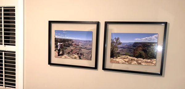
Markgregory
Loc: Advance, NC
Canon Pixma Pro 100 all the way. Here are two photos I printed out. Shots were from an iPhone X.

Dec 6, 2019 11:09:19 #
Harry13 wrote:
I've used that printer for years - no clogs and so far, no fading in indirect sunlight. Great color too! I print mostly on semi gloss with Canon ink/paper.
I must say, all of this advice - "You have to profile this and you have to profile that." I've never profiled anything in my life and my Pix 100 does a fantastic job never the less! Accurate and brilliant color is the order of the day with that printer. I'm retired so I have plenty of spare time I've fooled around with different papers and inks but never with profiling. And if some of you were to visit and see the print that I put up of a Sonoma seashore, you might take a step back. Even at 88, my "mind's eye" is still working so I mostly hang other people's prints, even a few commercial ones. Lest you think that I just wandered down out of Michigan's UP with a box camera, I've had many shows of my photography and one of my photos even graced the cover of Dance Magazine back in the day. Harry
Dec 6, 2019 13:24:27 #
Harry13 wrote:
I must say, all of this advice - "You have to... (show quote)
You're probably lucky! One of the most common questions on UHH is, "Why are my prints so... (dark, green, light, red, drab, lifeless, posterized... whatever.)
Color management can fail in many ways. Most failures start with a monitor that isn't displaying accurate color, and continue with someone using that monitor to attempt color and brightness adjustments. If you never adjust color of your images, you won't encounter the issue. If you work from raw files, you probably WILL encounter the issue at some point. And if multiple people using the same computer tweak a monitor to their individual tastes, disappointment with print quality almost always follows.
I implemented ICC color management in a large portrait lab. There, we received files from hundreds of different professional photographers. About 20% of them looked good with no adjustment. The rest ranged in quality from "almost right" to "what were they thinking?"
Because we served lots of different customers, all of whom expected perfection, we had to maintain strict standards for color quality. It isn't difficult, but does require disciplined attention.
My files are full of accounts of issues we had with photographers and color quality. My favorite is the guy who swore up and down he calibrated his monitor to our specs. What we finally figured out was, his kid was using the computer after hours to play games. Of course, the kid had messed around with the color, brightness, contrast, and other settings on the front of the monitor, to make his games look "better!" A monitor optimized to match photo lab color or home printer color will be boring for a gamer. A gaming monitor makes a terrible monitor for evaluating color for printing.
Some people are pickier than others. Professionals are often asked to match a specific color... "CocaCola Red," or "Bullitt Mustang Green," or in our case, to "nail all the skin tones and maintain consistent backgrounds in 1000 kids' portraits for a school yearbook." There are various strategies for that, and all of them involve ICC color management.
Monitor calibration and profiling ensure world-standard accurate color, not (just) pleasing color. The process enables a great approximation of "What You See Is What You (or your lab) Prints".
Dec 6, 2019 14:32:42 #
[quote=burkphoto]You're probably lucky!
As I've told my wife many times, "I'd rather be lucky than good!"
Probably in my case, "dumb luck" - but still, better than no luck at all - or bad luck. :-)
Harry
As I've told my wife many times, "I'd rather be lucky than good!"
Probably in my case, "dumb luck" - but still, better than no luck at all - or bad luck. :-)
Harry
Dec 6, 2019 14:48:48 #
"I implemented ICC color management in a large portrait lab. There, we received files from hundreds of different professional photographers. About 20% of them looked good with no adjustment. The rest ranged in quality from "almost right" to "what were they thinking?
Because we served lots of different customers, all of whom expected perfection, we had to maintain strict standards for color quality. It isn't difficult, but does require disciplined attention."
You're clearly a pro and face many problems that I don't even have to think about. In my case it's like the song, "You can't please everyone so you've got to please yourself!" And so that's what I do. I like to think that you'd like my prints too but bottom line is that I really don't give a damn!
I don't do portraits so no skin tones, I mean there may be people in one or more of my shots but I don't give a tinker's damn about what they like or want. <g> S'why I really like that 100, no fooling around, just print. My top hobby is reading, I'm an omnivorous reader. Second is bird dog and spaniel field trials (mock hunting). Photography comes third so the easier the better. Harry
If you want to reply, then register here. Registration is free and your account is created instantly, so you can post right away.