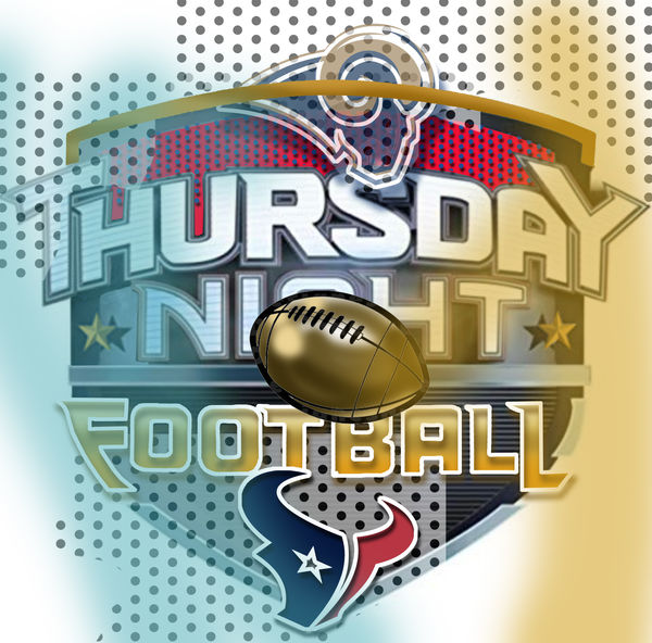
Thursday Night Football loose logo concept
Dec 1, 2019 02:23:25 #

Being a graphic designer, for fun I redesign logos, such as the Thursday Night Football loose logo concept.
See if you like this at all!
See if you like this at all!
Dec 1, 2019 02:27:08 #
Dec 1, 2019 06:07:32 #
Not enough contrast on the letter T - doesn't standout enough, the stippling makes it hard to pick up at a glance
Dec 1, 2019 10:22:54 #
RichardTaylor wrote:
I like it.
Thanks Richard! I appreciate your positive response to this one!
Dec 1, 2019 10:25:40 #
gcolegate1 wrote:
Not enough contrast on the letter T - doesn't standout enough, the stippling makes it hard to pick up at a glance
Excellent point gcolegate1.......I totally agree with you. I think I knew this before I sent it out but needed you to confirm it. Thanks again. I like the constructive approach you have given.
Dec 1, 2019 11:26:21 #
gcolegate1 wrote:
Not enough contrast on the letter T - doesn't standout enough, the stippling makes it hard to pick up at a glance
gcolegate1, you have inspired me to adjust the image and improve it with your suggestions and a few other "Tweaks" that I added. What do you think?

Dec 1, 2019 14:16:29 #
Dec 1, 2019 21:32:22 #
Dec 2, 2019 07:14:40 #

I know you're a Rams fan and a professional designer but you could get top dollar for that logo featuring Sunday night's game between the Texans and the Patriots. Do you have a web site featuring your work?
Dec 2, 2019 08:00:47 #
BrentHarder wrote:
gcolegate1, you have inspired me to adjust the image and improve it with your suggestions and a few other "Tweaks" that I added. What do you think?
I like it much better the second way. I had the same thought, and then reading down the page saw that the subject was covered. You should license it to Thursday Night football. I think it is that professional!
Dec 2, 2019 08:53:04 #
Great logo, Brent. Pretty cool you can do that kind of stuff. The first thing that caught my eye was the Rams logo is obscured by the gold line.
Dec 2, 2019 10:11:54 #
MWojton wrote:
Great logo, Brent. Pretty cool you can do that kind of stuff. The first thing that caught my eye was the Rams logo is obscured by the gold line.
Yes. That caught my eye as well.
Dec 2, 2019 10:11:56 #

Dec 2, 2019 10:14:44 #
I think your first try had more emphasis on the football. As usual you are showing your artistry.
Dec 2, 2019 10:20:50 #
If you want to reply, then register here. Registration is free and your account is created instantly, so you can post right away.