Old Photo: Color or Monochrome?
Oct 23, 2019 20:05:21 #

oregonfrank wrote:
Bike guy, your last statement is really interesting. Color vision is enabled by receptor cells in the retina (back of the eye) called cones. It would be interesting whether your Dr explained how cataract surgery (front of eye where lens is) improved your color vision.
Frank
Frank
Yes Frank, I know it doesn’t make sense at first. But cataracts dim ones vision. It was amazing how much brighter things looked. I can drive at night and green lights are not white..
Oct 23, 2019 20:06:45 #
rmorrison1116 wrote:
I do not understand many folks preference to black and white photos. Maybe back in the day when B&W was more common than color because of cost and difficulty, but not now. We don't live in a black and white world, we live in a world of color. B&W is not real, color is. I like the color version much better because it is much closer to reality.
Glad nobody told that to Ansel Adams!
Oct 23, 2019 20:50:28 #

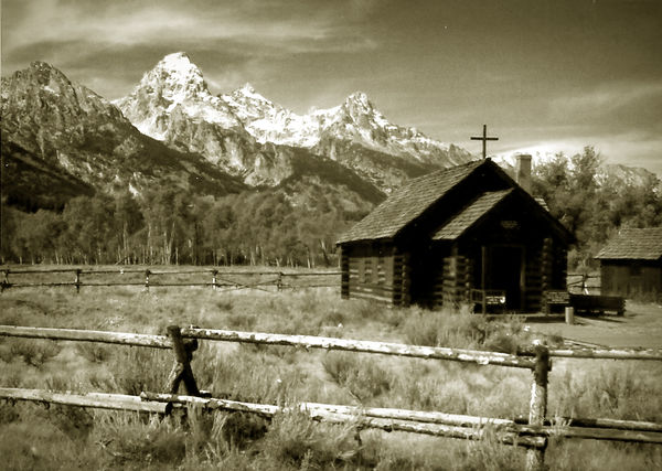
As usual, color gives a sense of reality, B&W emphasizes graphic qualities of shape, value, and composition. Both of yours do their job well. The color has the "real" feel of how we see, not the sparkly, sharp as a tack. "precious" work that is so often preferred now. The B&W shows relationships between the shapes of mountains and church, diagonal relationships between mountain line and fence, contrast of textures, and the all-important aspect of graphics, a center of interest.
Both are fine, to the eyes of this juror and critique conductor.
Both are fine, to the eyes of this juror and critique conductor.
Oct 24, 2019 01:20:53 #
Harry0
Loc: Gardena, Cal
I'm going to say ... both. As separate but equal photos.
The color is just good. The colors point out all the separate items and add depth.
The B&W is an example of "why?". Without the distraction of color, the starkness of the details in the barn become obvius.
The color is just good. The colors point out all the separate items and add depth.
The B&W is an example of "why?". Without the distraction of color, the starkness of the details in the barn become obvius.
Oct 24, 2019 03:55:12 #

Linda From Maine wrote:
Then your comment that I quoted makes no sense to me. But I'm easily confused, so worry not 😇
It has to do with preference. I prefer color because it is more realistic. From my experience and observation, many older folks, not that I'm a youngster but by UHH standards I probably am, are more into B&W because of the ease of processing B&W film and prints prior to digital photography and printers. I no longer have a dark room. The house my dark room was in was torn down twenty some years ago. The TS 9020 is an excellent printer for B&W because of its 6 ink cartridges, two are grey. The TS 9020 also does nice color prints and documents, but, there are times when monochrome really makes a print pop, like a photo of a big old steam locomotive.
Oct 24, 2019 05:30:01 #

mffox wrote:
The 2 images below originated almost 40 years ago (Pentax 35mm using Kodachrome film). I converted from slide to digital (color), then to B&W a few years ago.
Which do you prefer: color or monochrome? Any comments/ critiques of the images themselves would be most appreciated. Thanks in advance.
Which do you prefer: color or monochrome? Any comments/ critiques of the images themselves would be most appreciated. Thanks in advance.

Oct 24, 2019 05:52:55 #

I must be the odd ball. I like the B&W better. Colors are washed out in the original for me.
Oct 24, 2019 07:24:47 #


Oct 24, 2019 07:25:57 #
With some work, as Linda has suggested, the black and white would outshine the color version.
Oct 24, 2019 07:55:54 #

I lean towards black and white, whether using film or digital. I like both but prefer the black and white version. However, I think the shadows on the building are a bit too dark.
--Bob
--Bob
mffox wrote:
The 2 images below originated almost 40 years ago (Pentax 35mm using Kodachrome film). I converted from slide to digital (color), then to B&W a few years ago.
Which do you prefer: color or monochrome? Any comments/ critiques of the images themselves would be most appreciated. Thanks in advance.
Which do you prefer: color or monochrome? Any comments/ critiques of the images themselves would be most appreciated. Thanks in advance.
Oct 24, 2019 09:38:17 #
hustlerb58
Loc: Fort Worth, Texas
Hi Folks: Over the years I've restored many old B/W photos, and in trying to keep them looking authentic for the time frame from where they came from, I make sure they are saved in RGB so I can add a small amount of yellow and red. I've worked with photoshop sense there was photoshop. I've ben a graphic designer for a major aerospace company here in Fort Worth, Texas starting in 1968 after a tour in Vietnam and Thailand.
Photography is about information. For me, B/W photos that were originally color, lack a lot of detail that adds to what you want others to see. For more modern times, (50s-70s) photos were printed on a better paper that held the image longer. So, think of time frame when selecting B/W.
Photography is about information. For me, B/W photos that were originally color, lack a lot of detail that adds to what you want others to see. For more modern times, (50s-70s) photos were printed on a better paper that held the image longer. So, think of time frame when selecting B/W.
Oct 24, 2019 09:48:04 #

Oct 24, 2019 09:52:14 #

mffox wrote:
The 2 images below originated almost 40 years ago (Pentax 35mm using Kodachrome film). I converted from slide to digital (color), then to B&W a few years ago.
Which do you prefer: color or monochrome? Any comments/ critiques of the images themselves would be most appreciated. Thanks in advance.
Which do you prefer: color or monochrome? Any comments/ critiques of the images themselves would be most appreciated. Thanks in advance.
I don’t care what most other people say on this topic I like both images they are 40-year-old pictures and that’s good I like them both I couldn’t choose, I just like them both thank you for sharing.
Bruce
Oct 24, 2019 10:00:48 #

mffox wrote:
The 2 images below originated almost 40 years ago (Pentax 35mm using Kodachrome film). I converted from slide to digital (color), then to B&W a few years ago.
Which do you prefer: color or monochrome? Any comments/ critiques of the images themselves would be most appreciated. Thanks in advance.
Which do you prefer: color or monochrome? Any comments/ critiques of the images themselves would be most appreciated. Thanks in advance.
I like both equally but for different reasons. The color example is closer to reality and promotes the little church and a older time in memoriam while the B&W appears to have more attention to the clouds & mountain range in the background with lesser accent on the church in it's foreground. I agree that the front entrance to the church needs some lightening as it is way too dark for my tastes but the shot is the shot and what you get is what you've got.
BTW......I encourage everyone to digitize all of your old films & slides and remaster the ones you love & forgot about after decades of storage in some old album or shoebox.......you'll be glad you did.
It's a VERY Good Thing.
Thank you.
Oct 24, 2019 10:03:30 #

Both have their merits. I think Linda is right on track with the building in the B & W needing some work on the front end. Other then than, I would be proud of both.
If you want to reply, then register here. Registration is free and your account is created instantly, so you can post right away.