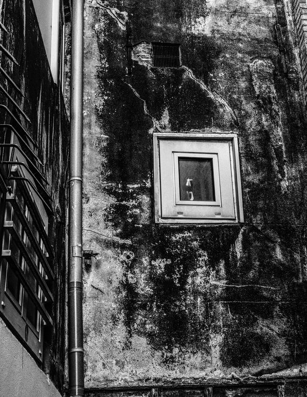
Alleyway Wall
Sep 23, 2019 15:58:37 #

Shot in the Rokin District of Amsterdam -- looking for constructive feedback before I print
Sep 24, 2019 07:54:05 #
RickH wrote:
Shot in the Rokin District of Amsterdam -- looking for constructive feedback before I print
Another interesting shot.
Would you have either one in color? I can see the kerchief in the other and the window with frame in this one processed in color against the B&W as the backdrop.
The shots are great of their own. I think that the color would bring out a stronger story. My opinions, of course.
Sep 24, 2019 10:05:49 #

Its difficult to judge brightness, but it looks dark heavy. So dark that the character in the back wall is mostly obscured. In my experience printing b/w this edit might disappoint. I coaxed it around a little to my liking but perhaps you feel its just the way you want it. May as well put it in.

Sep 24, 2019 11:25:32 #

I guess I'm too . . . whatever . . . to understand this. I don't know what I'm looking at.
Sep 24, 2019 18:49:46 #
these always look so much different when posted. I tend to keep my monitor brightness turned down just because its the best way to simulate how a print will come out. My edit looks pretty bleached out. Basically just being able to see that the back wall is a surface full of character was my intension.
Sep 25, 2019 07:59:08 #
thanks, all, for these comments; I will try printing two small versions and then conmpare
Sep 25, 2019 10:21:52 #
I was on my tablet last night when this thread came up again. The interesting thing is that looking at the image on my tablet, it was perfectly clear. Looking at it on my computer screen, I couldn't even decipher what was in the image! I guess there's something to be said for smaller views!
It's an interesting wall.
It's an interesting wall.
Sep 25, 2019 17:09:48 #

I did like the edit that fergmark did, but I think you have included too much in the frame. The things I find interesting .. besides the texture of the building .. are the the two very different window openings, what's inside those frames, and the cracks running between them. I think that wall and the two windows is all you need. The pipe could be included, but anything beyond that distracts. I would crop it to a square and do a perspective correction so that the partial wall on the right is gone as well.
If you want to reply, then register here. Registration is free and your account is created instantly, so you can post right away.