Check out Traditional Street and Architectural Photography section of our forum.
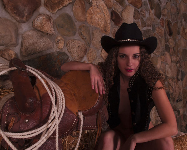
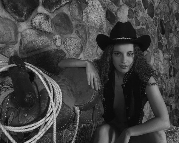
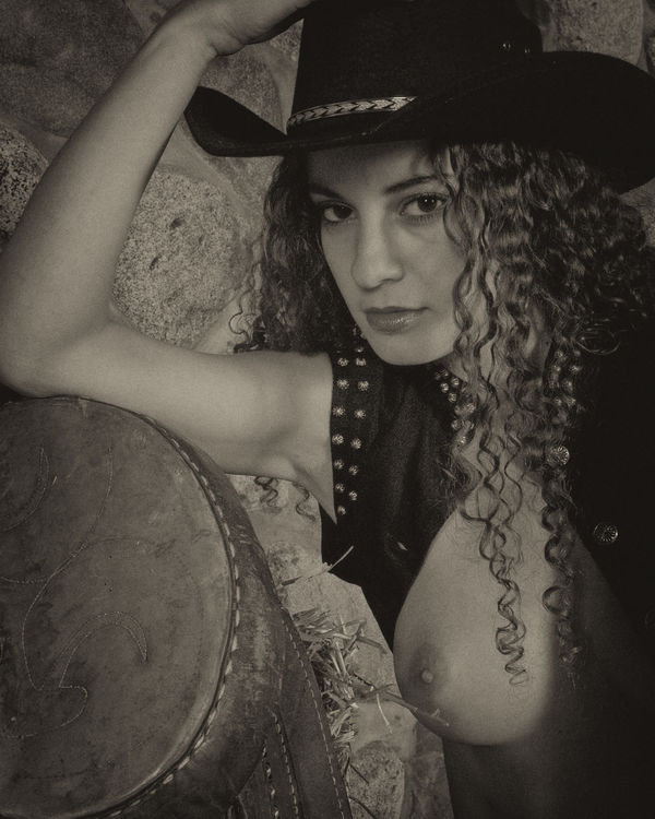
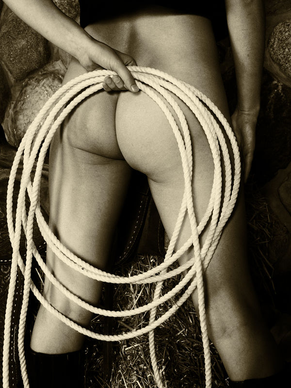
One theme from an extended shoot (repeat with images)
Aug 15, 2019 09:42:16 #
Aug 15, 2019 10:05:40 #

vertigo wrote:
I personally like the B&W better--seem to fit the theme better.
That's one way to get the red out!!!!
Very nice images!!!!
Aug 15, 2019 11:24:26 #
Yup--it works! Or I could take the time to slide the red down a little and not use the one straight from the camera. I knew I was going to convert to BW I just take the easiest way out but at least YOU noticed. Thanks. People who respond with "too light" or "too dark" may be missing the photographer's point OR may just have monitors or device screen set to different brightness. I calibrate mine just by matching to what comes out of the printer--cheap, quick, dirty but as long as I stick to one paper it works (for me.)
Check out Professional and Advanced Portraiture section of our forum.
Aug 15, 2019 11:58:00 #

vertigo wrote:
Yup--it works! Or I could take the time to slide t... (show quote)
The first two look too dark to me, and I have a calibrated monitor, but maybe you like them dark.
Aug 16, 2019 07:28:07 #

Aug 16, 2019 08:06:11 #

Aug 16, 2019 11:46:38 #

Check out True Macro-Photography Forum section of our forum.
Aug 16, 2019 19:19:07 #
If you want to reply, then register here. Registration is free and your account is created instantly, so you can post right away.
Check out Underwater Photography Forum section of our forum.