A flower developed with Affinity - what frequently goes into finishing a flower photo.
Jul 12, 2019 14:48:11 #

abc1234 wrote:
I enjoy this rendering. For me, photography is an... (show quote)
Possibly I live in fear of being told my photos are over-cooked. I have a definite tendency to go too dark and dull. I prefer a brighter look but tend to hold back in processing. This was shot outside at a Lowes's garden center and there was a breeze. It was shot at 1/80 so it could have done with more shutter speed.
I appreciate your interest and feedback. I want my photos to be pleasing.
Jul 13, 2019 11:44:43 #

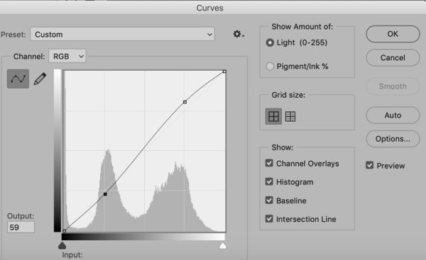
Cwilson341 wrote:
Thank you, Bob. I would be interested in your thoughts on the revision I just posted.
I think it might be closer to what you want, and, objectively, is more rich in tonal range. I would prefer a little more tone separation between the flower and its background, to make it stand out just a bit more (attached Photoshop Curves).
I am on your side about not overcooking. Always tricky, and viewers have different tipping points. We have to exaggerate to tell the reality--but carefully in my opinion,
Jul 13, 2019 11:45:56 #
artBob wrote:
I think it might be closer to what you want, and, objectively, is more rich in tonal range. I would prefer a little more tone separation between the flower and its background, to make it stand out just a bit more (attached Photoshop Curves).
I am on your side about not overcooking. Always tricky, and viewers have different tipping points. We have to exaggerate to tell the reality--but carefully in my opinion,
I am on your side about not overcooking. Always tricky, and viewers have different tipping points. We have to exaggerate to tell the reality--but carefully in my opinion,
Thank you, Bob, for sharing your insight!

Jul 15, 2019 21:53:49 #

Jul 15, 2019 22:55:02 #
Dixie Native wrote:
Very nice Carol!
Thank you! I've about worn this file out!
Jul 19, 2019 09:07:05 #

Cwilson341 wrote:
I know I have posted a great many flower photos in... (show quote)
You did a great job with both the original photo and the post-processing work---seamless.
Jul 19, 2019 12:01:26 #
Rob48 wrote:
You did a great job with both the original photo and the post-processing work---seamless.
Thank you, Rob.😊
Jul 20, 2019 15:03:33 #
Beautifully done, Carol, and thanks for sharing the steps you took.
Mike
Mike
Jul 20, 2019 15:55:52 #
Blenheim Orange wrote:
Beautifully done, Carol, and thanks for sharing the steps you took.
Mike
Mike
Thank you, Mike.😊
If you want to reply, then register here. Registration is free and your account is created instantly, so you can post right away.