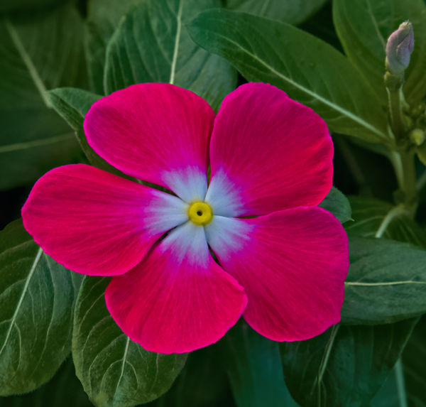
A flower developed with Affinity - what frequently goes into finishing a flower photo.
Jul 12, 2019 07:13:53 #

Jul 12, 2019 08:02:57 #

I do not use Affinity, but it appears you accomplished you intended goal. Whatever it takes to complete your vision. Nice going.
Jul 12, 2019 09:13:09 #

Guyserman wrote:
I'm glad you showed the "before'' picture also. Nice work and beautiful result. It's good you have things to enjoy.
Thank you! I've always liked working with software and photography certainly give me plenty of opportunity!
Jul 12, 2019 09:15:35 #
yssirk123 wrote:
Great job Carol - I would not have guessed all the steps taken on this excellent image. The sign of good editing is that it's not immediately noticeable, and you nailed it.
Thank you, Bill. I really try to take a close look when I think I'm finished. Usually I find that there is something else that needs a tweak. I like for flowers to be unblemished and fresh looking.
Jul 12, 2019 09:17:23 #
Rathyatra wrote:
Nice work Carol.
Thank you! I appreciate that you still look after all the flowers I post!
Jul 12, 2019 09:19:38 #
NJFrank wrote:
I do not use Affinity, but it appears you accomplished you intended goal. Whatever it takes to complete your vision. Nice going.
Thank you, Frank. Affinity apparently is much like Photoshop in its ability. My vision right now seems to be flower portraits but I am slowly trying to get a bit more creative with them.
Jul 12, 2019 12:57:54 #
You took your picture to another level Carol. Additional drama and texture that creates interest for the viewer. Well Done!
Jul 12, 2019 13:29:40 #
Jim-Pops wrote:
You took your picture to another level Carol. Additional drama and texture that creates interest for the viewer. Well Done!
Thank you! It always makes me feel good to finish a photo and know I've improved the experience.
Jul 12, 2019 13:39:20 #

The optical quality is too soft or out of focus, the brightness too dark and colors not as vivid to suit my taste.
Jul 12, 2019 13:58:30 #
abc1234 wrote:
The optical quality is too soft or out of focus, the brightness too dark and colors not as vivid to suit my taste.
I'm sorry it doesn't please you. The shot was hand held which could cause some softness. The flower could be brighter but it is close to real life in color and I didn't want to make it garrish. I am comfortable with the outcome although I can also see where more luminosity might be good.
Jul 12, 2019 14:11:26 #
Cwilson341 wrote:
I'm sorry it doesn't please you. The shot was hand held which could cause some softness. The flower could be brighter but it is close to real life in color and I didn't want to make it garrish. I am comfortable with the outcome although I can also see where more luminosity might be good.
Here are some things to consider for the future. Will that optical quality be acceptable? Does your rendering have to be as close to the original as possible? After all, you did remove that errant flower. If you would want the colors to pop more, could you do so without making them garish? These are the kind of self-reflections we all have as well develop our own styles. Good luck and keep shooting.
Jul 12, 2019 14:18:27 #

Art hides art, and you have done that very well, perhaps because you had a general idea of where you wanted to go with the photo. Fine techniques, bringing out the essence without overdoing it as I see it.
Jul 12, 2019 14:19:35 #
abc1234 wrote:
Here are some things to consider for the future. Will that optical quality be acceptable? Does your rendering have to be as close to the original as possible? After all, you did remove that errant flower. If you would want the colors to pop more, could you do so without making them garish? These are the kind of self-reflections we all have as well develop our own styles. Good luck and keep shooting.
Here is an enhanced update and I believe I do like it better. As for the optical quality, I don't really have a problem with it. I don't feel that photos in general have to reflect reality although I tend to prefer something close to reality in my own work. I also appreciate artistic interpretations but that wasn't my intent here.
Jul 12, 2019 14:20:35 #
artBob wrote:
Art hides art, and you have done that very well, perhaps because you had a general idea of where you wanted to go with the photo. Fine techniques, bringing out the essence without overdoing it as I see it.
Thank you, Bob. I would be interested in your thoughts on the revision I just posted.
Jul 12, 2019 14:35:11 #
Cwilson341 wrote:
Here is an enhanced update and I believe I do like it better. As for the optical quality, I don't really have a problem with it. I don't feel that photos in general have to reflect reality although I tend to prefer something close to reality in my own work. I also appreciate artistic interpretations but that wasn't my intent here.
I enjoy this rendering. For me, photography is an artistic endeavor and I prefer, like you, something closer to reality but a little salt and pepper may help at times.
When I started in photography, lenses and films were not sharp and for many, sharpness was the goal. That history informs my expectations today. If you start with sharp, you can always soften. The reverse is very much harder to obtain.
In your picture, I suspect the lack of sharpness is due to the flower being slightly out of focus. If your hand were unsteady or the flower were moving in the breeze, you would see motion blur instead. I did not look at the metadata so I am only guessing. By the way, working in the shade as you likely did here produces nicer results than direct sun. You might also want to experiment with bracketing your exposures.
If you want to reply, then register here. Registration is free and your account is created instantly, so you can post right away.