bear editing help
May 21, 2019 16:53:35 #
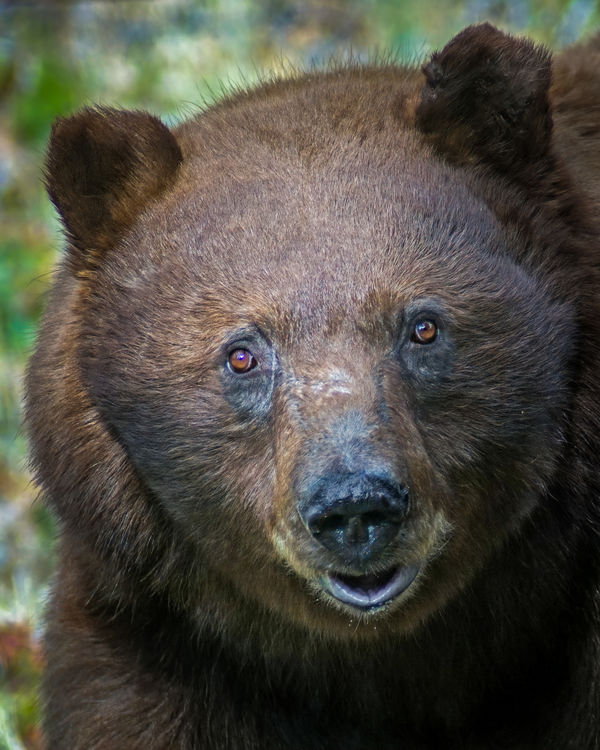
I posted one of these in the Photo section but this forum is tons better for my kind of questions. All these are cropped to get the look I wanted. The first shot has only a little lightening, the 2nd is after some cloning work, and finally the last is with the addition of Dehaze, or Haze Remover (whichever it's called in PSE).
The last pops best on screen, maybe a little too 'processed' look, but prints out terribly. I haven't printed any of the others yet.
My question - does Dehaze always make a photo look over-processed? And was there something else I should have done to make it look a little more natural?
My goal was to get something I could print at 8x10 and be proud to hang on the wall.
ron
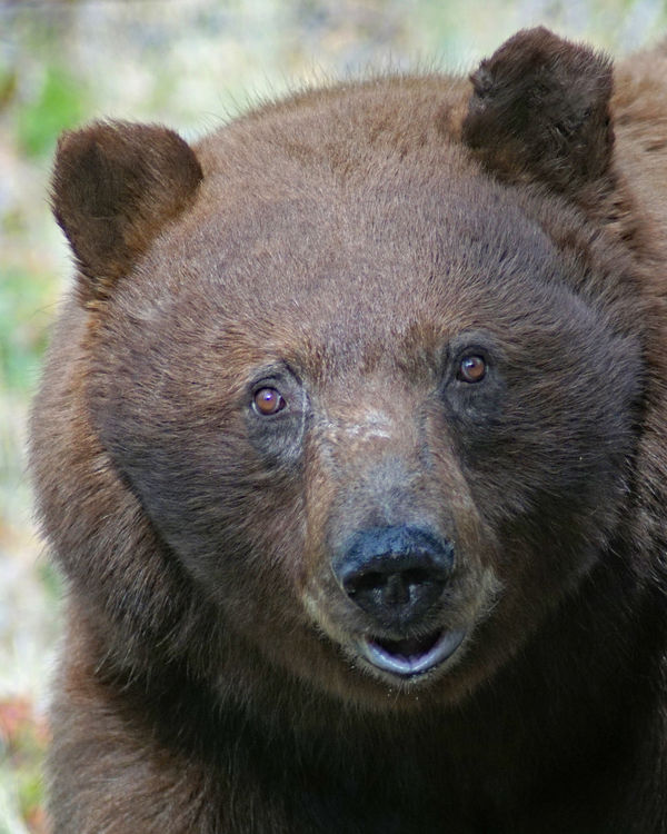
Cropped, maybe lightened a little
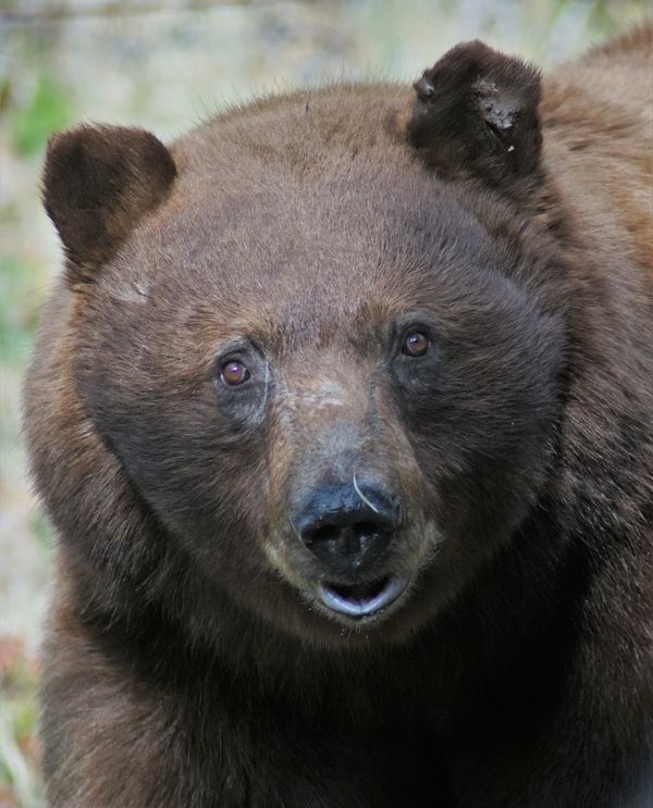
(Download)
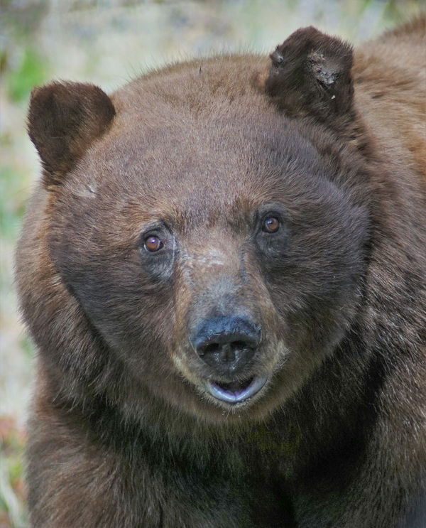
Cloned but no haze removal
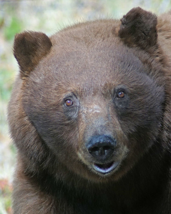
(Download)
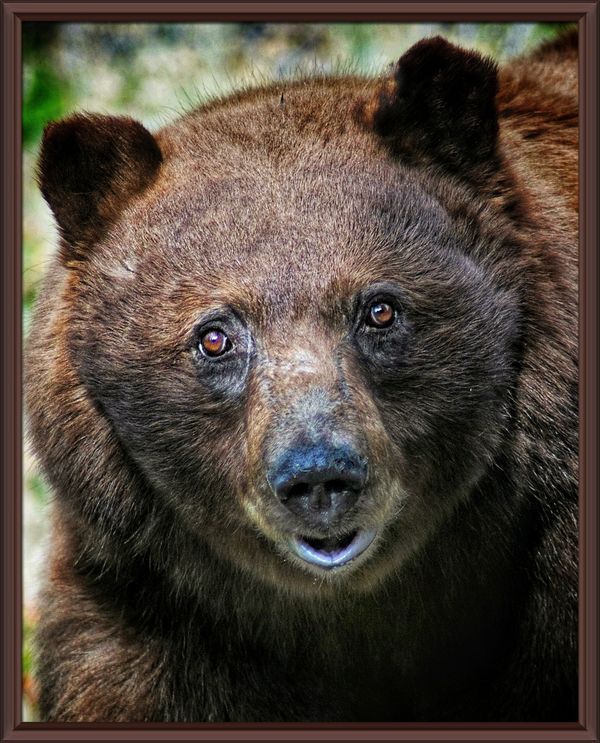
with haze removal
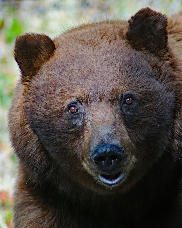
(Download)
May 21, 2019 17:37:22 #

Did you use the auto haze removal, or the haze removal that's further down the list? The second one offers two sliders: amount of haze reduction and sensitivity.
Below is with the first slider set about 1/4 of the way across and sensitivity halfway.
After that, try the adjust sharpness tool. Lots of sliders there
Below is with the first slider set about 1/4 of the way across and sensitivity halfway.
After that, try the adjust sharpness tool. Lots of sliders there
May 21, 2019 17:43:09 #

I'd take Linda's suggestion, and experiment with different amounts of adjustments, to get what YOU are after. Yes, usually some exaggeration is necessary to convey what we saw or want to express, but too much becomes a distraction. What painters can do by scraping and overpainting, photographers have to do my making multiple versions for the platform they want, then choosing and/or refining some more.
May 21, 2019 18:59:34 #
 I'd say that you're well on your way! The suggestions sound excellent as well!
May 21, 2019 20:30:23 #
Headslap - missed the sliders for some reason. I knew my problem would be identified quickly here.
Thanks, guys.
ron
Thanks, guys.
ron
May 22, 2019 05:59:09 #
cucharared wrote:
Headslap - missed the sliders for some reason. I knew my problem would be identified quickly here.
Thanks, guys.
ron
Thanks, guys.
ron
Good with V8 juice! https://www.youtube.com/watch?v=J-pyGdJCV04
May 22, 2019 11:21:12 #
It looks like your answer although would like to suggest some additional information. When you use the Dehaze tool everything in the picture will change. All the colors are enhanced, drawn out, many times unrealistically.
I think what you were looking for with this picture was sharpness. I went about it differently. I changed sliders in Camera Raw - Contrast +8, Shadows +98, Blacks -2. Next under Sharpening - Amount 69, Radius 1.0, Detail 25, Masking 13. If at this point it looks too light to you add just a bit of exposure. I used Photoshop to fix the white line in and about the nose using the Spot Healing Brush, quick fix. Watch the exposure as you mentioned you are going to make a print of your picture. I have found all my pictures when printed are a bit darker. So when I am happy with a picture I make one more adjustment to lighten the print file about a half a stop.
I think what you were looking for with this picture was sharpness. I went about it differently. I changed sliders in Camera Raw - Contrast +8, Shadows +98, Blacks -2. Next under Sharpening - Amount 69, Radius 1.0, Detail 25, Masking 13. If at this point it looks too light to you add just a bit of exposure. I used Photoshop to fix the white line in and about the nose using the Spot Healing Brush, quick fix. Watch the exposure as you mentioned you are going to make a print of your picture. I have found all my pictures when printed are a bit darker. So when I am happy with a picture I make one more adjustment to lighten the print file about a half a stop.
May 22, 2019 11:49:12 #

Are you trying to do it all using just the dehaze tool? I always used dehaze at the end of my edit when needed. You're better going thorough the usual procedures to add pop and to get the light levels right, then finish off with a touch of dehaze if needed.
What I found with Lr's dehaze is that if you pushed it, the darks would go too dark and I would mitigate that by lifting the blacks slightly. But if you've done your other processing properly, most shots only need a touch of dehaze, if any.
What I found with Lr's dehaze is that if you pushed it, the darks would go too dark and I would mitigate that by lifting the blacks slightly. But if you've done your other processing properly, most shots only need a touch of dehaze, if any.
May 22, 2019 13:30:30 #
cucharared wrote:
I posted one of these in the Photo section but thi... (show quote)
I really like your second shot the best. The third looks over-processed. I might also suggest a bit of burning on the forehead with a large brush and the exposure (adjusted at the top near the brushes) set at about 35%-50%. For a final touch I would select the eyes (just the eyes and do them separately) and sharpen a bit. That will make them pop which is important for a portrait.
Erich
May 22, 2019 14:00:04 #

A "portrait" of Mr. Bear suitable for framing and hanging proudly!
May 22, 2019 14:33:11 #
E.L.. Shapiro wrote:
A "portrait" of Mr. Bear suitable for framing and hanging proudly!
May 22, 2019 18:59:52 #
cucharared wrote:
I posted one of these in the Photo section but thi... (show quote)
Hi Ron,
Great bear capture, one I wish I had made myself.
Just my opinion, but image 1 and 2 are too flat for my taste. I agree that the dehaze tool on image 3 looks slightly over-processed.
I don't think you need to use the dehaze tool at all. IMO, all that is needed is a little tone adjustment, sharpening and some dodging and burning around the bear's face to add a little depth to the image.
The areas I would modify would be to reduce the bright area behind the bear and to the right of the it's head. I find the bright areas distracting. I would pull out some of the detail in the shadows under the bears head. Then I would apply a little overall sharpening, but concentrate on the bears eyes. I would consider a vignette to focus the viewer onto the bears face, which, after all, is the subject. Since it looks like the light is coming from the left, I would D&B to emphasize the facial shadows adding a little depth the face. I would finish up by slightly increasing global contrast until I was satisfied with the final result.
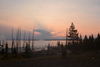
Here is an example where no dehaze was used. I generally don't use dehaze except for adding pop to white puffy clouds.
Mike
May 23, 2019 00:42:55 #
Jim-Pops wrote:
It looks like your answer although would like to s... (show quote)
Thanks, Jim-Pops. Good info. I'm still stumbling around learning the fundamentals. All this info helps.
ron
May 23, 2019 00:44:53 #
R.G. wrote:
Are you trying to do it all using just the dehaze ... (show quote)
I was just trying out the dehaze in PSE. I didn't even notice the sliders, just that the result was too over-processed looking. Thanks for the info. I'll try to use other methods before dehazing.
ron
May 23, 2019 00:46:01 #
ebrunner wrote:
I really like your second shot the best. The third looks over-processed. I might also suggest a bit of burning on the forehead with a large brush and the exposure (adjusted at the top near the brushes) set at about 35%-50%. For a final touch I would select the eyes (just the eyes and do them separately) and sharpen a bit. That will make them pop which is important for a portrait.
Erich
Erich
Again, excellent info for me to try next time. Thanks.
ron
If you want to reply, then register here. Registration is free and your account is created instantly, so you can post right away.