Which one
May 6, 2019 13:15:06 #
May 6, 2019 13:18:33 #

May 6, 2019 13:32:55 #

May 6, 2019 13:38:46 #

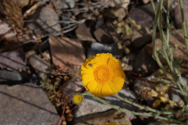
no contest # 1 And the close-up shows how vibrant a bit of cropping will make it.
May 6, 2019 14:25:00 #

May 6, 2019 19:07:55 #

May 7, 2019 06:24:22 #


May 7, 2019 08:04:20 #

May 7, 2019 08:06:32 #

May 7, 2019 08:13:34 #

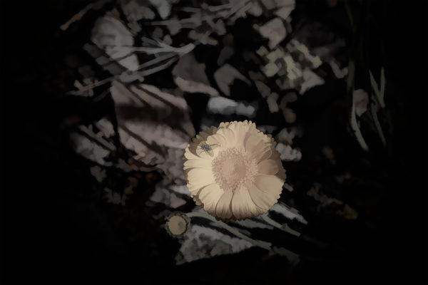
I’d suggest saturation about half-way between the two...1+2=3 3/2 = about # 1.5
Dave
Dave
May 7, 2019 08:28:48 #

The first one--the second comes off as flat. I think it would have been better had you gone to black and white.
May 7, 2019 08:47:10 #

May 7, 2019 10:03:49 #

May 7, 2019 12:33:31 #

May 8, 2019 19:58:39 #

If you want to reply, then register here. Registration is free and your account is created instantly, so you can post right away.