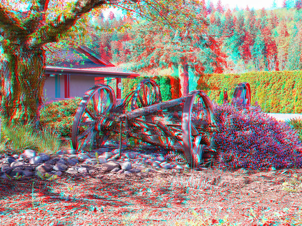
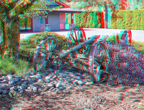
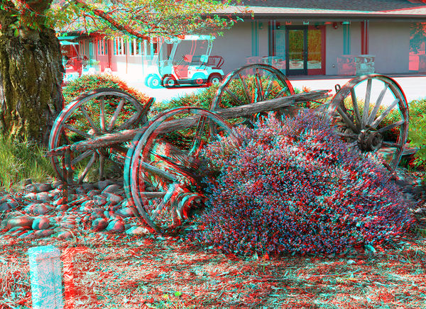
3D - Very Old Western Wagon.
Apr 25, 2019 09:49:11 #

You will need a pair of anaglyph glasses to view in 3D.
3D Pictures created from several adjacent photos.
3D Pictures created from several adjacent photos.
Apr 25, 2019 10:18:42 #

Apr 25, 2019 10:26:03 #

The 3D effect on these is very good. I especially like the first one. Good job. 
Apr 25, 2019 10:48:45 #
EdJ0307 wrote:
The 3D effect on these is very good. I especially like the first one. Good job.
***
Thank you, ED. I was on my knee for the first shot.
Apr 25, 2019 10:56:29 #

These look pretty cool. Better no doubt with those special glasses. When can one find them?
Apr 25, 2019 11:57:31 #
AJFRED wrote:
These look pretty cool. Better no doubt with those special glasses. When can one find them?
***
Amazon or you can find them by doing a search on the Web.
Apr 25, 2019 11:58:25 #
Silverman wrote:
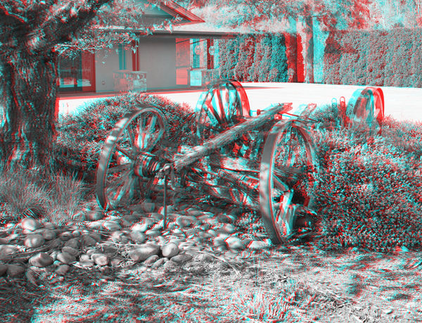
Would B&W worked well for this Photo?
**
I have taken the time to do a conversion to B&W I hope you like it in B&W.
Apr 25, 2019 12:53:58 #
SoHillGuy wrote:
I downloaded this and the color version in separate tabs and flipped back and forth between them. Although the B&W is nice I prefer the color version better with the green foliage. That's me anyway.**
I have taken the time to do a conversion to B&W I hope you like it in B&W.
I have taken the time to do a conversion to B&W I hope you like it in B&W.
Apr 25, 2019 15:23:11 #
EdJ0307 wrote:
I downloaded this and the color version in separate tabs and flipped back and forth between them. Although the B&W is nice I prefer the color version better with the green foliage. That's me anyway.
***
Me Too.
However, there are times when Black & White can enlighten you on certain subjects.
https://digital-photography-school.com/what-subjects-are-good-for-black-and-white-photography/
Apr 25, 2019 16:09:00 #

SoHillGuy wrote:
***
Me Too.
However, there are times when Black & White can enlighten you on certain subjects.
https://digital-photography-school.com/what-subjects-are-good-for-black-and-white-photography/
Me Too.
However, there are times when Black & White can enlighten you on certain subjects.
https://digital-photography-school.com/what-subjects-are-good-for-black-and-white-photography/
I like both versions.
I think a lot more can be said for B&W than was stated in the article.
There are plenty of times when B&W can be an improvement.
This may be a good example of distracting colors. The relatively colorless wagon is the primary subject but the green vegetation draws the viewer's attention away from it.
Apr 25, 2019 17:25:05 #
selmslie wrote:
I like both versions.
I think a lot more can be said for B&W than was stated in the article.
There are plenty of times when B&W can be an improvement.
This may be a good example of distracting colors. The relatively colorless wagon is the primary subject but the green vegetation draws the viewer's attention away from it.
***
I have the feeling that the color of the green shrub and the colored bush on each side of the wagon focuses my attention towards the wagon between them.
Apr 26, 2019 09:58:26 #
The first and second are spot-on to me. In the third one I had a lot of trouble getting the golf cart to focus which is a pity since the lavender was fully in focus.
Apr 26, 2019 10:01:15 #
DragonsLady wrote:
The first and second are spot-on to me. In the third one I had a lot of trouble getting the golf cart to focus which is a pity since the lavender was fully in focus.
***
That is interesting as I have no problem with seeing it in focus.
Apr 26, 2019 11:09:22 #
DragonsLady wrote:
The first and second are spot-on to me. In the third one I had a lot of trouble getting the golf cart to focus which is a pity since the lavender was fully in focus.
If you back away from the screen it might help.
The only I have problem with the third image is the white post in the lower left corner. It must have been too close to the camera.
Apr 26, 2019 12:15:08 #
selmslie wrote:
If you back away from the screen it might help.
The only I have problem with the third image is the white post in the lower left corner. It must have been too close to the camera.
The only I have problem with the third image is the white post in the lower left corner. It must have been too close to the camera.
***
If you concentrate your view on the post in question it will come into focus and seem to be floating outside of the picture.
If you want to reply, then register here. Registration is free and your account is created instantly, so you can post right away.