Using Color-Grading to Increase Image Contrast
This topic is locked to prevent further replies.
Apr 16, 2019 11:04:43 #
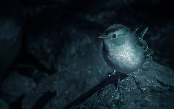
This image spawned from my participation in the Use of Light and Dark Challenge in the Post-Processing Digital Images section.
http://www.uglyhedgehog.com/t-587279-1.html
I had not heard of chiaroscuro (Italian for light-dark), but I am aware of the strength or even importance of using shadows and highlights or whites and blacks to create strong contrast. So I snooped around YouTube and found a tutorial on using Lightroom to create a moody style Color-grade. In the past I’ve dodged and burned and used luminosity masks to create image drama, but watching this tutorial I became aware of using color-grading and brushes as well.
The tutorial was entitled “To Edit Like Dylan Fursty On Instagram.”
http://www.youtube.com/watch?v=FeCE7Zw7_jU&list=PLgBEIQRS9aBK2_8WXytnXsPmq2768Zf-e&index=13&t=0s
This is my first attempt at that process. I used Lightroom’s basic panel to desaturate green and color-grade the image, split toning to increase the blues, calibration for more effect, HSL for color adjustment, and curves to add some contrast. Selected brightening in the image was created using the elliptical tool and brushes; and finally Photoshop for fine tuning.
Apr 16, 2019 12:31:12 #

A highly engaging result! Thanks so much for your time in putting this together, Claud.
Apr 16, 2019 12:49:44 #
Linda From Maine wrote:
A highly engaging result! Thanks so much for your time in putting this together, Claud.
My Pleasure!
The color-grading process is elaborate, so to save time for the next image I created a Lightroom develop preset and three brush presets.
I'd be happy to share those with anyone who might be interested.
Thanks!
Apr 17, 2019 12:22:09 #
Crichmond wrote:
This image spawned from my participation in the b... (show quote)
Very cool image and process. I love the subdued teal and orange colors of Dylan Furst images. I'll be trying this more often. Thanks for sharing.
Mike
Apr 17, 2019 12:37:11 #
SalvageDiver wrote:
Very cool image and process. I love the subdued teal and orange colors of Dylan Furst images. I'll be trying this more often. Thanks for sharing.
Mike
Mike
My pleasure!
If you want to reply, then register here. Registration is free and your account is created instantly, so you can post right away.