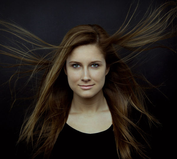
Winds of War (Studio Portrait)
Feb 14, 2013 15:30:54 #
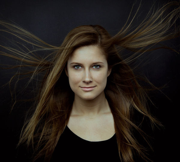
Finally got my daughter back in the studio. This was a new 4 light setup I was working on. We adjusted the lights quite a bit to get the feeling right. The goal was to give the photo an old Estate(above the fireplace) look. It ended up having a slight touch of the Adams Family look as well.
It's probably going to get downsized. I just liked this crop.
Comments welcome.
It's probably going to get downsized. I just liked this crop.
Comments welcome.
Winds of War
Feb 14, 2013 15:51:36 #
Nice work, love the lighting...and how did you get that hair?..obviously a fan? oh and great model!
Feb 14, 2013 16:06:24 #
Feb 14, 2013 16:18:36 #

Feb 14, 2013 16:23:23 #
Feb 14, 2013 16:25:45 #

Feb 14, 2013 17:14:34 #

PalePictures wrote:
Finally got my daughter back in the studio. This was a new 4 light setup I was working on. We adjusted the lights quite a bit to get the feeling right. The goal was to give the photo an old Estate(above the fireplace) look. It ended up having a slight touch of the Adams Family look as well.
It's probably going to get downsized. I just liked this crop.
Comments welcome.
It's probably going to get downsized. I just liked this crop.
Comments welcome.
Your daughter is beautiful. She's a great model.
Feb 14, 2013 17:22:48 #

Feb 14, 2013 18:32:03 #

Wendy2 wrote:
Very cool!!
I agree with Wendy and add, Way Cool!
Pat
Feb 14, 2013 18:50:36 #
PalePictures wrote:
Finally got my daughter back in the studio. This was a new 4 light setup I was working on. We adjusted the lights quite a bit to get the feeling right. The goal was to give the photo an old Estate(above the fireplace) look. It ended up having a slight touch of the Adams Family look as well.
It's probably going to get downsized. I just liked this crop.
Comments welcome.
It's probably going to get downsized. I just liked this crop.
Comments welcome.
Great shot, great artistry and beautiful lady. :thumbup: :thumbup: :thumbup:
Feb 14, 2013 20:18:30 #

Those eyes are so intense, reminds me of that famous Nat. Geo photo from years back. She is a stunner and your work is always so good.
Feb 14, 2013 20:37:28 #

Feb 14, 2013 20:46:02 #
Thanks so much for commenting everyone. I have to tell you that I was dissapointed in the upload. Both here and on my website. I corrected the photo in both places. The photo did not accurately represent the soft tones I was getting in Photoshop. Apparently the conversion to jpeg caused my photo to be a little less soft and more contrasty than what I wanted or was seeing. I decided to try another jpeg conversion with a little better quality in the jpeg file to alleviate the discrepancy. I really struggle to try to create images that are moving. I hope this second rendition has a little softer feel and better represents what I was seeing in my PSD format. I know some may or may not like it better.
I hope it shows up different after the downsize.
Please comment if you can see any difference! Which one you like better?
Yes, I put my pants on and struggle just like everyone else.
Russ
Well it looks like no difference. It's the downsizing and conversion. I gotta figure this one out.....
I hope it shows up different after the downsize.
Please comment if you can see any difference! Which one you like better?
Yes, I put my pants on and struggle just like everyone else.
Russ
Well it looks like no difference. It's the downsizing and conversion. I gotta figure this one out.....
FInal warmer Softer version
Feb 14, 2013 21:08:25 #

Terrific shot, love the hair and the lighting. I don't see much difference between the two shots, flipping back and forth. However, in both, her skin tones on my monitor are almost a corpse-like shade of very pale green. As you referenced the Addams Family, maybe it's intentional, but in my mind, not very flattering, no offense to your beautiful daughter.
The portrait does capture her eyes in a wonderful manner, really striking. But I can't get past the skin tone, tho again, could just be my monitor.
The portrait does capture her eyes in a wonderful manner, really striking. But I can't get past the skin tone, tho again, could just be my monitor.
Feb 14, 2013 21:16:28 #
Treepusher wrote:
Terrific shot, love the hair and the lighting. I ... (show quote)
Yep the tones are off here. It was meant to be slightly off just not that much. I am really struggling with RGB now. Still working on my color.
The color overtones on my website seem to better represent what I was going for. I really need to look at these photos on different monitors. My MAC is calibrated. I have a Linux machine that is not. I think I'm going to boot it up to take a look.
Thanks for the feed back Treepusher. I'm all about quality.
If you want to reply, then register here. Registration is free and your account is created instantly, so you can post right away.