I was at it again...
Feb 7, 2013 20:26:58 #

... still trying to conquer tabletop/still life and glass!
What do you think?
What do you think?
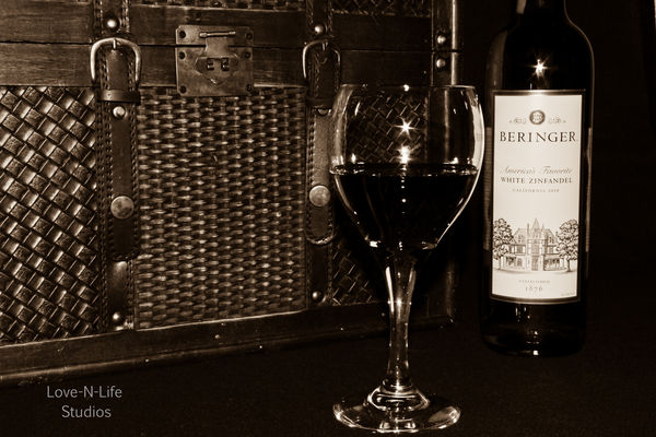
sepia treatment
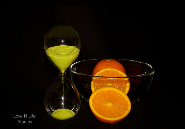
even through glass, the orange slice turned out pretty good imo

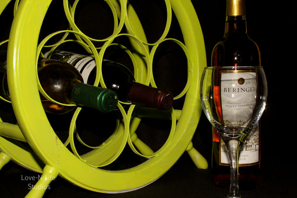
just for fun... I kinda like the label through the glass...
Feb 7, 2013 20:44:41 #

Wonderful photos, Theresa! I especially like the 2nd one, the sepia tone. The all meet or exceed your usual high standards!
Thank you so much for sharing!
Thank you so much for sharing!
Feb 7, 2013 20:46:18 #

Nice T !!!! Great setups and the colors are wonderful. In the first one and the last one. You cun off the bottom of the glasses. I am picky I know:):)
Erv
Erv
Feb 7, 2013 20:48:46 #
Feb 7, 2013 21:13:02 #
Feb 7, 2013 23:03:49 #

Feb 8, 2013 00:03:41 #

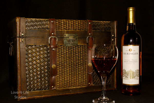
While these are nice, there are two things that can use some improvement. One of the things about outstanding still life images would be the 3-D nature of the image by use of shadows allowing shape and form to anchor in the image. Some additional lighting is needed to create shadow, shape and form, while allowing the subjects to anchor and not float. For example the trunk in the wine images seems to float in a sea of undefined black.
The second thing that is so very important with still life images is an absolute attention to detail. This attention to detail is what allows us to create a still life image that is real and not staged. Here again I refer to the wine images, where a glass of red wine is sitting with an "un-opened" bottle of Beringer's White Zinfandel. . .as the label indicates, is a white wine. To make this image "real", the bottle needs to be opened, and be a bottle of red wine to match what is in the glass. The details hold a still life together. Maybe lipstick on the rim of the wine glass could add to the truth of the image?
By the way, the Beringer winery, in the Napa Valley, is a wonderful place to visit. Great photo ops.
Keep up the good fight. Make your still life images come alive with truth, view your images upside down for a more clear idea of your image.
Feb 8, 2013 06:41:57 #
mooseeyes wrote:
While these are nice, there are two things that ca... (show quote)
___________________________________
Thank you so much!
I really appreciate your helpful comments/critique and definitely understand what you mean about the box "floating". I had the intention of working more with this on a character-laden wooden table... a different color of wood... that might remedy this situation.
My primary focus in this series was, again, glass and finding a way to eliminate the glare from lights which I don't want but didn't want to go too far overboard with that.
BTW- the wine in the glass IS Beringer's White Zin (which I considered a "blush"??).
I have a BIG, OPENED bottle I took it from to fill the glass *blush*. It never occurred to me that someone would give any heed to that detail... so I can't thank you enough for pointing it out.
Still life should set a scene and be believable... and I didn't carry it far enough.
I'm going to try this again in earnest, keeping in mind your suggestions regarding shadow and lighting, especially. :)
Feb 8, 2013 06:44:54 #
Erv wrote:
Nice T !!!! Great setups and the colors are wonderful. In the first one and the last one. You cun off the bottom of the glasses. I am picky I know:):)
Erv
Erv
_________________________
*snickers*
I KNEW the moment I posted the one with the foot cut out, that someone would comment about it lol. I'm picky too (and the first one does show the foot, albeit very close to the bottom).
However, I wanted the focus of the shot to be more of a close-up of the label through the glass, so chose the lesser of the two evils, so-to-speak. Perhaps I chose the wrong one ;)
I really appreciate your comment and critique, Erv. Thanks much :)
Feb 8, 2013 06:47:33 #
Danilo wrote:
Wonderful photos, Theresa! I especially like the 2nd one, the sepia tone. The all meet or exceed your usual high standards!
Thank you so much for sharing!
Thank you so much for sharing!
______________________________
Wow! :)
Thank you!
(I had this little bet with myself that the sepia toned version would go over bigger with men and the colored version would probably appeal more to women... but I'm finding that theory not-so-supported! :) )
Feb 8, 2013 06:48:28 #
Many thanks to Tim, Ian and Sarge, too for peeking and your kind comments :)
Feb 8, 2013 07:13:00 #

I looked and studied them and was ..........................
speechless, for a while. I like 3 and 4 best. I think the chest detracts in 1 and 2. In 3 and 4 the orange color against the black background is stunning! I don't know how you get that black background, but I REALLY like it.
I think one of the best photos I have seen on this forum was by Lez I think, of a red apple with side light and a pitch black background.
Thanks Tilde, for helping all of us grow in photography!
---Beagleman
Feb 8, 2013 07:33:34 #

tilde531 wrote:
... still trying to conquer tabletop/still life and glass!
What do you think?
What do you think?
Ya did real good!
Feb 8, 2013 07:42:56 #

Danilo wrote:
Wonderful photos, Theresa! I especially like the 2nd one, the sepia tone. The all meet or exceed your usual high standards!
Thank you so much for sharing!
Thank you so much for sharing!
I agree, I love this 2nd one!
Feb 8, 2013 08:26:53 #

Well done! Great work on these. I'd like to try duplicating your efforts here, but there's no way.
The darned cats would drink up all the wine, and then spend the night playing cards and ordering pizza. I wouldn't get anything done.
The darned cats would drink up all the wine, and then spend the night playing cards and ordering pizza. I wouldn't get anything done.
If you want to reply, then register here. Registration is free and your account is created instantly, so you can post right away.