Check out Film Photography section of our forum.
Original to a Portrait
Feb 2, 2013 13:24:38 #

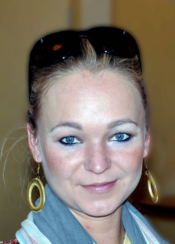
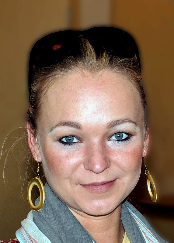
First see the original than the portrait. Would like you to give general critique on what you think.
original

portrait

Feb 2, 2013 13:27:34 #

sab2101 wrote:
First see the original than the portrait. Would like you to give general critique on what you think.
Very nice, great work.
Feb 2, 2013 21:21:15 #

Check out Street Photography section of our forum.
Feb 2, 2013 21:43:45 #

The problem is that it LOOKS like you did what you did. I agree that the blurring over the face is not needed.
Feb 3, 2013 07:50:38 #
Feb 3, 2013 07:51:27 #
Feb 3, 2013 07:53:07 #
Thank you Captain overall there is to much blurring I guess I got to carried away.Thanx......................Mike
Check out Panorama section of our forum.
Feb 3, 2013 08:39:38 #

CaptainC wrote:
The problem is that it LOOKS like you did what you did. I agree that the blurring over the face is not needed.
Captain, can you explain yourself with a little detail?
Feb 3, 2013 08:42:59 #

Three things that jump out at me.
1.) The original isn't sharp at her eyes; that's a must for portraits. You can do almost anything you want if the eyes are sharp.
2.) As was said, the blurring in the second shot wasn't pleasing.
3.) In either case, it SEEMS like you used on camera flash..she has sort of a "deer-in-the-headlights" thing going on...not sure.
Do you have a lens that will open up wide enough to blur backgrounds in a reasonable way?
Feb 3, 2013 08:48:20 #
I thought it was sharp at the eyes in the original, maybe my eyes are not as good as they used to be................Mike
Feb 3, 2013 08:52:14 #
sab2101 wrote:
I thought it was sharp at the eyes in the original, maybe my eyes are not as good as they used to be................Mike
No..it's not. Sorry to be the bringer of bad news.
On my shots, first cut is 100% view, is there good focus?
If not...they get axed immediately.
Check out Digital Artistry section of our forum.
Feb 3, 2013 11:57:21 #

I think #2 face photo crop was over blurred and detracted from the very pretty face n eyes . I just did some fast photshop and this is what I came up with
Feb 3, 2013 12:02:03 #
Feb 3, 2013 12:02:42 #
Feb 3, 2013 15:14:37 #

Fairly quick job, but this is close to how I would handle this one.

If you want to reply, then register here. Registration is free and your account is created instantly, so you can post right away.
Check out Drone Video and Photography Forum section of our forum.