Lookin for some creative Criticism
Jan 27, 2013 21:32:15 #
Straightshooter
Loc: Edmonton AB
I would like some input just to find out what I could have done better

Jan 27, 2013 22:00:45 #

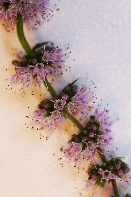
I like your second one, Straightshooter, but I think you're a bit underexposed on both of them. You may be able to "snap" them up a little in PS, or PSE, etc. Nice work, though. Keep it goin'!
Jan 27, 2013 22:09:12 #
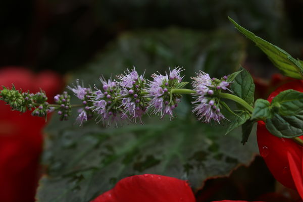
Wow! Your Exif Data indicates 1/13sec. at f-11.0 and ISO 2000! Was it really that dark when you shot this? (Second Image).
I altered it a little and will post the result upon your permission.
I altered it a little and will post the result upon your permission.
Jan 27, 2013 22:17:21 #

I like the second one but like Danilo said a little under exposed the first one does not work for me because the subject is splitting the picture across the middle would have worked better IMHO if it would have went from bottom corner to the opposite upper corner.
Jan 28, 2013 00:15:24 #
Straightshooter
Loc: Edmonton AB
Danilo wrote:
Wow! Your Exif Data indicates 1/13sec. at f-11.0 and ISO 2000! Was it really that dark when you shot this? (Second Image).
I altered it a little and will post the result upon your permission.
I altered it a little and will post the result upon your permission.
Absolutely go ahead
Jan 28, 2013 00:36:03 #
Straightshooter
Loc: Edmonton AB
hangman45 wrote:
I like the second one but like Danilo said a little under exposed the first one does not work for me because the subject is splitting the picture across the middle would have worked better IMHO if it would have went from bottom corner to the opposite upper corner.
You are correct point taken
Jan 28, 2013 01:49:26 #
This may or may not agree with your vision of the image.
BTW: I'm curious as to why your ISO was at 2000?
BTW: I'm curious as to why your ISO was at 2000?
Jan 28, 2013 06:20:20 #
Straightshooter wrote:
I would like some input just to find out what I could have done better
Hi Straightshooter, I like the subject but I agree with Danilo. They are both a tad under exposed and the first one has too narrow a depth of field (imho). The whole plant along its lenght is not in focus because it "bends" a little but that's enough to change it's DoF.
Not trying to be too critical, just help. :D
Jan 28, 2013 11:49:13 #
Straightshooter
Loc: Edmonton AB
Danilo wrote:
This may or may not agree with your vision of the image.
BTW: I'm curious as to why your ISO was at 2000?
BTW: I'm curious as to why your ISO was at 2000?
The first shot was taken outside however this one was taken inside on the dining room table on a Macro stand
Apartment living with windows only on one side and I did not have my ring flash yet
I like what you have done to lighten it, Thank you
I am looking into getting PS-CS6 that is my next project
By the time I am 110 I should know it all. 71 now
Jan 28, 2013 11:52:57 #

I like the 2nd shot, 1st shot does nothing for me, personally. I really like what Danilo did with it.
Jan 28, 2013 12:00:24 #
Straightshooter
Loc: Edmonton AB
MissStephie wrote:
I like the 2nd shot, 1st shot does nothing for me, personally. I really like what Danilo did with it.
Thanks and yes you are right
Jan 28, 2013 12:00:26 #
Straightshooter wrote:
quote=Danilo This may or may not agree with your ... (show quote)
I processed just like I would one of my macro shots I like how the light is white on one side and yellow tint on the other I guess the white side is the one that was facing window.

Jan 28, 2013 12:10:52 #
Straightshooter
Loc: Edmonton AB
hangman45 wrote:
quote=Straightshooter quote=Danilo This may or m... (show quote)
It was that or LED lights from the kitchen on one side and throwing a shadow on the other
Here again it is the light that I did not pay any attention to that really made the differance
Jan 28, 2013 19:35:40 #

Straightshooter wrote:
I would like some input just to find out what I could have done better
Really like #2 except it's needs to be brighter like the couple of changes made, very pretty :-D
Jan 28, 2013 19:40:59 #

There probably isn't much more you can do with that second shot (which is the best one, imo) to balance out the two sides because you have the cooler white light of the window to the right side of the photo and the warmer, yellowy light from the interior light on the other side.
May I download and give it a shot?
It's a great, creative perspective and I think something can be done to salvage it... "artsy"-style.
May I download and give it a shot?
It's a great, creative perspective and I think something can be done to salvage it... "artsy"-style.
If you want to reply, then register here. Registration is free and your account is created instantly, so you can post right away.