Check out People Photography section of our forum.
Which composition is best?
Jan 19, 2013 10:46:03 #


Jan 19, 2013 10:53:11 #

Jan 19, 2013 11:04:46 #
i like number 2 but the image seems distorted a bit what lenses have you used?
Check out Infrared Photography section of our forum.
Jan 19, 2013 11:30:31 #

Jan 19, 2013 11:50:00 #
whiteowl wrote:
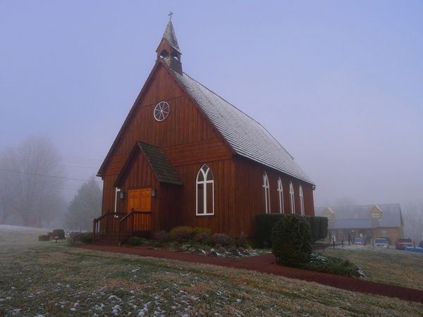
Smokey mountain church on a foggy morning
Of the three, I like #1 the best.
IMO, #2 is good but the stuff in the background is distracting to the subject and #3 is too busy?
Which do you like the best?
Jan 19, 2013 11:54:08 #

I found #2 to be a very lovely shot, but do agree that the perspective was a tad off. In the original you can see that the outside walls slant in as they go up. I used a perspective adjustment in CS5 to pull them back out. The other shots are also nice but I feel they hid the church rather than high lite it.

Jan 19, 2013 12:15:40 #

whiteowl wrote:
Smokey mountain church on a foggy morning
I believe #1 has the best composition of the three. You may want to experiment by cloning out some of the lower branches near the main subject to see how it looks. Nice photo, well done. :thumbup:
Check out Commercial and Industrial Photography section of our forum.
Jan 19, 2013 13:50:12 #

whiteowl wrote:
Smokey mountain church on a foggy morning
#1 like the framing best.
Jan 19, 2013 14:37:11 #
ftpecktim
Loc: MONTANA
CajonPhotog wrote:
I found #2 to be a very lovely shot, but do agree that the perspective was a tad off. In the original you can see that the outside walls slant in as they go up. I used a perspective adjustment in CS5 to pull them back out. The other shots are also nice but I feel they hid the church rather than high lite it.
He asked witch composition was best. Didn't see where he asked to have them messed with.You need to review the rules again........Number three for me..Nice shots.
Jan 19, 2013 14:44:41 #
Quote:
He asked witch composition was best. Didn't see where he asked to have them messed with.You need to review the rules again........Number three for me..Nice shots.
Oops, sorry. Will look closer next time. thanks for the heads up.
Jan 19, 2013 15:10:34 #

whiteowl wrote:
Smokey mountain church on a foggy morning
IMHO, #3 displays the best composition. The path below and tree on the left along with its branches frames the church in a way to draw the eye into the image. Nicely done whiteowl.
Check out Advice from the Pros section of our forum.
Jan 19, 2013 15:39:14 #

Jan 19, 2013 16:31:06 #
Number one for me but I wish you were a little lower as the cross and part of the steeple are behind a branch and this is a minus for me.
Jan 19, 2013 19:22:32 #
whiteowl wrote:
Smokey mountain church on a foggy morning
Number 3. The framing kinda traps your eye on the church. You have no doubt as to the subject of this picture.
Larry
Jan 19, 2013 23:57:03 #
docrob
Loc: Durango, Colorado
whiteowl wrote:
Smokey mountain church on a foggy morning
#1.
#2 is just a building in fog
#3 tells me you liked the scene better with the tree too but weren't sure how to use it.
#4 How come no vertical compositions?
If you want to reply, then register here. Registration is free and your account is created instantly, so you can post right away.
Check out Film Photography section of our forum.