Manipulation on two dreadful day photos
Jan 16, 2013 11:57:48 #
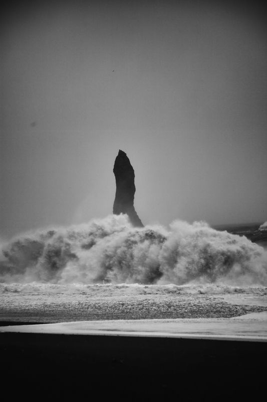
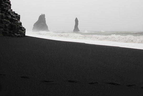
I am wondering how best to make a couple of photos printable? They were both taken in Iceland in pouring rain and strong wind on a black volcanic beach and are therefore very dull (also I should have upped the ISO but didn't!) They were taken with a 5d Mk11, 16-36mm lens: the circular one was f/4.5 @1/50th and -0.7. The rocks one is f/5 @1/200 and -1 step. I have tried working on them, but am sure that there are lots of you who know far more than me, and could do a much better job. I am attaching the original photos plus my feeble efforts. I only have Elements 10. The photos need to show that it was a horrible day i.e. to keep the atmosphere, and that it is a black beach. Any advice very gratefully received! :o) PS Sorry, a bit "phallic" but that's how it was!
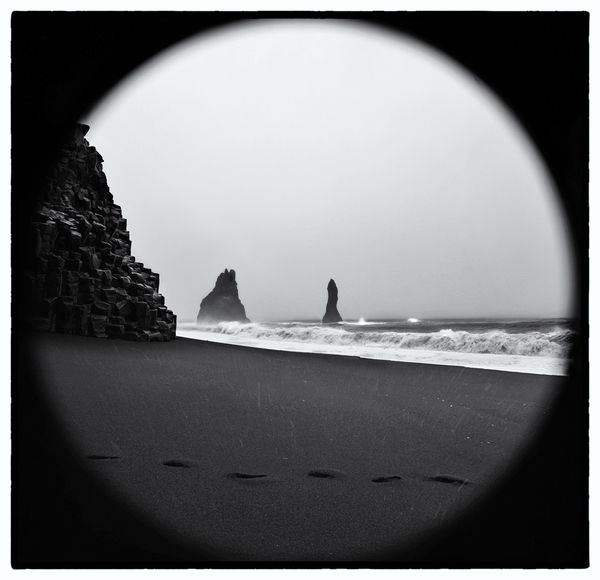
Black Sand beach with Robinson Crusoe's footsteps edited
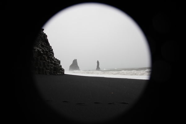
Same photo original
Rock, sea and black beach Edited
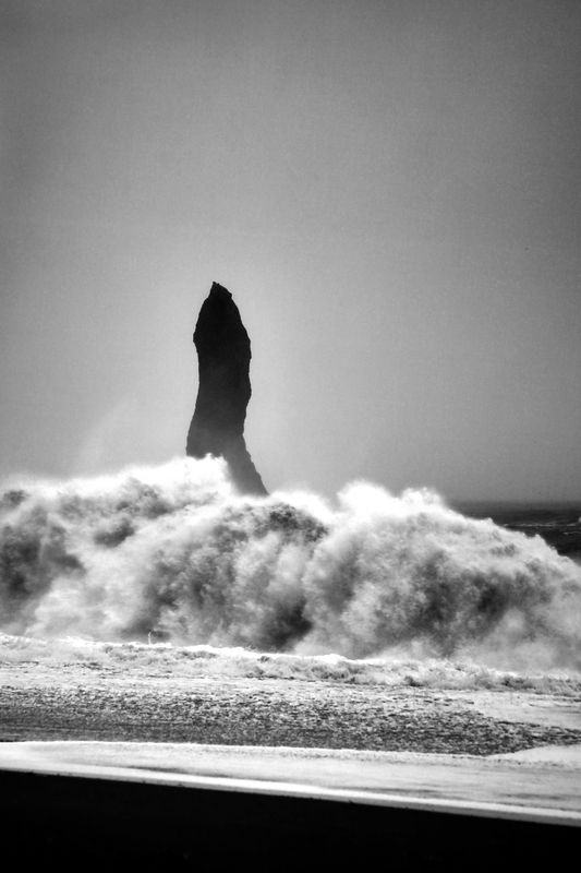
Single rock original
Jan 16, 2013 12:37:23 #

You might try playing with the contrast a bit, but I am afraid they are what they are. I also see what looks like some sensor spots on the last one.
Jan 16, 2013 16:52:18 #
Thanks, you're right about the sensor spot, but that is on the original. You will see that I cloned it out on the edited version.
Jan 16, 2013 19:18:23 #
photosarah wrote:
Thanks, you're right about the sensor spot, but that is on the original. You will see that I cloned it out on the edited version.
Sorry I didn't read the captions well.
Jan 17, 2013 08:35:23 #
RichieC
Loc: Adirondacks
Have they been converted to black and white? That's ok, in fact I prefer B&W for this sort of thing, however, getting detail out of an image using the color channels before you convert to B&W is the preferred way.
It's a cool shot... the sensor spot is an easy fix.
It's a cool shot... the sensor spot is an easy fix.
Jan 17, 2013 08:57:32 #

I have had shots with a similar range of white to gray to black and made them stand out more by changing that range via a curves layer. I use photoshop rather than elements, but believe that the process is similar.
In photoshop, I add a curves adjustment layer to the picture. That will bring up a histogram, and you will see in this kind of picture that the histogram only occupies a portion of the left-to-right scale. Don't adjust the curve anywhere in its middle, just at the two end points. Take the right upper end of the curve and move it to the left until it reaches the point where the histogram starts to "jump". Then take the lower left end of the curve and move it to the right to the point where the histogram starts to "jump".
This will reduce the fog/haze a bit and intensify the rocks. I think you will like the result.
Jan 17, 2013 09:02:00 #
Here's my attempt. Cropped, then cloned in missing beach on corners. Cleaned up a lot of what looks like noise. Could have done more but wasn't sure what was noise and what was beach. Increased contrast and adjusted lighting a bit, but kept it gray instead of brightening surf and sky. Also cloned in some missing footprints as they come in from the right. All done with PSE9.
Jan 17, 2013 12:22:08 #
RichieC wrote:
Have they been converted to black and white? That's ok, in fact I prefer B&W for this sort of thing, however, getting detail out of an image using the color channels before you convert to B&W is the preferred way.
It's a cool shot... the sensor spot is an easy fix.
It's a cool shot... the sensor spot is an easy fix.
No the images are not converted to b/w. The rain and lack of light, and the black rocks and sand, make them naturally b/w. But thanks for your comment anyway.
Jan 17, 2013 12:34:09 #
mdeman wrote:
Here's my attempt. Cropped, then cloned in missing beach on corners. Cleaned up a lot of what looks like noise. Could have done more but wasn't sure what was noise and what was beach. Increased contrast and adjusted lighting a bit, but kept it gray instead of brightening surf and sky. Also cloned in some missing footprints as they come in from the right. All done with PSE9.
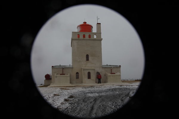
Thanks mdeman. That's a good job you did, and thanks very much for taking the time to do it. The reason that the image was circular is that because of the driving rain, I deliberately used a long lens hood on a wide angle lens, which means that of course there wasn't enough angle and the camera photographed the end of the lens. For this particular picture, it is probably better the way you have done it, but for a couple of others, it is quite neat to have the circle. I've attached a photo to show what I mean, although this photo is just a record shot - a "we were here" photo. This has not been edited.
Lighthouse above the beach
Jan 17, 2013 12:40:49 #
PrairieSeasons wrote:
I have had shots with a similar range of white to ... (show quote)
Thanks PrairieSeasons. All new ideas to me, and I'm not sure that I understand what you mean by "histogram starts to jump", but maybe as I try and follow your advice, it will become obvious. I'll give it a go tomorrow, as I have time.
Jan 17, 2013 12:44:01 #
photosarah wrote:
quote=PrairieSeasons I have had shots with a simi... (show quote)
I don't have a good way to describe that without pointing at an example. At the ends of the histogram, the value is zero (or nearly so), and the "graph" you see stays at the bottom. When I say the histogram "jumps" is at the point at either end where the values start to become greater than zero and the graph makes sudden moves up. Hope that helps.
I'd do one and post it, but won't be at my PS computer until tonight.
Jan 17, 2013 13:38:11 #

You will get some great recomendations on this thread. I only want to suggest that you look at Jack Grahm's website to get some ideas for what you may want to make the image look. Jack leads photo tours in Iceland. Jack spoke at my camera club and I was impressed with his images and his advice for photography.
Jan 17, 2013 16:11:47 #

I'll give it a shot but it would be better to work with the full colour versions with no adjustments at all.
Jan 17, 2013 17:13:48 #
mcveed wrote:
I'll give it a shot but it would be better to work with the full colour versions with no adjustments at all.
Hi mcveed. There was no "full colour version". If you check, you will see that I posted the original photos without adjustments, just as they came out of the camera (i.e. the "negatives"), plus my effort to lighten and brighten them without making them look too bright. But I would be very interested to see what you can make of them: probably much better than mine! Thank you for taking the time.
Jan 17, 2013 17:15:01 #
chapjohn wrote:
You will get some great recomendations on this thread. I only want to suggest that you look at Jack Grahm's website to get some ideas for what you may want to make the image look. Jack leads photo tours in Iceland. Jack spoke at my camera club and I was impressed with his images and his advice for photography.
Thank you for the suggestion, chapjohn. I looked at Jack's website and agree with you, his images are lovely.
If you want to reply, then register here. Registration is free and your account is created instantly, so you can post right away.