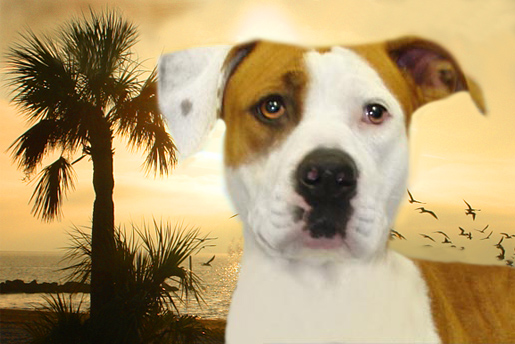
This is a portrait of a shelter dog imposed over a picture
Jan 12, 2013 22:57:05 #
Jan 12, 2013 23:00:28 #

I think that looks great. Very inviting and may attract someone that loves the beach and would love to run with their new dog. The color scheme is very attractive.
Jan 12, 2013 23:08:53 #
Jan 12, 2013 23:15:59 #
john439 wrote:
Thanks Wendy...was going for a good color blend.
You definitely achieved it! Very pleasing :)
Jan 13, 2013 07:30:46 #
Jan 13, 2013 10:58:52 #
PIPDYOUNGER
Loc: SUNDERLAND NORTH EAST ENGLAND
john439 wrote:
of our beach.......criticisms welcomed
Hi john, I dont do editing so maybe I shouldnt criticise. To me it looks as though its been cut out and imposed, the body looks a bit small. I dont know how hard it is to do. Sorry I hope I have not disappointed you. Hope someone tells me im wrong :cry:
Jan 13, 2013 12:31:50 #
Jan 13, 2013 12:34:42 #
Pip that is the actual size of the body in proportion from the original. I am still trying to improve the "cutout" look....it seems like I have tried everything and this is as close as I have got....anyone else have a suggestion on how I can improve on the cutout look??...Thanks for your comments Pip
Jan 13, 2013 12:49:23 #

The key to making these kinds of composite images look correct is to pick a replacement background where the lighting matches the subject's lighting, as best as possible. Here, the lighting for the subject and the selected background change are in complete conflict. Also, for a more "natural" look, double catch-lights in the eyes generally don't work. I tend to like the more "natural" look of a single catch-light in each eye, which is easy to do by just removing the extra one(s).
Your execution of this was nice and seamless; however, for the reasons stated, I think you just picked the wrong background image. Also, if you are looking to focus on the rescue dog, a backgound with less compeating detail and elements would be a better choice, in that it would not draw attention away from your main subject.
Your execution of this was nice and seamless; however, for the reasons stated, I think you just picked the wrong background image. Also, if you are looking to focus on the rescue dog, a backgound with less compeating detail and elements would be a better choice, in that it would not draw attention away from your main subject.
Jan 13, 2013 15:51:07 #

A nice combo image John. One comment: The dog needs a bit more depth... nose is soft even though the eyes are sharp...and then placed upon a sharp background. I like the thought, however.
Joe
Joe
Jan 13, 2013 15:56:49 #

Well...looking at this two things come to mind:
1.) Why? (or maybe more specifically...what are you trying to convey?)
2.) The actual job technically is generally not great. If the idea is to make it seem that the dog is in this scene then it's not working.
Compositing isn't that easy to do a good job so just keep trying.
1.) Why? (or maybe more specifically...what are you trying to convey?)
2.) The actual job technically is generally not great. If the idea is to make it seem that the dog is in this scene then it's not working.
Compositing isn't that easy to do a good job so just keep trying.
Jan 13, 2013 17:07:21 #
I think it conveys something a bit romantic, the idea of having a dog and taking it to the beach. Therefore the softness is not an issue, but only lends to the romantic feeling one gets when looking at the image.
The emotional value of this photo far outweighs the technical shortcomings. And besides, I am sure you are volunteering your time and skills to help these poor creatures find a good home.
The emotional value of this photo far outweighs the technical shortcomings. And besides, I am sure you are volunteering your time and skills to help these poor creatures find a good home.
Jan 13, 2013 17:45:48 #

Jan 13, 2013 21:17:46 #
john439 wrote:
of our beach.......criticisms welcomed
Nice work John, hope he finds a loving home.
Jan 13, 2013 23:56:03 #
Ok this is Trixie. The pasture in the background is a cow field I took a picture of on the way home tonight.
The pictures I do at the shelter, I always put a infinity background on the #1 picture as it blends well into the webpage and really spotlights the dog.
But some times I get tired of the same thing over and over again and want something with a little imagination and color in the #2 picture, I guess to entertain myself.
Trying to make a picture that make the dog look attractive and is pleasing to the eye. Thanks so much for everyones input.

If you want to reply, then register here. Registration is free and your account is created instantly, so you can post right away.