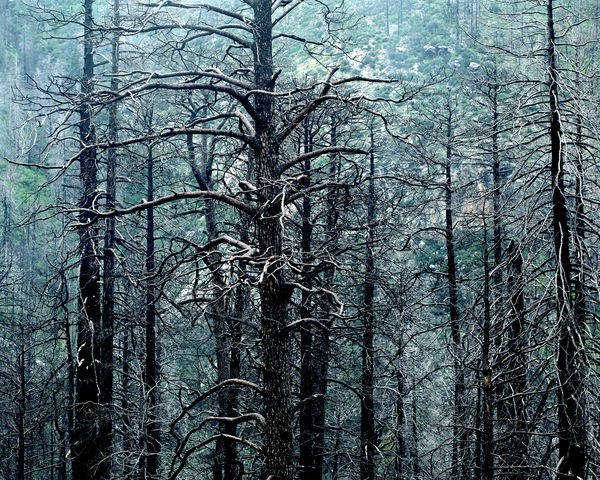
Burned Trees in the Fog
Jan 10, 2013 16:38:20 #
Burned trees in the fog, Santa Catalina Mountains, Arizona.
CC Please.
CC Please.
Jan 10, 2013 17:07:38 #

Sonoran Rat wrote:
CC Please.
C.C. Rider, now see see what you have done !!
There Sonoran Rat, happy now?
Jan 10, 2013 17:14:16 #
Jan 10, 2013 17:30:49 #
Sonoran Rat wrote:
Perfectly
Sonoran, be glad to give you some see see, I mean CC. But can't do it till later tonight.
My phone is only good for giving wisecracks.
PS, I too am an old runner
Jan 10, 2013 17:41:31 #
I really like scenes like this. However, I like them for a different reason than you. I would have shot this showing the ground. I would have used it in a composite.
You are showing the texture/lines and burnt tree as your subject.
The subject would be stronger with the ground present even if the tops of trees are not present.(IMO)
You are showing the texture/lines and burnt tree as your subject.
The subject would be stronger with the ground present even if the tops of trees are not present.(IMO)
Jan 10, 2013 17:58:56 #
Jan 10, 2013 18:39:57 #
Nice SR!! I would crop the right side out a little and make The big tree the main focus. But I do like it as is. Nice textures.
Erv
Erv
Jan 11, 2013 02:23:17 #
Sonoran Rat wrote:
Burned trees in the fog, Santa Catalina Mountains, Arizona.
CC Please.
CC Please.
Rat, still on my Phone but will try to make this CC usefull to you. First I will agree with Pale. You need to anchor the trees. They are floating. Not that it can never work, but we are used to seeing trees in the ground.
I don't think the square crop helps the composition. A 3:2 or close would work better if the photo is clean in those areas, or crop more from the top and bottom. Especailly with no ground.
I'm surprised Erv suggested moving the big tree to center. I thought just the opposit. Move it to the left and take advantage of the 3rds. Your eye will enter from the left side and will freely flow into the rest of the photo, instead of riveting you into the center. You want the viewer to examine the entire scene.
The trees are converging, need straightening.
The color is a little blue. Not realistic, unless you are treating this as a pictorial and not a nature shot.
I would decease the shadows and increase the contrast to make the trees pop against the background. And make the sunny area more sunny on the branches. Would add a little more dimension and depth. Not so flat and compressed.
I can't see it on my phone, but the lenses you list are very sharp, so I will assume it is tack sharp.
Of course this is all just my opinion. Let me know if I helped.
Nice shot though.
Jan 11, 2013 02:28:36 #
As above, it is too 'chopped off' and the most prominent item is too central. You could only get away with such a tight crop for a subject like this, if there was a strong point of interest on the tree, like a bear, or better still, a moose foraging for roast pine cones, of which I understand the moose is very partial.
Jan 11, 2013 11:12:38 #

I agree partially with all of you. For "my eye" I would like to see the composition showing the trees from the ground up and the big tree to the left. I do however really like the blue tint, for me it adds to the picture even if it's not natural. Very striking. Thanks for sharing and I am looking forward to seeing your next take. Cheers
Jan 11, 2013 11:19:30 #
Jan 13, 2013 14:15:26 #
I agree with a vertical orientation on the picture, with the big tree either to the left, or right of center (depending on what is on the other side that has interest. I DO like the blue, but would like to have seen more of the fog that your post says what there.
Jan 14, 2013 00:55:46 #
SharpShooter wrote:
quote=Sonoran Rat Burned trees in the fog, Santa ... (show quote)
Thanks Sharpshooter, The cropping was pretty much dictated by the scene, lots of rocks that limited movement but I agree, I could have made it better, lazy. The blue cast was a light fog and I wanted to keep that in , but it didn't turn out so well. Comments are well taken and appreciated.
Jan 14, 2013 01:02:39 #
Thanks Erv, Trevor Dennis, CResQ, Steve6 and Aubti
Thanks all for replying, please see reply to SharpShooter
Thanks all for replying, please see reply to SharpShooter
If you want to reply, then register here. Registration is free and your account is created instantly, so you can post right away.