monochrome or color
Dec 28, 2012 19:47:40 #
C&C always welcome
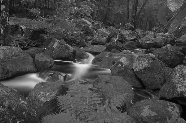
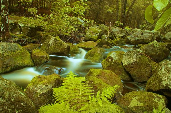
Bear Brook, Allenstown NH
Bear Brook, Allenstown NH
Dec 28, 2012 20:07:25 #

Bruce with a Canon wrote:
C&C always welcome
I think you captured the water flow perfectly. Both of them are great and the download really shows them off. :thumbup: :thumbup:
Dec 28, 2012 20:12:22 #
Bmac wrote:
I think you captured the water flow perfectly. Both of them are great and the download really shows them off. :thumbup: :thumbup:
Bruce with a Canon wrote:
C&C always welcome
I think you captured the water flow perfectly. Both of them are great and the download really shows them off. :thumbup: :thumbup:
Thank you kind sir, I was just upgrading from 35mm to digital with these shots. Entry level gear, kit lens and a sturdy tripod
Dec 28, 2012 21:01:05 #
lighthouse
Loc: No Fixed Abode
Bruce with a Canon wrote:
C&C always welcome
I'm gonna be blunt as you are probably going to get many people tell you how wonderful both of the images are.
That colour image is horrible.
The colour is way off with a horrible yellow/khaki cast.
The B&W is lacking contrast and interest.
See if you prefer these versions.
I am by no means an expert.
I did both these in less that 5 minutes.
Someone who knows what they are doing could do much much better.


Dec 28, 2012 21:10:53 #
Dec 28, 2012 21:12:21 #
lighthouse
Loc: No Fixed Abode
ioptfm wrote:
What program are each of you using?
I used CS5 but did nothing that I couldn't have done with eg CaptureNX2 or DPP.
Dec 28, 2012 21:15:08 #
Dec 28, 2012 22:18:39 #

The "changes" made by 'lighthouse' are "ok" but my question is, which is closer to the original as they were seen by the eye??
Personally I like the original color version better, it has a lot more peace and calming effect. Too much contrast in the 'changed' image.
Personally I like the original color version better, it has a lot more peace and calming effect. Too much contrast in the 'changed' image.
Dec 28, 2012 22:26:56 #

lighthouse wrote:
quote=Bruce with a Canon C&C always welcome /... (show quote)
Nice job. I like these much better.
Dec 28, 2012 22:32:28 #

lighthouse wrote:
quote=Bruce with a Canon C&C always welcome /... (show quote)
Agree with Lighthouse on the color bias toward yellow/green and on the B&W comments: there is not enough contrast-- or tonal separation, if you will. The ferns are the same tone as the rock adjacent.
Dec 29, 2012 01:06:43 #

Bruce with a Canon wrote:
C&C always welcome
Even though the colour version has a heavy yellow cast, I like it much better than the B/W version. The B/W version does not have enough contrast, to the point where in certain areas you can barely see what is portrayed.
Sorry, to be so negative....
EstherP
Dec 29, 2012 05:16:11 #

Personally there is not enough tonal range for mono so colour if you remove the cast
Dec 29, 2012 06:40:49 #
lighthouse wrote:
quote=Bruce with a Canon C&C always welcome /... (show quote)
Thank you for ytour thoughtful critique.
The image presented is an accurate representation of the conditions at the time.
While your over porocessed is interesting, they have no relationship to the image.
I recognize thee are folks that would rather idealize what they think an image ought to be, and that is certanily valid.
In this instance I prefer to present the natural circumstances.
Have a great day.
Dec 29, 2012 08:45:30 #
Bruce with a Canon wrote:
Thank you for ytour thoughtful critique.
The image presented is an accurate representation of the conditions at the time.
While your over porocessed is interesting, they have no relationship to the image.
I recognize thee are folks that would rather idealize what they think an image ought to be, and that is certanily valid.
In this instance I prefer to present the natural circumstances.
Have a great day.
First a question: What was the WB in your camera set on?
Then: I would like to give you a challenge: Print the coloured image, just the way you have it. Then go back to the location where you took it, hopefully with similar weather and at the same time of day and therefore similar lighting, and compare the photo to what you find there.
The fern shown in the front of the picture is definitely not a yellow-green, we used to have lots of them growing on our property, true dark leaf-green.
The rocks on either side of the fern have patches of what should be grey. If I can make it out right in the picture, this is a lichen that often shows up on rocks. The lichen is a true grey, not a yellow-grey.
So, armed with that information, go back to the spot and see how good your colour-memory is - if you are a "normal" person, I'm afraid it's not very good. Just to emphasise that, have you ever tried to buy a tie for a certain shirt or suit, without taking the garment with you?
OK, enough said. Please let us know what you find when you return to the location: not only you, but many of us will be able to learn from that too.
EstherP
Dec 29, 2012 08:54:15 #
EstherP wrote:
quote=Bruce with a Canon br Thank you for ytour ... (show quote)
Thank you for your comments, Returning to that location ( 320 miles more or less) is not an option in the near future. This shot was taken around 2008 with a pentax entry level dslr.
I imagine at my age the memory might falter.
I have takne hundreds of shots in that general vacinity (Bear Brook park, Allenstown NH)
I do not know what the WB was set to, I would imagine "Auto". I think a main issue with this shot is color shift due to long shutter 20-30 sec and small aperture, probably f/22.
I am looking foward to revisiting some of my favorite haunts in NH, and this one is certainly omn the list.
Perhaps if and when my ability increases in post processing, I can finesse this shot to a more attractive image.
Bruce
If you want to reply, then register here. Registration is free and your account is created instantly, so you can post right away.