A few shots from Wensdays shoot...C/C this group.
Dec 21, 2012 12:29:56 #

Dec 21, 2012 13:08:28 #
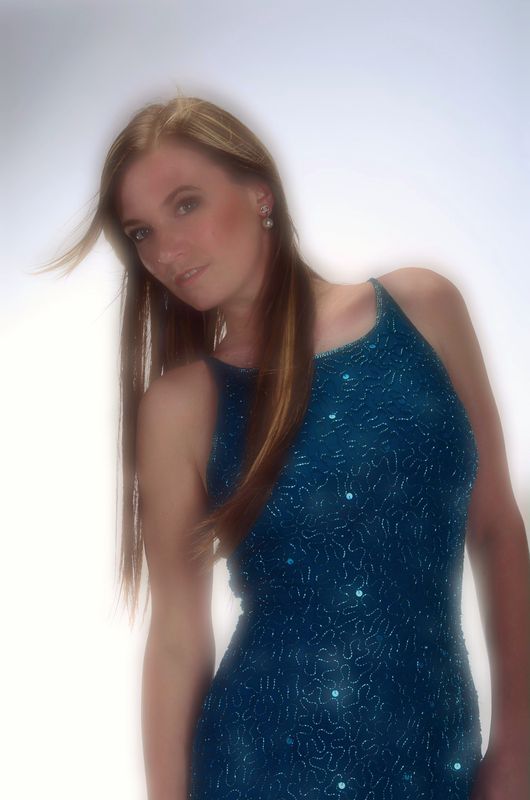
#2 strikes me as the best of the bunch. #3 doesn't quite work for me. Supposed to be soft and dreamy, I guess, but the fade - particularly her hair - doesn't fall off right. This is one photo that MIGHT benefit from a vignette (I don't usually like vignettes).
Dec 21, 2012 13:16:41 #
Yes I looked into that...but with the white BG...just didn't look good....just to much contrast I think.
Dec 21, 2012 13:59:41 #

Dec 21, 2012 17:05:05 #

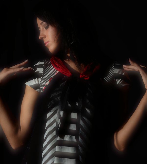
I've said before that I am a fan of high-contrast images. So I do like number 4.
Number 2 is the best however.
My main issue is not your fault. Could someone have done a better job on the makeup and choice of clothes for the women?
Number 2 is the best however.
My main issue is not your fault. Could someone have done a better job on the makeup and choice of clothes for the women?
Dec 21, 2012 17:14:51 #
Dec 21, 2012 20:13:45 #
Two is the best.
Four is ok with interesting light.
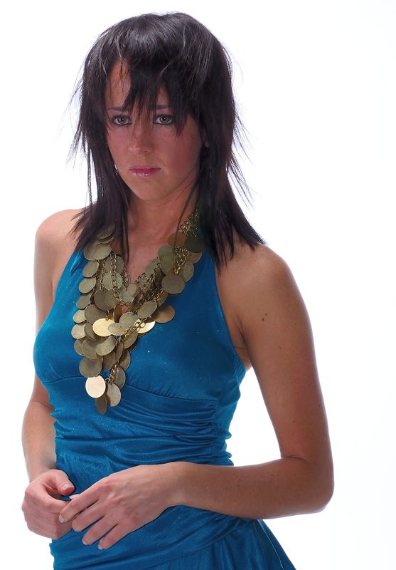
1) I don't like full arm sleeveless. It exposes to much skin. Light is fairly flat. Back of hand not attractive. I'm not a fan of hipbone crops. Also not a fan of this much hair in the face. It limits your options in post.
3) Way to soft. Looks like a Gaussian blur over the whole image.. Not good.
Angle of the head and the body in the pose looks unnatural.
Good points.. You had her bend her joints!
That's it for me Bret.
1 other note on 1. nose in crops should usually have more in front. You have more empty frame behind her.
Four is ok with interesting light.
1) I don't like full arm sleeveless. It exposes to much skin. Light is fairly flat. Back of hand not attractive. I'm not a fan of hipbone crops. Also not a fan of this much hair in the face. It limits your options in post.
3) Way to soft. Looks like a Gaussian blur over the whole image.. Not good.
Angle of the head and the body in the pose looks unnatural.
Good points.. You had her bend her joints!
That's it for me Bret.
1 other note on 1. nose in crops should usually have more in front. You have more empty frame behind her.
Dec 22, 2012 05:01:43 #
Thanks Russ. I'd have never guessed 2...make-up just seems like patch work. 3 and 4 I added in-camera soft focus just to see what it does.
Dec 22, 2012 08:30:01 #
I like #4 but I think it would have come off better with a lighter background. Her hair blends into the background far too much. I do like the pose. Just my humble opinion.
Dec 22, 2012 10:14:37 #

I like #3 and love #4. I assume you used the orton effect on #3 - if you'd back the bloom off a little bit it would be very good. #4 looks like the orton effect again only right on this time. Love the shadows and skin tones. The first 2 pics are ok but 3 and 4 have substance to them. An amatuer's opinion here.
Dec 22, 2012 12:01:27 #
Jan 6, 2013 10:26:55 #

If you want to reply, then register here. Registration is free and your account is created instantly, so you can post right away.