Check out Sports Photography section of our forum.
Is this an improvement or is it over the top?
Dec 15, 2012 09:47:04 #

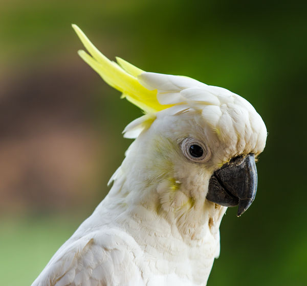
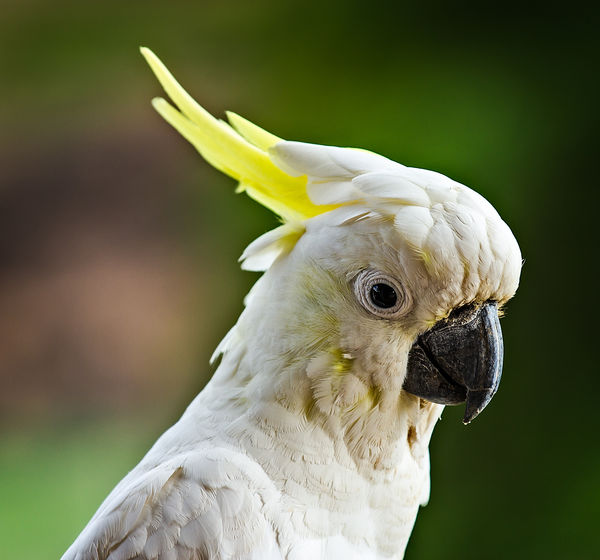
I took this pic of a sulphur crested cockatoo the other day and was pretty happy with the result. However-- I was fooling around on the computer and found a free plugin for lightroom called Perfect effects 4, downloaded it and applied a preset called tonal contrast to the image. I think the results are very pleasing, giving almost a 3D effect without the grainy appearance of HDR.
I wold be interested in the opinions of UHH members as to whether they prefer the original or the PE4 version
I wold be interested in the opinions of UHH members as to whether they prefer the original or the PE4 version
original image
pe4 image
Dec 15, 2012 10:06:46 #
Dec 15, 2012 10:53:16 #
The second one is better because of the light. If you haven't adjusted the light, it looks like all the plugin does is actually brighten the darks and also applies sharpening. The program didn't seem to add any noise but then you had a nice clean pic to begin with.
Dec 15, 2012 11:08:59 #

Dec 15, 2012 11:13:28 #

drydock wrote:
I took this pic of a sulphur crested cockatoo the other day and was pretty happy with the result. However-- I was fooling around on the computer and found a free plugin for lightroom called Perfect effects 4, downloaded it and applied a preset called tonal contrast to the image. I think the results are very pleasing, giving almost a 3D effect without the grainy appearance of HDR.
I wold be interested in the opinions of UHH members as to whether they prefer the original or the PE4 version
I wold be interested in the opinions of UHH members as to whether they prefer the original or the PE4 version
#2 beautiful bird, beautiful photo. I am a bird lover with 2 silly parrots!!!
Dec 15, 2012 11:27:08 #

Number 2 does it, but then again what does a nut know? They are nice!
Dec 15, 2012 21:02:39 #

Check out Infrared Photography section of our forum.
Dec 16, 2012 08:03:41 #

#2 appears sharper. They did it by adding noise to sharpen the edges, which you can easily see in the fine feathers to the lower left of the eye. They took it just a hair over the edge for me, but then I do my own in CS5 and dislike seeing noise. For automation, it appears good. If you are doing it yourself, I would back off the sharpening just a hair.
Dec 16, 2012 10:50:51 #

Another vote for number two, improving an already good photo.
Dec 16, 2012 11:06:08 #
Dec 16, 2012 13:55:44 #

The second one seems to be an improvement, however the post processing induced a green fringe along the right side of the Cockatoo
Check out Photo Critique Section section of our forum.
Feb 8, 2013 08:40:37 #

Feb 8, 2013 08:43:17 #

Feb 8, 2013 08:44:53 #

Much better job with the p/p....just keep this in mind...less is almost always more...go to far with it and it starts looking "cooked"...nice shot btw.
If you want to reply, then register here. Registration is free and your account is created instantly, so you can post right away.
Check out The Dynamics of Photographic Lighting section of our forum.