Composite that doesn't seem right
Apr 17, 2024 08:13:12 #
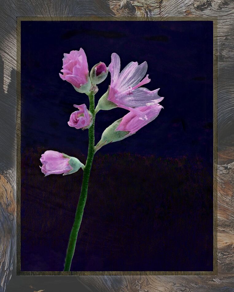
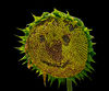
Where I find these mallow wildflowers growing, it is difficult to get an uncluttered background with all the other vegetation surrounding the plants.
I've tried off and on since late summer 2022 when I took some pictures of some, to process them in ways that could decrease the background and let a mallow or two be emphasized. None did well.
There is an almost gossamer-like character to some of the petals, and that is what I wanted to bring out, but with all the distraction of the clutter of other vegetation, I wasn't getting there.
So, I selected this stem for a candidate and tried to make a 'portrait' of it.
Using a couple non-descript pics I have, I blended them into a composite, gave it some heavy-handed alteration with the curves tool, and put it onto the original background, letting a hint of the original barely show through in a couple places, if you know where to look for it. I tried to get the background so it doesn't detract attention from the florets of the subject.
Then, making another composite of three other pics, I made a 'mat' border for the 'portrait'.
Now, I tried a few different adjustments for the overall composition, but this one doesn't seem to come together quite right.
•• Is there an imbalance somewhere?
-- the 'pose' is wrong?
-- too much negative space, or it's in the wrong area?
-- lighting on the subject is not conducive to a good result?
-- is the aspect ratio not the best for this?
-- it's just too hokey an idea to pull off very well?
......or do I just need to lay it aside for a few weeks, then come back and look at it again after my eyes and mind have had a break from it for a while?
Apr 17, 2024 10:02:09 #

dustie wrote:
Where I find these mallow wildflowers growing, it ... (show quote)
First off, I like it! It's a lovely flower and nicely imaged. I think the "pose" is right on, and no, there's not too much negative space. I think the lighting is fine except that there seems to be a shadow on the "frame." The frame you have used is very pretty, but to my taste it's a bit too "heavy" for the subject. Not sure what I'd use instead, though, so that's no help.
Apr 17, 2024 10:19:58 #

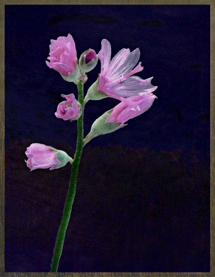
For me, the thick and busy frame overpowers the delicate nature of the blooms and clashes color-wise. Do you have a copy without the frame you could upload for us to offer alternate views? If you're willing? 
The composite itself seems very nice, with no issues IMO about spacing or aspect or background.
The composite itself seems very nice, with no issues IMO about spacing or aspect or background.
Apr 17, 2024 13:13:21 #

Apr 17, 2024 13:16:14 #

First let me say it doesn’t look like a composite. Perhaps someone more familiar with this flower would see it as a composite. I am a fan of black backgrounds, so I am good with that. The frame works for me. Maybe if you changes the frame to a wood frame, Linda may find that more appealing.
Apr 17, 2024 13:59:28 #
Linda From Maine wrote:
For me, the thick and busy frame overpowers the delicate nature of the blooms and clashes color-wise. Do you have a copy without the frame you could upload for us to offer alternate views? If you're willing?
The composite itself seems very nice, with no issues IMO about spacing or aspect or background.
The composite itself seems very nice, with no issues IMO about spacing or aspect or background.
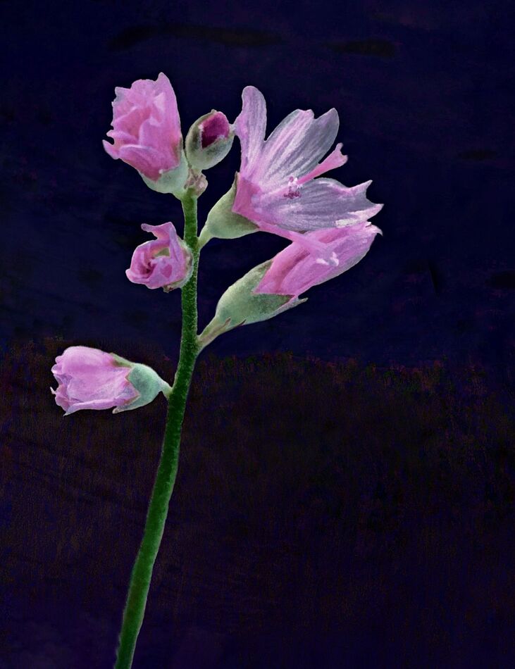
I'll put two up to consider, kind of working backward from where it had the full border down to the plain jane borderless.
So, that changes the aspect ratio of each image, because I'm just removing outer elements, but the ratio of the background portion should remain consistemt with itself (at least, I believe it does.)
Apr 17, 2024 13:59:50 #
dustie wrote:
Where I find these mallow wildflowers growing, it ... (show quote)
Overall, I find it a lovely image. Laying it aside often works for me, so you might find a more satisfying version later. Regarding the negative space and the aspect ratio, it does feel a little imbalanced for me; I think a little more negative space on the left would help. And I suspect I might prefer a little less of the stem, but only a little. Finally, for me, the frame is fine as is, although a more delicate design might be more appealing to some viewers.
Apr 17, 2024 14:01:03 #
AzPicLady wrote:
First off, I like it! It's a lovely flower and nicely imaged. I think the "pose" is right on, and no, there's not too much negative space. I think the lighting is fine except that there seems to be a shadow on the "frame." The frame you have used is very pretty, but to my taste it's a bit too "heavy" for the subject. Not sure what I'd use instead, though, so that's no help.
Thank you. I'll have to do some musing on 'frame' style change.
Apr 17, 2024 14:02:00 #
Apr 17, 2024 14:06:03 #
NJFrank wrote:
First let me say it doesn’t look like a composite. Perhaps someone more familiar with this flower would see it as a composite. I am a fan of black backgrounds, so I am good with that. The frame works for me. Maybe if you changes the frame to a wood frame, Linda may find that more appealing.
"...it doesn't look like a composite..." ?
I'm not sure if you mean it's " to realistic" looking, or falling short in some way.
Apr 17, 2024 14:12:02 #
cbtsam wrote:
Overall, I find it a lovely image. Laying it aside often works for me, so you might find a more satisfying version later. Regarding the negative space and the aspect ratio, it does feel a little imbalanced for me; I think a little more negative space on the left would help. And I suspect I might prefer a little less of the stem, but only a little. Finally, for me, the frame is fine as is, although a more delicate design might be more appealing to some viewers.
Thanks for that.
Whether there is not enough negative space to the left is part of what I kept debating. I didn't find putting it more centered really cleared my questioning, either, though.
I don't know if I saw too many variations as I was working on it, and maybe just the setting it aside a while may be the thing that can help get a 'fresh look' at it, and resolve some uncertainties.
Apr 17, 2024 14:15:24 #

Apr 17, 2024 14:17:43 #
dustie wrote:
"...it doesn't look like a composite..." ?
I'm not sure if you mean it's " to realistic" looking, or falling short in some way.
I'm not sure if you mean it's " to realistic" looking, or falling short in some way.
Let me try to clarify what I printed. You mentioned it was a composite. In trying to separate it from the background. Well you did a really good job. It didn’t come off a composite as far as I am concerned. The flowers attached to the stem works for me.
As for the placement of the flowers on them stem, it looks real to me.
Apr 17, 2024 14:18:30 #
dustie wrote:
I find the smaller frame more appealing, though the color is not. I think we probably just don't have the same colors on our monitors, or maybe it's my eyes (cataract surgery next year) I'll put two up to consider, kind of working backward from where it had the full border down to the plain jane borderless.
So, that changes the aspect ratio of each image, because I'm just removing outer elements, but the ratio of the background portion should remain consistemt with itself (at least, I believe it does.)
So, that changes the aspect ratio of each image, because I'm just removing outer elements, but the ratio of the background portion should remain consistemt with itself (at least, I believe it does.)
Many thanks!
Apr 17, 2024 14:19:03 #
DWU2 wrote:
Try it with a white background.
Maybe I should take a look at that, again.
To me, the white background seemed too overpowering....too glaring, I guess I would have called it....so I did not save a version of that.
If you want to reply, then register here. Registration is free and your account is created instantly, so you can post right away.