The mean streets of the city
Feb 18, 2024 19:57:49 #
AI WARNING
All three images are from MidJourney.
What I need from you is an honest critique on the composite. I appreciate emojis and "well done" BUT from you folks that make composite images: What is right, what is wrong. Be truthful and brutal. I am not happy with my skill and I need your help
All three images are from MidJourney.
What I need from you is an honest critique on the composite. I appreciate emojis and "well done" BUT from you folks that make composite images: What is right, what is wrong. Be truthful and brutal. I am not happy with my skill and I need your help
Feb 18, 2024 20:19:17 #

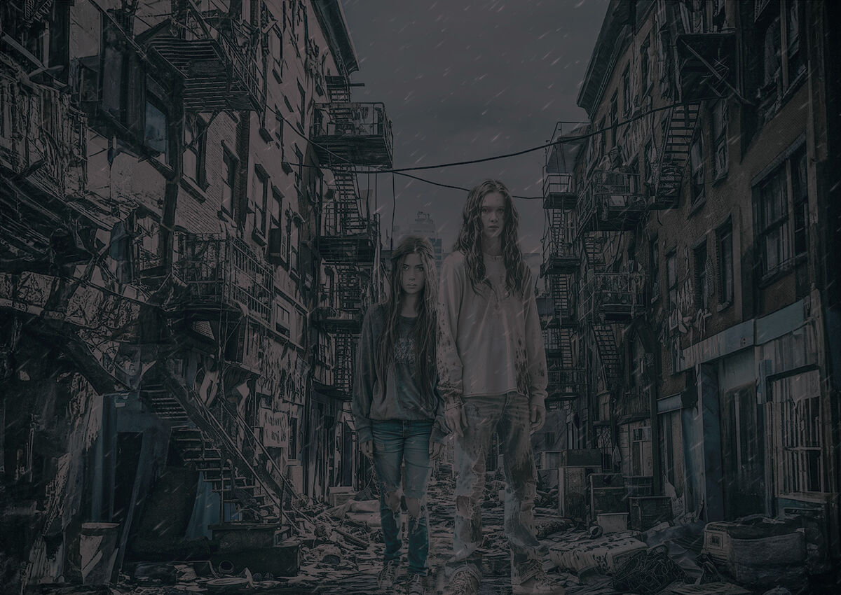
I still find a difference in perspective between the figures and the steps. Somehow if you can, increase the distance, between both items. Am I making sense? The steps can be made a little larger and the figures a bit smaller. And shadows! The figures need a bit of shading, perhaps around the bottom of their feet. I DO think this scene is a scene stealer! Really striking in its presentation. You do these scenes so well!!!
Feb 18, 2024 20:30:32 #

I overall like the presentation. But I am having a problem with the direction of the rain. Perhaps because it is going right to left. I also find it a bit flat. Perhaps ramping up the contrast would help the view. Of course everything is subjective in the analysis.
Feb 18, 2024 20:37:07 #

Feb 18, 2024 22:38:33 #
veralisa296 wrote:
I still find a difference in perspective between the figures and the steps. Somehow if you can, increase the distance, between both items. Am I making sense? The steps can be made a little larger and the figures a bit smaller. And shadows! The figures need a bit of shading, perhaps around the bottom of their feet. I DO think this scene is a scene steeler! Really striking in it's presentation. You do these scenes so well!!!
OK Veronica I see what you mean about the steps. Size is always difficult for me. I will use Generative Fill to expand the foreground, move the subjects forward some and see if it helps
Feb 18, 2024 22:42:15 #
NJFrank wrote:
I overall like the presentation. But I am having a problem with the direction of the rain. Perhaps because it is going right to left. I also find it a bit flat. Perhaps ramping up the contrast would help the view. Of course everything is subjective in the analysis.
Thanks Frank, I agree about the rain. There is no indication anywhere in the image of wind. The rain should be coming straight down. I'm not sure I understand what you mean about flat.
Feb 18, 2024 22:42:29 #
Feb 19, 2024 07:32:51 #

Veronica is correct in her comment on perspective, however, if it were cinema, the couple would be standing and discussing the scene behind them. The scene would change as they talked about their life. Perspective of them and the scene would be two separate things.
Using such a mud-dull color for a dreary effect is unusual, and here quite effective. This is not a photo that should be looked at for detail, it is one of emotional impact; look and feel. Imagine sitting in a pitch-black room, mind dulled by two glasses of wine, and seeing the image huge projected on a wall with the couple standing and talking and the places behind them changing. Very film noir.
Using such a mud-dull color for a dreary effect is unusual, and here quite effective. This is not a photo that should be looked at for detail, it is one of emotional impact; look and feel. Imagine sitting in a pitch-black room, mind dulled by two glasses of wine, and seeing the image huge projected on a wall with the couple standing and talking and the places behind them changing. Very film noir.
Feb 19, 2024 08:11:33 #

Veronica and Frank have touched on the key aspects that need work IMO.
The "flat" tones show in my editor as all being well below middle gray. As Don mentioned, effective for the mood, but very difficult for certain aging eyes (guess whose ) to see.
The "flat" tones show in my editor as all being well below middle gray. As Don mentioned, effective for the mood, but very difficult for certain aging eyes (guess whose
) to see.Feb 19, 2024 08:30:57 #
Curmudgeon wrote:
Thanks Frank, I agree about the rain. There is no indication anywhere in the image of wind. The rain should be coming straight down. I'm not sure I understand what you mean about flat.
Before I was going to answer your question. I read the rest of the thread. I should have mentioned the muted tones. If you have the girls a bit brighter that would be the pop What I was thinking about.
Feb 19, 2024 09:44:08 #
Downloaded and edited using Topaz Clarity, I boosted the contrast and white level and ended up with a bright day with two people standing on a trash street... Frank's suggestion of improving contrast destroyed the depressing Noir film mood of the image.
Changing the size perspective to be "correct" no longer allows the couple to be the source of the narrative. "Correctly Sized" They become part of the scene and are not talking to us about the scene.
Changing the size perspective to be "correct" no longer allows the couple to be the source of the narrative. "Correctly Sized" They become part of the scene and are not talking to us about the scene.
Feb 19, 2024 11:08:28 #
dpullum wrote:
For the intriguing story Don alludes to, I'd reduce the size of everything behind, and keep the figures large, to emphasize the distance and size difference. Perhaps right now the image is caught between realistic and fanciful?...
Changing the size perspective to be "correct" no longer allows the couple to be the source of the narrative. "Correctly Sized" They become part of the scene and are not talking to us about the scene.
Changing the size perspective to be "correct" no longer allows the couple to be the source of the narrative. "Correctly Sized" They become part of the scene and are not talking to us about the scene.
Feb 19, 2024 11:49:29 #
dpullum wrote:
Veronica is correct in her comment on perspective,... (show quote)
Thanks for looking and commenting. I was trying to capture the resignation of two young people with no past and no future.
Feb 19, 2024 11:50:30 #
Linda From Maine wrote:
Veronica and Frank have touched on the key aspects that need work IMO.
The "flat" tones show in my editor as all being well below middle gray. As Don mentioned, effective for the mood, but very difficult for certain aging eyes (guess whose) to see.
The "flat" tones show in my editor as all being well below middle gray. As Don mentioned, effective for the mood, but very difficult for certain aging eyes (guess whose
) to see.Thanks for taking the time to look and comment Linda
Feb 19, 2024 11:55:17 #
NJFrank wrote:
Before I was going to answer your question. I read the rest of the thread. I should have mentioned the muted tones. If you have the girls a bit brighter that would be the pop What I was thinking about.
Thanks again Frank. I didn't want pop. I wanted them to be as drab and hopeless as the rest of the background.
If you want to reply, then register here. Registration is free and your account is created instantly, so you can post right away.