Deco City
Jan 4, 2024 09:59:50 #

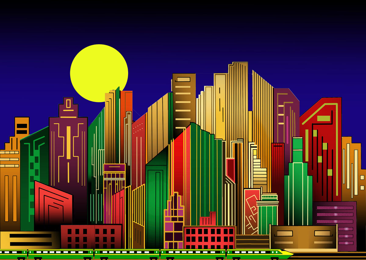
This is something I put together over the last several weeks. The image was made entirely with Adobe Photoshop. I was originally inspired by a Christmas ornament I saw somewhere and tried to expand on the theme. The last element I added was the train at the bottom of the image. That may have been overkill. I would love to know your thoughts; what did I do right and where did I go too far. Thanks for taking a look. Chris
Jan 4, 2024 10:03:28 #

Jan 4, 2024 12:41:30 #

Jan 4, 2024 14:49:20 #
Jan 4, 2024 15:16:08 #

Due to the different colors of the structures, I wonder how the train would look with each of the train cars and the engine having different colors of the buildings with less color opacity. This is just my thought, you asked.
Jan 4, 2024 15:37:46 #
SoHillGuy wrote:
Due to the different colors of the structures, I wonder how the train would look with each of the train cars and the engine having different colors of the buildings with less color opacity. This is just my thought, you asked.
Thanks. I'm happy to get suggestions. I may give it a try.
Jan 4, 2024 15:40:00 #

A feast for the eyes! The gradient in the sky is a great idea, keeping our eyes within the frame. The colors and sharp lines are all marvelous. The train is perfect IMO.
It's an ultra-charming work that must have taken you a very long time to accomplish.
It's an ultra-charming work that must have taken you a very long time to accomplish.
Jan 4, 2024 15:47:19 #
SoHillGuy wrote:
Due to the different colors of the structures, I wonder how the train would look with each of the train cars and the engine having different colors of the buildings with less color opacity. This is just my thought, you asked.
Wouldn't they have a tendency to blend in with the buildings then?
I like the contrast between the buildings and the train.
Jan 4, 2024 15:59:39 #
Longshadow wrote:
Wouldn't they have a tendency to blend in with the buildings then?
I like the contrast between the buildings and the train.
I like the contrast between the buildings and the train.
***
As I said, I wonder.
Jan 4, 2024 16:04:47 #
SoHillGuy wrote:
***
As I said, I wonder.
As I said, I wonder.
Simply giving you more to wonder about.

Jan 4, 2024 17:05:27 #
Linda From Maine wrote:
A feast for the eyes! The gradient in the sky is a great idea, keeping our eyes within the frame. The colors and sharp lines are all marvelous. The train is perfect IMO.
It's an ultra-charming work that must have taken you a very long time to accomplish.
It's an ultra-charming work that must have taken you a very long time to accomplish.
Thank you for the very kind words Linda. I learned about linear and radial gradients while making this. I used linear gradients in most of the buildings as well. They really gave the image more depth. Learning that and how to use the pen tool has been fun. The pen tool is great once you start to figure it out.
Jan 4, 2024 20:06:57 #
saxman71 wrote:
This is something I put together over the last several weeks. The image was made entirely with Adobe Photoshop. I was originally inspired by a Christmas ornament I saw somewhere and tried to expand on the theme. The last element I added was the train at the bottom of the image. That may have been overkill. I would love to know your thoughts; what did I do right and where did I go too far. Thanks for taking a look. Chris
The train belongs there, and the colors are wonderful! This has an updated Deco feel that I like very much.
Jan 5, 2024 05:22:03 #

saxman71 wrote:
This is something I put together over the last several weeks. The image was made entirely with Adobe Photoshop. I was originally inspired by a Christmas ornament I saw somewhere and tried to expand on the theme. The last element I added was the train at the bottom of the image. That may have been overkill. I would love to know your thoughts; what did I do right and where did I go too far. Thanks for taking a look. Chris

Jan 5, 2024 06:50:14 #

Jan 5, 2024 07:33:12 #
saxman71 wrote:
Oh I see that now in the buildings, had been too into taking in the whole experience and missed the individual gradients. Great idea!!Thank you for the very kind words Linda. I learned about linear and radial gradients while making this. I used linear gradients in most of the buildings as well. They really gave the image more depth. Learning that and how to use the pen tool has been fun. The pen tool is great once you start to figure it out.
If you want to reply, then register here. Registration is free and your account is created instantly, so you can post right away.