Polish-Jewish hero, Jan Karski
Jan 4, 2024 08:01:03 #

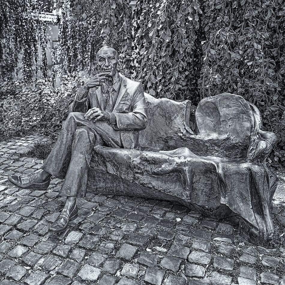
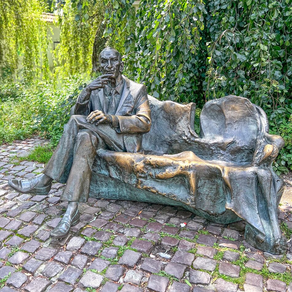
Artist Karol Badyna. I shot this image while walking through the Jewish Quarter in Krakow,Poland this past summer. Jan Karski was a legendary courier of the Polish Underground State during II World War. This glorious emissary, putting his life in danger, got across the Warsaw Ghetto to prove to the Western world the truth about the Holocaust. In 1942 Karski informed the Allies about the mass extermination of Jews in Poland. For that reason, he is known as 'the man who tried to stop the Holocaust'. I decided that it was best presented in Black and White. I included the original color version.
This was our second visit to the beautiful city of Krakow.
IPhone 13 Pro Max
This was our second visit to the beautiful city of Krakow.
IPhone 13 Pro Max
Jan 4, 2024 10:37:15 #

To me, the color version is better. The statue does not stand out from the busy background.
Jan 4, 2024 11:17:32 #

I like the color version better. It really adds “life” to the image, as well as the sculpture, and gives it character. I agree with NMGal about the B&W version.
Jan 4, 2024 11:26:47 #
NMGal wrote:
To me, the color version is better. The statue does not stand out from the busy background.
Thanks for your reply. I am on the fence about color vs black n white. I might be too close to the fire on this. On our first visit to Krakow, we visited the Auschwitz-Birkenau concentration camps. It was a roller-coaster of emotions ranging from deep sadness to over the top anger. A very dark period in history for sure. When walking around in the Jewish quarter and the Jewish Cemetery in Krakow, I view these scenes as Black and White.
Jan 4, 2024 19:03:05 #
Quizas47
Loc: Seattle, WA
Fstop12 wrote:
Artist Karol Badyna. I shot this image while walki... (show quote)
I like the color version better; the statue stands out more.
Jan 4, 2024 20:54:00 #

F Stopp
I agree with the rest the color separates the statue from the background. The black and white the statue just blends in to the background. Understand your feelings.
Johnny
I agree with the rest the color separates the statue from the background. The black and white the statue just blends in to the background. Understand your feelings.
Johnny
Jan 4, 2024 21:18:26 #
Jan 5, 2024 00:18:17 #

As with the others, thoughI like the framing and the subject, I think the statue gets a little lost in the busy background in the monochrome.
If you have Lightroom Mobile you can darken the greens after changing to a black and white profile. That would provide better contrast between the statue and the leaves.
If you have Lightroom Mobile you can darken the greens after changing to a black and white profile. That would provide better contrast between the statue and the leaves.
Jan 5, 2024 06:22:18 #
Quizas47 wrote:
I like the color version better; the statue stands out more.
Thanks for replying
Jan 5, 2024 06:22:39 #
johnny1950 wrote:
F Stopp
I agree with the rest the color separates the statue from the background. The black and white the statue just blends in to the background. Understand your feelings.
Johnny
I agree with the rest the color separates the statue from the background. The black and white the statue just blends in to the background. Understand your feelings.
Johnny
Thank you
Jan 5, 2024 06:23:00 #
Jan 5, 2024 06:23:21 #
jaredjacobson wrote:
As with the others, thoughI like the framing and the subject, I think the statue gets a little lost in the busy background in the monochrome.
If you have Lightroom Mobile you can darken the greens after changing to a black and white profile. That would provide better contrast between the statue and the leaves.
If you have Lightroom Mobile you can darken the greens after changing to a black and white profile. That would provide better contrast between the statue and the leaves.
Thank you for your response.
Jan 5, 2024 12:38:23 #
Billy Boy
Loc: MO
I must be the only lad who likes the B&W version. 1st it better reflects the mood and 2nd the eroded yellow on the bench detracts the eye.
Jan 5, 2024 12:43:08 #
Billy Boy wrote:
I must be the only lad who likes the B&W version. 1st it better reflects the mood and 2nd the eroded yellow on the bench detracts the eye.
Thank you for your reply.
Jan 7, 2024 22:34:04 #

I think I’m in agreement with Billy Boy. The B&W version requires more concentration and time to soak it in. It’s kind of like the works of a great composer, you don’t get everything on the first pass. To each their own though. 🤷🏻♂️
If you want to reply, then register here. Registration is free and your account is created instantly, so you can post right away.