B&W conversions
Dec 18, 2023 22:05:59 #

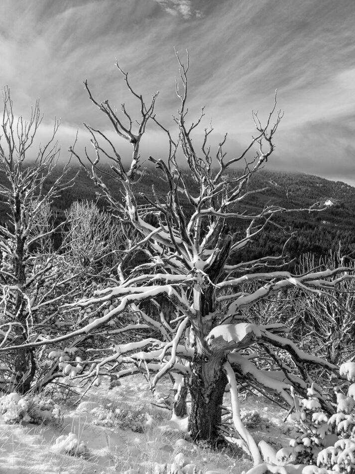
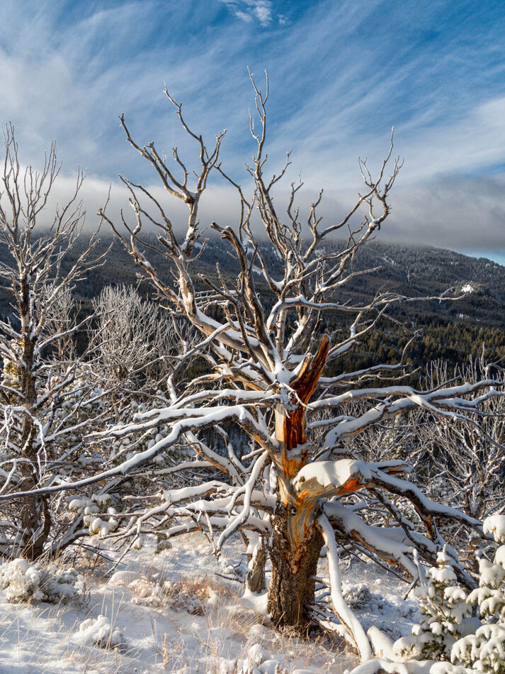
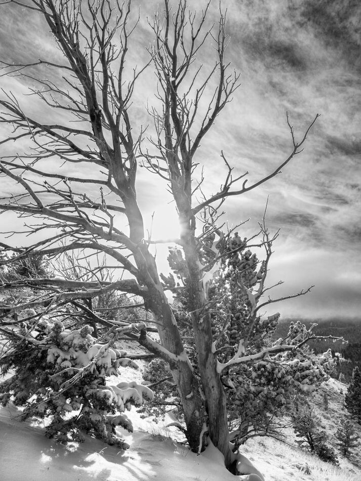
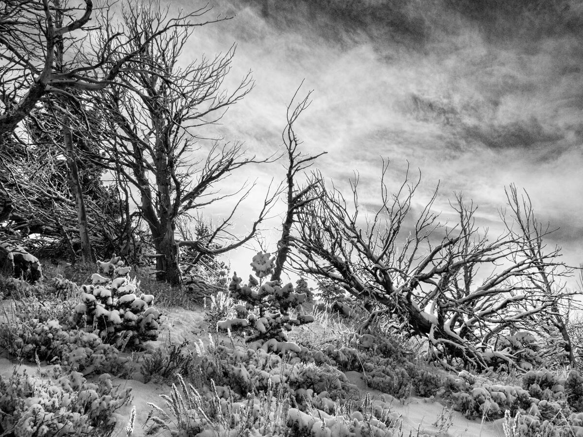
I had a request to convert a shot of a tree to black and white. I haven't done many in b&w so all comments/critiques are welcome on these shots. I have included the color version as well.
These where taken this past November in the Centennial Mountain Range in Lima MT, we are at an elevation of about 10,000 feet elevation hunting elk and it was a very COLD morning!
Here is your tree tommystrat, hope you like it.
These where taken this past November in the Centennial Mountain Range in Lima MT, we are at an elevation of about 10,000 feet elevation hunting elk and it was a very COLD morning!
Here is your tree tommystrat, hope you like it.


Dec 18, 2023 23:18:38 #

Dec 19, 2023 08:27:45 #

Dec 19, 2023 08:37:56 #

I'd increase the contrast of the B&W versions, either by adjusting the contrast or adjusting the blacks to be more black.
Dec 19, 2023 09:22:45 #

There are so many ways to edit for black and white, it just comes down to what you want to say. Gentle tones v. high contrast, for example. Also, with busy scenes full of detail, sometimes it's good to do selective dodging and burning to help lead the eye through the frame.
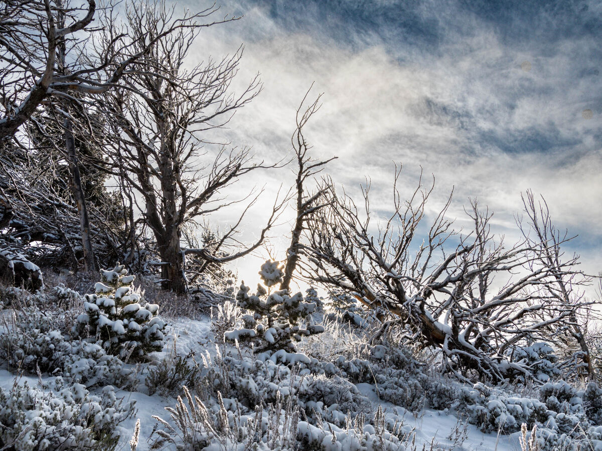
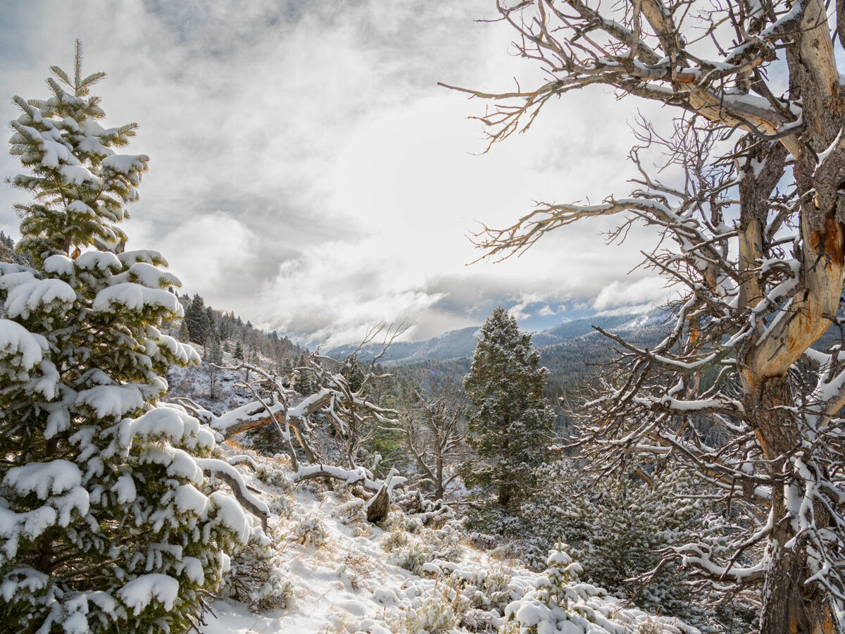
I don't feel #2 is a good candidate for conversion because of the washed-out light. #3 is quite busy, but I find the bare trees on the ridge beautiful, so I'd perhaps lighten the foreground in order to make those trees stand out.
#4 has gorgeous details and a composition that draws me into the scene. However, the blown white sun area in the middle distracts. One possibility is to clone some clouds over that spot, but do in low opacity so that just a hint of detail shows.
Sometimes doing edits prior to conversion works bettter, depends
Dec 19, 2023 11:14:37 #
The color versions are far better, you see so much more. In my opinion.
Brian
Brian
Dec 19, 2023 11:20:39 #

Nice work, Cindy. B&W works nicely for these images. The color versions are good and made great starting points.
Dec 19, 2023 11:47:15 #
Dec 19, 2023 11:47:23 #
Dec 19, 2023 11:47:49 #
CHG_CANON wrote:
I'd increase the contrast of the B&W versions, either by adjusting the contrast or adjusting the blacks to be more black.
Thanks...I will play around with the blacks and contrast some more.
Dec 19, 2023 11:48:36 #
Linda From Maine wrote:
There are so many ways to edit for black and white... (show quote)
Thanks Linda! I will be able to play around later tonight hopefully and see what I can come up with.
Dec 19, 2023 11:49:27 #
Brian S. wrote:
The color versions are far better, you see so much more. In my opinion.
Brian
Brian
I kinda agree with ya! I hardly ever do stuff in b&w but it's a fun learning experience.
Dec 19, 2023 11:49:42 #
kpmac wrote:
Nice work, Cindy. B&W works nicely for these images. The color versions are good and made great starting points.
Thanks ken!
Dec 19, 2023 11:50:07 #

Beautiful photos in both modes, Cindy! Merry Christmas to you and yours.
Dec 19, 2023 13:11:30 #

As a very general rule, B&Ws are very contrast-tolerant and very sharpness-tolerant. That is especially true of the shots of dead trees that you posted. Contrast and sharpness bring out structure and shape, which are the main things that give dead trees their distinctiveness.
As usual, Linda highlights the essence of the issue. I would add that "gentle tones" is the least likely reason for wanting to do B&W and if that's the desired effect there's a good chance that colour would produce equally good if not better results. What B&W excels at is starkness.
Linda From Maine wrote:
There are so many ways to edit for black and white, it just comes down to what you want to say. Gentle tones v. high contrast, for example....
As usual, Linda highlights the essence of the issue. I would add that "gentle tones" is the least likely reason for wanting to do B&W and if that's the desired effect there's a good chance that colour would produce equally good if not better results. What B&W excels at is starkness.
If you want to reply, then register here. Registration is free and your account is created instantly, so you can post right away.