Indian Chief Progression
Dec 4, 2023 10:18:43 #

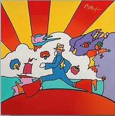
Starting from a blank white file and using a vintage apple box label as inspiration, I used the various line and shape tools in Photoshop to create the outline of an art deco style Indian chief. I then filled it in with color (image 1). My process is generally to create something, in this case the Indian chief, and then see what else I can do with it. So I doubled him, flipped him horizontally, changed the color slightly on the second image, added a little texture to the headdress, and put the two of them face to face in a new file (image 2). In looking at the result, I saw an opportunity to draw in a spear between the two opposing images (image 3). My final adjustment was to create the black background, put the two chiefs in an oval which I then overlayed with one of the tile commands from the filter gallery. I'd love to know your thoughts and whether you take similar approaches when creating your artwork. I'm pretty happy with the result but I'd like to hear your ideas how you would make it better.


Dec 4, 2023 10:25:05 #

I think your result is gorgeous: colors, curves, textures, and the illusion of the "vase/face" brain teaser*
*See this article.
I'm unable to create something from nothing, and rarely have a finished piece in mind before starting. But sometimes when I'm fiddling with two photos for a possible composite, or using layer blend modes or textures, a "vision" comes to me
Many thanks for your time putting this together in a thoughtful topic!
Dec 4, 2023 10:32:16 #
Linda From Maine wrote:
I think your result is gorgeous: colors, curves, t... (show quote)
Thank you Linda and thanks for the article link. I have assumed artists building composites take an approach similar to mine.
Dec 4, 2023 10:42:14 #
saxman71 wrote:
Starting with an inspiration such as the apple box is a great idea. I've read (here and other forums) of those who let their left brain take over and are kind of led along ("see what I could do with it"), and others who carefully map/plan their final result. All good, all fun!Thank you Linda and thanks for the article link. I have assumed artists building composites take an approach similar to mine.
Dec 4, 2023 11:32:07 #

Peter Max of the 1950 Art Deco poster era would be proud of you. Your shapes are bold and your colors unapologetic. Reminds me of Max's Cosmic Dancer. You have a good thing going, now that you have the technique "Go For It."
https://www.amazon.com/Artwork-Paintings-Posters-Bedroom-Unframe-10-12x12inch/dp/B0C9QJHJ89?th=1
Thank you for the following... you have corrupted me :
https://photoshoproadmap.com/create-a-peter-max-cosmic-pop-art-style-artwork-in-photoshop/
https://www.amazon.com/Artwork-Paintings-Posters-Bedroom-Unframe-10-12x12inch/dp/B0C9QJHJ89?th=1
Thank you for the following... you have corrupted me :
https://photoshoproadmap.com/create-a-peter-max-cosmic-pop-art-style-artwork-in-photoshop/
Dec 4, 2023 12:07:04 #
Well that sure opened my eyes on this cold, 55 degree, Arizona morning. Wonderful use of colors and textures
Dec 4, 2023 12:21:35 #

Dec 4, 2023 12:29:41 #
dpullum wrote:
Peter Max of the 1950 Art Deco poster era would be proud of you. Your shapes are bold and your colors unapologetic. Reminds me of Max's Cosmic Dancer. You have a good thing going, now that you have the technique "Go For It."
https://www.amazon.com/Artwork-Paintings-Posters-Bedroom-Unframe-10-12x12inch/dp/B0C9QJHJ89?th=1
Thank you for the following... you have corrupted me :
https://photoshoproadmap.com/create-a-peter-max-cosmic-pop-art-style-artwork-in-photoshop/
https://www.amazon.com/Artwork-Paintings-Posters-Bedroom-Unframe-10-12x12inch/dp/B0C9QJHJ89?th=1
Thank you for the following... you have corrupted me :
https://photoshoproadmap.com/create-a-peter-max-cosmic-pop-art-style-artwork-in-photoshop/
Thank you. I may spend some time with the second link. It's going to be a long winter ahead.
Dec 4, 2023 16:48:50 #

saxman71 wrote:
Starting from a blank white file and using a vinta... (show quote)
Love this image! You did some fine work here with color, form and what captured me was the use of your negative space. I was captured by the development of the spear between the faces.
Dec 4, 2023 17:49:45 #
veralisa296 wrote:
Love this image! You did some fine work here with color, form and what captured me was the use of your negative space. I was captured by the development of the spear between the faces.
Thank you. The spear was sort of a happy accident. There was no premeditated intent. However, when I did visualize it, I needed to straighten out the chief's neck lines to really make the spear work.
Dec 5, 2023 05:53:11 #
Dec 5, 2023 08:04:19 #

Very nicely done, and interesting to hear your workflow too. Each stage is interesting although the oval would be a step too far for my personal taste. Stage 3 is about perfect!
I struggle whether I have something in mind as an end result or not and use both methods until something starts to gel nicely, then home in. I don’t think it matters what method you adopt, it’s the result that counts.
I struggle whether I have something in mind as an end result or not and use both methods until something starts to gel nicely, then home in. I don’t think it matters what method you adopt, it’s the result that counts.
Dec 5, 2023 13:16:27 #
It's interesting how the images appear to rotate as you scroll and each image leaves to top of the screen. At first I thought it was an animated .gif. Nice image.
Dec 5, 2023 18:30:39 #

Your bold colors really make this dramatic. I like the 3rd one with the purple as the background, but love the textures in the 4th. Well processed progression.
Dec 9, 2023 14:20:02 #
If you want to reply, then register here. Registration is free and your account is created instantly, so you can post right away.